


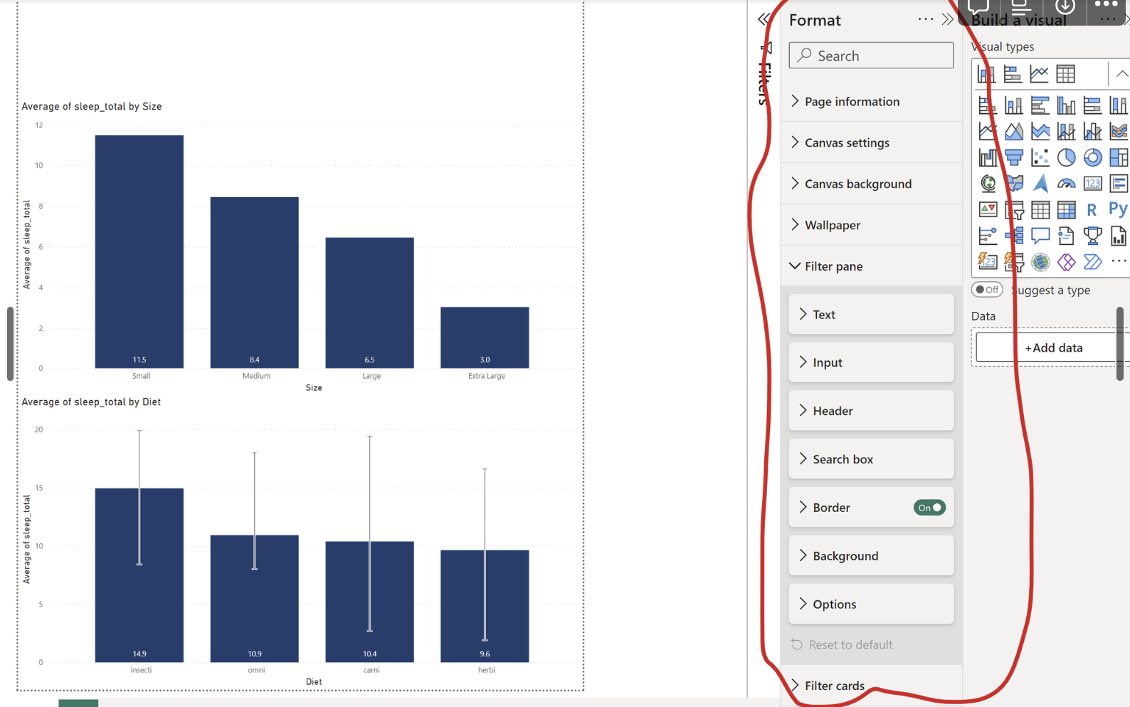
Using average metrics in bar charts can give you a great overview of data between different categories but without additional details it fails to show the spread of your data. This is where error bars come to help out!
To add those, all you have to do is go into your Format pane of your chart (make sure you have your chart selected first):
Then, scroll down until you see the Error Bars section:
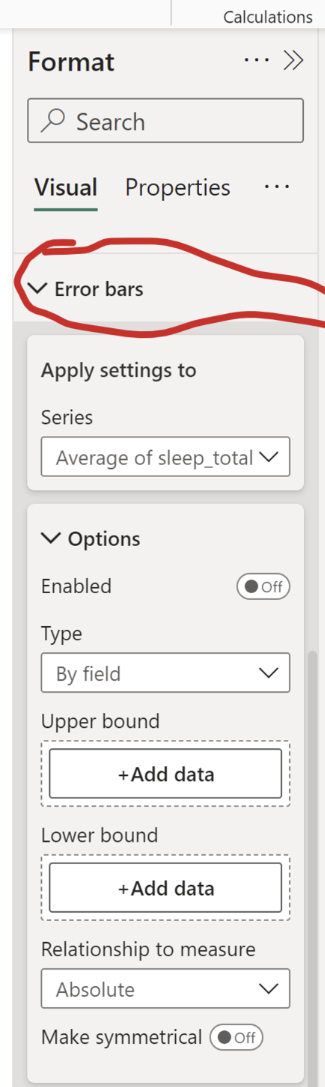
After opening the section you are presented with multiple options. Firstly, ensure your Apply Settings To section has the right metric selected (important if you have more than one field on your X-Axis).
After that switch on the Enabled toggle. Now you need to tell PowerBI what your Upper and Lower Bounds are (i.e. the furthest points to which error bars will reach). For that you need to add new Measures:
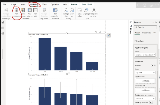
Depending on what you want your bars to reach to, you have to write the appropriate formula. The easiest option is to use MIN and MAX formulas:

After that, add both of the measures in the appropriate fields in your Error Bar section:
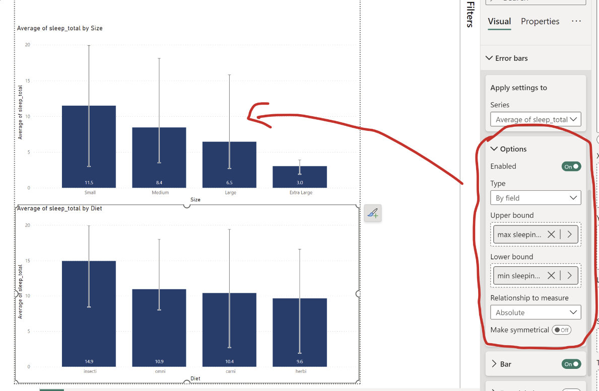
And there you go!
Now your bar chart have error bars representing the data spread for each category!