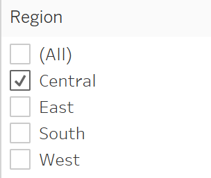
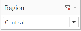
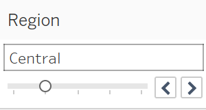
Tableau dashboard offers the ability to apply filters onto the view. Usually, this appears by dropdown, slider, or tick boxes.


Wouldn’t be nice to have buttons with this functionality instead? Well, it is possible to accomplish this, using a little trick. In this blog post, I will explain this process step by step.
For example, purposes, I will use the included dataset Sample-Superstore.
To begin with, drag the dimension you want to use, in this case Region, onto the columns shelf.
Then drag the measure number of records next to it.
Right click onto the number of records pill and change the aggregation from SUM to AVG. This will always return the value ‘1’.
Now right-click onto the axis and select Edit Axis.
From here choose the range ‘Fixed’ and set is as follows. Fixed start: 0 Fixed end: 1.
You can now hide the axis and the dimension names by right-clicking onto them and untick Show Headers.
Now drag the same Dimension you have used for the bars onto the Label marks. Clicking onto the text mark you can adjust the alignment to your preference.
To remove the lines around the buttons right-click onto one of the bar and select format and then borders. From there set every option as none.
To prevents tooltips from showing, press Tooltip from the Marks shelf and untick the Show tooltip option.
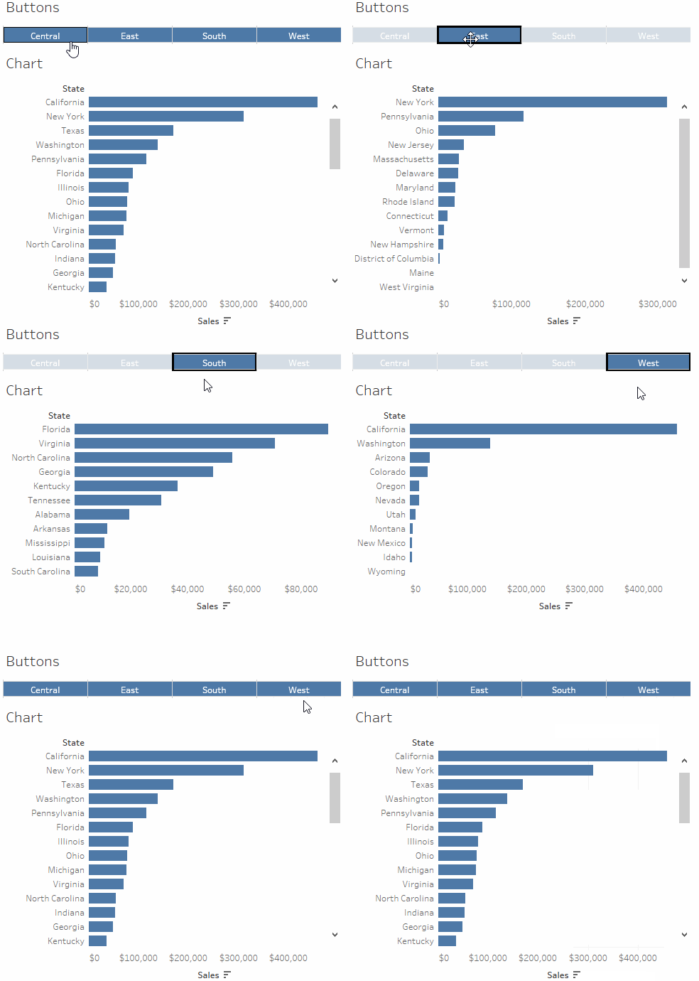
Now place this sheet onto a dashboard. Click onto it and select the little funnel on the right-hand side. You can also set the view to entire view to have larger buttons.
That’s it! Now you can use these buttons to filter the other views within that dashboard. In this example, I am filtering the US states based by their region.

