A parameter is a user-generated list of values which may or may not be present in the original dataset.
The first time I built one, I could not understand their functioning. In fact, if you only create a parameter, all you get is a dropdown of values which do not affect anything in the view.
In order to utilise a parameter in your view you need to follow these 4 steps:
- Create a parameter
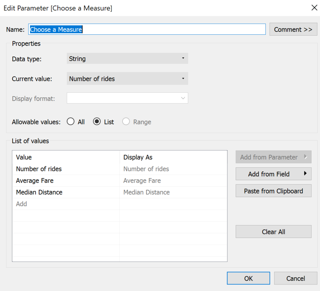
Here is possible to select the data type and the values to display. Those value can be part of a user-generated list or be set using a specific field.
- Show parameter control
Right-clicking on the new parameter will display the control options on the right-hand side of the view. Up to this step, the parameter is still unfunctional.
- Create a calculated field that uses the parameter
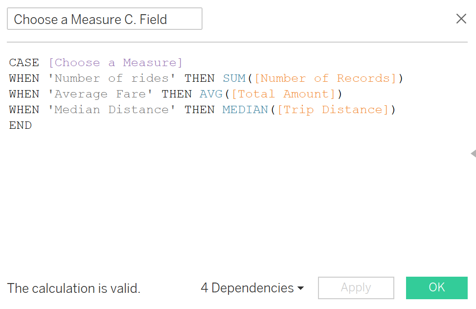
This is the focal step of this process. Utilising the parameter field inside a calculated field allows the parameter control to affect the view. The most common types of calculated fields using parameters are IF and CASE statement.
- Use the field
This may sound obvious, but if the calculated field is not part of the view (rows, column or marks card) it won’t affect the visualisation.
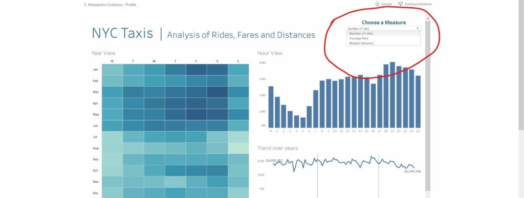
Here you can see an example of a visualisation I created that uses a parameter to select a specific metric.
This viz uses a dataset which recorded every taxi journey in New York City from 2009 to 2016. The parameter allows to select which metric to display, number of journeys, average fare or median distance.

To do so I created a parameter using these settings

I then created a CASE calculated field, which you can see in the picture below

Finally, I applied this calculated field in all different views that composed the dashboard, on the colour shelf for the heatmap and in the rows shelf for the other views.
