This is the week which past data schoolers only whisper of, current data schoolers completely dread and Andy Kriebel absolutely loves. It is the infamous Dashboard week. In case you are unaware of dashboard week, every day throughout this week we get a new data set and we have a day to essentially clean the data, find a story and make a dashboard. We also have to blog about our dashboard every day.
My task for Monday’s dashboard was finding the top shooters in the NBA. After playing around with various data sets, I finally found the one I thought would be most useful to produce my dashboards. After using Alteryx to clean up my data, I started building my dashboard.
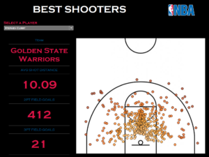
As soon as I started I realized the difficulty in producing one of the key components of my dashboard: a heat map. I wanted to use the X and Y coordinates in my dataset to visualize the exact position of shooters.
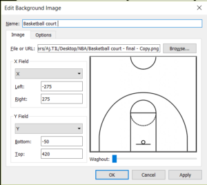
After reading blogs online I realized I could use background map to overlay a diagram of the basketball court and would able to produce a heat map.

One of the hardest parts of the whole task was lining the shots perfectly to the court. I had to make sure the court was had the perfect proportion and align it through trial and error. After spending a bit of time I was able to align it as close as possible.
After which I selected some of the key values as ‘BANs’, to highlight them
Here is my finished dashboard for Monday.

I am pleased with the way heat map ended up looking. If I had more time I would have made the heat map dark to match the rest of the dashboard theme.
