


Just have a short look on my "Comparing Exploratory & Explanatory Dashboards"
Background Information
In this blog post, I want to share a personal perspective on the differences between exploratory and explanatory dashboards. For me, it's about deciding whether to take the audience on a discovery journey or to create one single and clear output. In the business world, it's about choosing the right tool for the job. Sometimes, I find that both types have their place. By understanding these nuances now, I can deliver data visualizations that truly resonate with my future audience.
But now lets proceed with my own experience building them.
Associated Task
Two weeks ago, another task was generating insights from the "Superstore sample" data set. Those insights needed to be presented each in an exploratory and explanatory dashboard pointing out the differences between both options.
See my two versions (A and B) below.
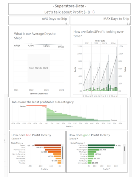
A) Exploratory Dashboard
What they include
From my perspective, exploratory dashboards should include a range of interactive tools that allow users to explore data in real-time. For example: drill-down features, hover effects, and dynamic visualizations. They provide flexibility and offer users options to analyze different aspects of the data through various views. Exploratory dashboards are particularly useful for analyzing unstructured data or situations where users may not have specific questions or hypotheses in mind, as they allow free exploration of the data. I think those potential users should be more professional ones as they need to exactly know how to explore such multifunctional dashboards.
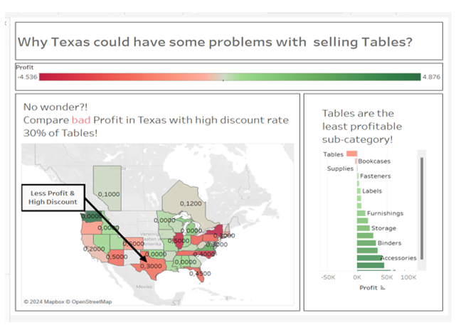
B) Explanatory Dashboard
What they include
From my perspective, explanatory dashboards are designed to present identified insights clearly and succinctly, aiding decision-making processes. Maybe also just answering one explicit question. They typically feature structured layouts and storytelling elements, such as narrative text and annotations, to contextualize the data and guide users through exact key findings. Explanatory dashboards prioritize communication of insights over interactive exploration, making them ideal for situations where users require a focused and informative presentation of data. I think users of explanatory dashboards often have a need for concise, actionable insights, leveraging the dashboard to support informed decision-making.
Summary of both versions
I would say that exploratory dashboards are more focused on data exploration and analysis, while explanatory dashboards aim to clearly communicate already identified insights and support decision-making. The choice between these two types of dashboards depends on the specific requirements of the project as well as the needs and expertise of the users.
Further tasks and Learning
After my presentation, the main feedback was to adjust the color selection for potential color blindness and to add more interactive filters to the exploratory dashboard for clearer differentiation between both versions. I plan to make these adjustments as a revision to enhance the clarity of the differences. I'll then publish both versions on Tableau Public, hoping my experience can benefit others.
Interesting Sources
 Cole Nussbaumer Knaflic
 Datawrapper