"In 90 Minutes to Power BI: Racing Against the Clock to Replicate a Tableau Dashboard"
Ever wondered if it's possible to recreate a Tableau Public dashboard in Power BI in just 90 minutes, even without much prior experience with Power BI? There are a number of very good publications comparing Tableau and Power BI. (see "Interesting Sources" at the end of this blog), but this is about my short race against time to bridge the gap between two powerful data visualization platforms. My preparation consisted in a few lectures providing some orientation regarding the various tools integrated in Power BI.
Query, M Language, DAX, Fabrics and more in Power BI:
What I learned by this little experiment: Once you know where to start and how the different tools are related, the access to Power Bi is rather simple.
But first things first
Here you can find my first application Dashoard "Comparing Global Innovation Index (GII)* of Switzerland and Germany " on Tableau Public giving some interesting insights about my previous daily business and job experiences as IP Paralegal. https://public.tableau.com/app/profile/aileen.pfleiderer/viz/UpdatefinalVersion/Update2ndVersion
Clock ticking
Don't be intimidated by the number of different tools. If you are not yet familiar with Power BI Desktop, Power BI Service, Power Query & Co. you should have a look on the extensive documentation provided by Microsoft (learn) somewhere beforehand. As I had a basic understanding of the tools and the process, my focus was initially on Power BI Desktop, as this is where the report and the visuals are prepared that will appear on the dashboard. The easy access to the data prep with the integrated Power Query is really nice. Power BI benefits from its ancestors, especially Excel. Most people are at least rudimentarily familiar with Excel spreadsheets, and that helps a lot with the first contact. I also have the advantage that my data is already available in Excel tables. So the import works like clockwork. There are two options: either you import the data without further transformation (Data Prep), or you go directly to the editor for transformation (Power Query Editor).
I have 5 Excel files with approx. 15 tables and always choose the second option for each of the tables. The Power Query Editor enables data preparation in individual steps with a straightforward menu. What I really like is that each step of the transformation appears in a list on the right. If you want to go back one or more steps, you can simply delete the steps there and try another way. This is very helpful.
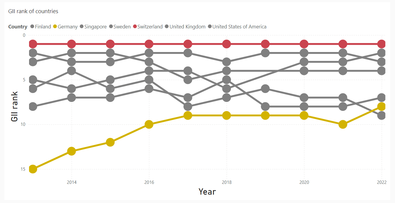
Bump Chart
Showdown: Tableau vs. Power BI
I work with many individual tables, each of which is rather small and clear. I have a table with the GII (Global Innovation Index) indicators for a large number of countries for the years 2013 to 2022. I had already prepped the first Excel table for Tableau. It only shows the final (aggregated) GII values for each country and the year in each case. Including reading in the Excel table, I only need 5 steps until the table is ready for the first visual. It is a simple line chart with one line for each country. The countries shown should later be interactively selectable in the dashboard. I checked for the corresponding explanation in Microsoft Learn but decided to skip the interaction in favor of completeness. In Tableau I made a bump chart, which at least at that time required an overlay of two charts (one with lines and the other with the bumps). In Power BI, I take a simple line chart and select the marks as bumps (see below the result).
Line Chart
Showdown: Tableau vs. Power BI
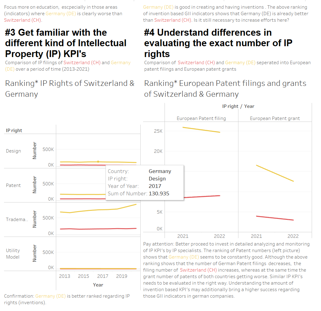
Next, I needed to compare certain indicators for Education and Intellectual Property in bar charts for the year 2022 only. Therefore, I only take the table for the year 2022, apply a filter as known from Excel and reduce the rows of the indicators to the required ones. That is also rather simple and intuzitive. Most of the transformation steps are required by the last line charts. The transformations differ only slightly between the first 8 and last 2 tables. I edit the first 8 tables with the Extended Power Query Editor. So I only perform the transformations for the first table manually and step-by-step. For the other tables it is mainly copy-and-paste from one Power Query Editor to the other.
15 tiles later...
What I finally did for a rebuild: copying and pasting the various headlines from the Tableau dashboard into separate tiles in Power BI. The process was rather smooth, and I found myself intuitively arranging and adjusting these tiles on the canvas (yes, Power BI also names it like that). In total, I created around 15 tiles to mimic the structure of the original dashboard. Luckily, I had two screens: One for the tableau template and one for the Power Bi imitation. Unlike Tableau, where containers offer a convenient way to organize elements, Power BI's approach felt somewhat different but that might be due to my little experience. I couldn't quite figure out how to optimize filters or fine-tune axis settings directly within the dashboard interface, but that can certainly be settled with little bit more time. Despite these minor hurdles, I must say, the end result was remarkably similar to the Tableau dashboard, considering the tight timeframe.
Conclusion
Have you ever wondered if it's possible to seamlessly transition a dashboard from Tableau Public to Power BI in only 90 minutes, especially without extensive experience in Power BI? Well, I would say the answer is YES..., but it always depends on the quality of your data I think. In just 90 minutes, I roughly recreated my application Tableau Public dashboard in Power BI, but there are issues that have remained unsolved, as headers, filters, formatting of axes etc. While there are differences in terminology and approach between Tableau and Power BI, the core principles remain consistent across both platforms.
Overall, the experience was both fun and of course challenging.
Comparison of both Dashboards

Application Dashboard built in Tableau (as Screenshot, Tableau Public link see above)


Application Dashboard Draft built in Power BI in 90 Minutes (Screenshots of most important details)
Interesting Sources

 Louisa Krutzfeldt