or how to analyse 'at risk' groups through data analysis. In the second internal client project, I was responsible for the following question: fire and rescue services need to demonstrate that they have carried out an analysis to identify the demographic groups/households most at risk of experiencing fires in their homes. Services must then take this information into account in their fire prevention activities. I created a helpful user story for the design of my dashboard outline:
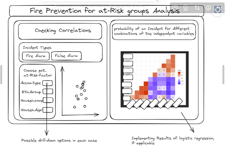
Userstory
As the fire and rescue services we want to identify correlations between people/households/groups and the level of fire risk based on demographic aspects such as gender, age, place of residence, etc. based on census data in order to optimise fire prevention measures.
My Sketch
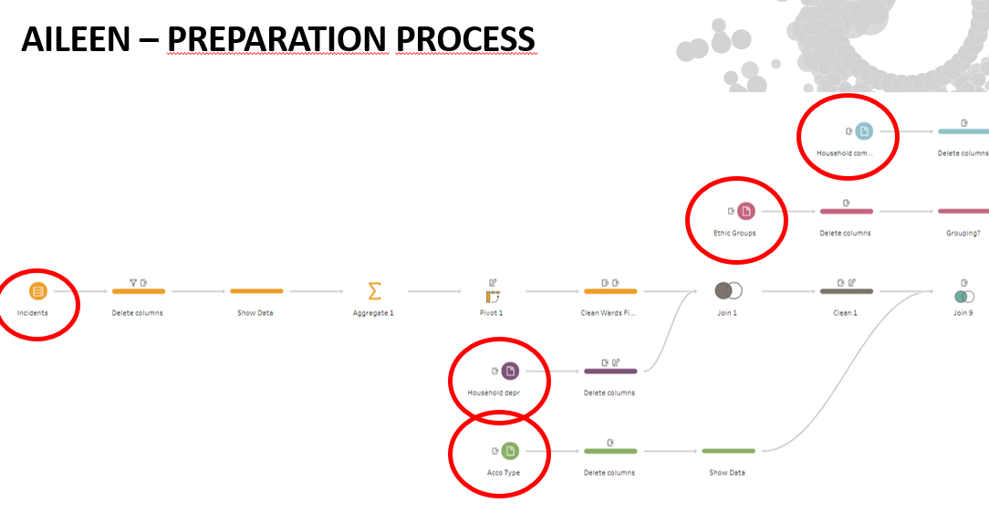
I gathered extensive data from various sources, including fire incident reports, census data, and local surveys. This data covered a wide range of sociodemographic factors such as age, income, housing type, and population density. (Datasource about: Accomodation Type, Ethnic Group, Household Composition, Household deprivation)
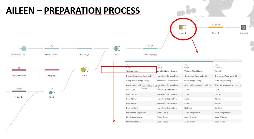
Data Preparation in Tableau Prep: I needed to clean, join and compare the different kinds of data sources (see workflow below)
Why this is important
The insights gained from this dashboard are not just academic, but also have practical implications. By identifying high-risk groups, we can: Tailor fire safety education and resources to the most at-risk populations. Ensure that fire prevention efforts are targeted where they are most needed. Provide community members with information about their own risk factors and promote proactive safety measures.
My Dashboard Link Tableau Public:
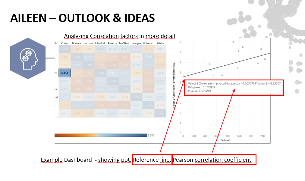
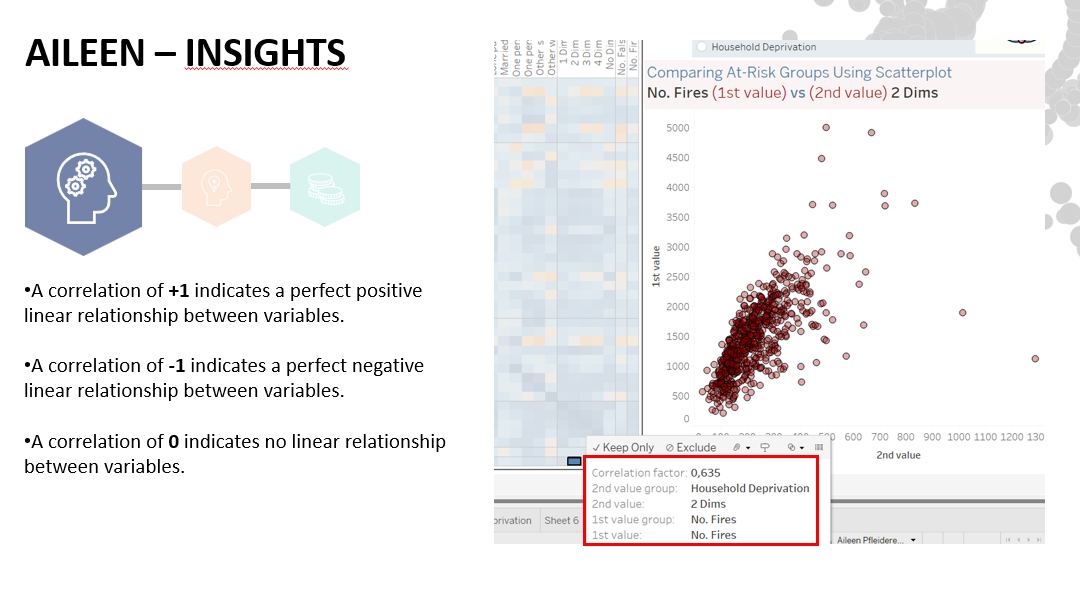
In the field of fire safety, understanding which groups are most at risk is crucial for effective prevention and resource allocation. To explore this, I used two powerful analytical tools: the correlation matrix and the scatter plot. Feel free to use the above Tableau Link as the dashboard is very exploratory. By comparing various socio-demographic factors with the number of fires, we can gain deeper insights into risk groups.
The correlation matrix is an excellent tool for identifying relationships between different variables. In my analysis, I compared the number of fires with various factors such as housing types, population density, income level and more. Using the correlation matrix, we can identify which factors are most strongly associated with fire incidents so that we can better target our prevention efforts.
In addition to the correlation matrix, I also used scatter plots to visualise the relationship between the number of fires and certain variables. This method helps to understand the distribution and possible outliers that can influence fire risk.
Personal Reflection
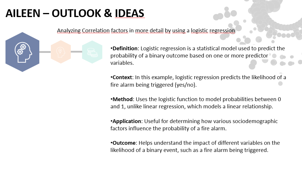
Working on this project has been incredibly rewarding. It has reinforced my belief in the power of data to drive positive change. If you're interested in seeing the dashboard in action or learning more about the project, please stay tuned for updates. Your feedback and support are invaluable as I would like to refine and expand this in future. Implementing logistic regression results in Tableau (tooltip heatmap) calculated in Alteryx or Python may have even more informative value.