


What Spotify Green Has to Do with The Matrix Theme
Today's focus was on exploring and analyzing Spotify data. I started by defining the insights I wanted to gain, such as listening habits (minutes played) and top tracks. The data was prepared directly in Tableau by uploading the JSON file.
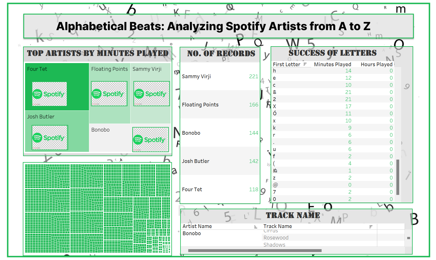
In a bid to break away from traditional data presentations, I explored Spotify data through a novel lens by analyzing the frequency and distribution of artist names based on their starting letters. This perspective not only illuminated the alphabetical landscape of Spotify’s artist catalog but also creatively connected to the iconic Matrix theme. Inspired by Spotify's green logo, reminiscent of the Matrix's digital world, I merged these two realms for a unique analysis approach.
My Idea
I aimed to enhance data storytelling by aligning artist names with Matrix-related terms. By sorting the names alphabetically and ranking them based on minutes played, I sought to add context and depth to the data. This approach made the analysis more engaging and added a thematic layer to the visualizations. It facilitated quick dashboard development while ensuring a compelling narrative.
Since we all used the same dataset from PGB, I needed to differentiate my work. I chose a simple ABC analysis (more ideas about this maybe in the future) to approach the data from a unique angle and provide a distinct perspective.
Improvements
Given the 3-hour timeframe to build this dashboard, there is significant room for refinement. While I incorporated Spotify's green, it may be too intense for the dashboard. I plan to reduce the number of tables, improve formatting by centering numbers and increasing sizes for readability, and add KPIs to show peak times for the top 5 artists. I will use containers to improve alignment, enhance Spotify buttons by removing background logos, and link the data to PGB’s dataset. The current background, which feels overwhelming, will be replaced with a black one to better match the Matrix theme. I will also introduce interactivity for artist-specific details, standardize headings, and consider adding photos of the top 5 artists on hover.
My Overall Learning Today
Delivering an MVP has really helped me, especially when time was short and things were constantly shifting. It allowed me to get a working version of my project out there that met the main goals, even though it wasn’t perfect. By focusing on something functional, I could get feedback, see what needed improvement, and make updates based on real user input. This approach will help me to make more progress and set a solid foundation for refining the project over time, all while managing the constraints of time and resources.
My Highlight
The buttons (logo) link the top 5 artists directly to their Spotify albums, providing a convenient way to listen to their music instantly. Please check also my Tableau Public Portfolio: https://public.tableau.com/app/profile/aileen.pfleiderer/vizzes