


Crafting My CV Dashboard: My Guide of Personal and Professional Visualization
Today, I embarked on an exciting challenge: transforming my CV into an exploratory Tableau dashboard. The goal was to add flair to my Tableau Public profile by visualizing my career in a way that's both informative and engaging. Inspired by various examples and guides, such as this useful Tableau blog on creating interactive resumes, I set out to build a comprehensive and stylish representation of my professional journey.
Planning and Design
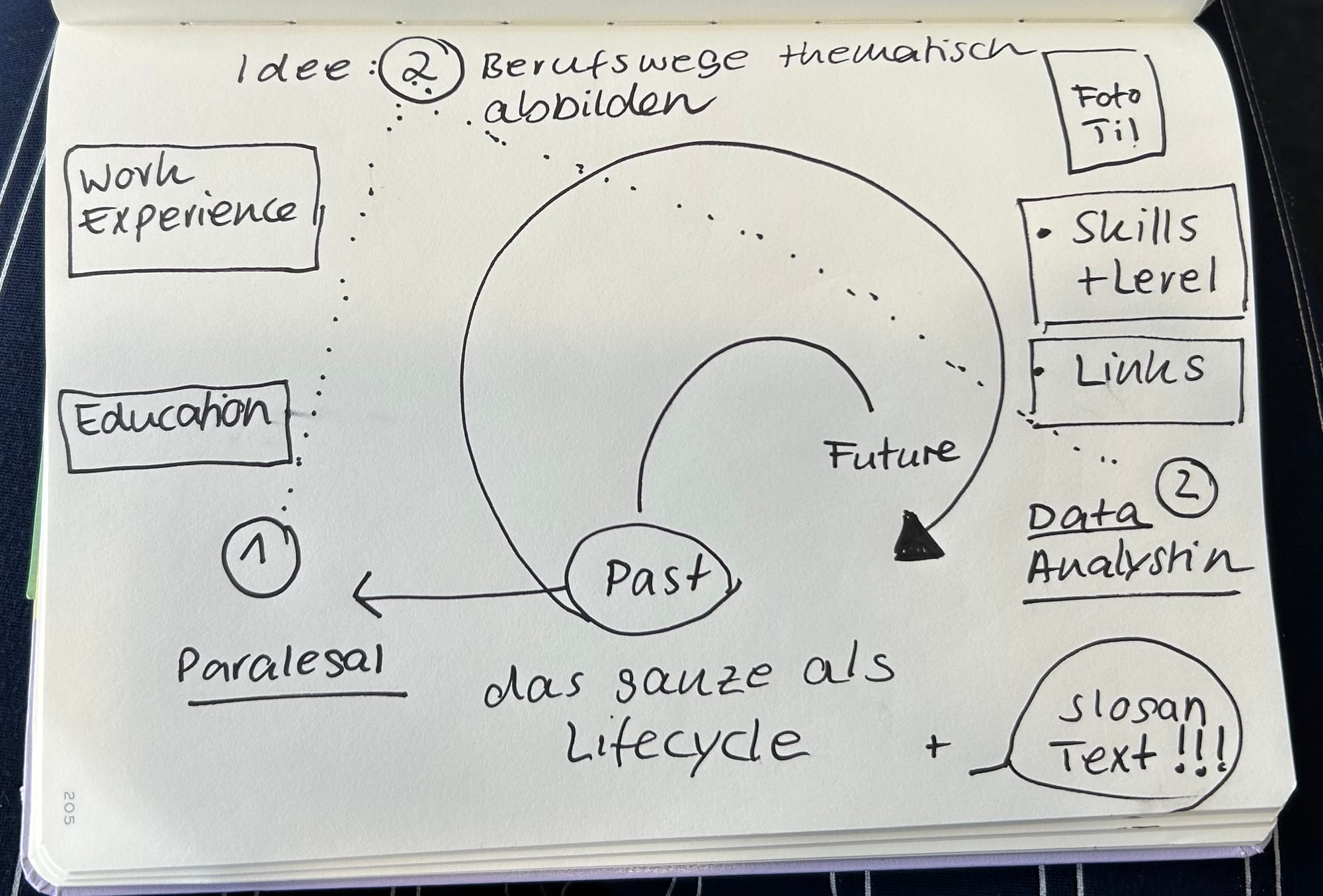
With time constraints in mind (5 hours), I knew I had to strike a balance between depth and simplicity. My initial steps involved sketching out the layout and deciding on the key elements to include. I focused on four main sections: Personal Data, Work Experience, Education, and Skills.
My Sketch
Data Preparation
Creating the dataset was crucial. I organized my data into separate sheets for each section, ensuring it was well-structured for Tableau. Each sheet included relevant details such as Work Experience, Education, Skills & Levels as well as clickable Buttons (Links to LinkedIn etc.).
Relationships

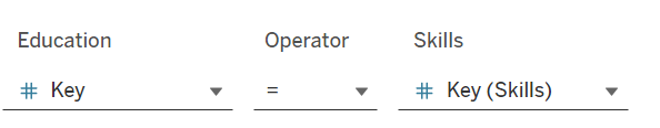
Additionally, it was crucial to establish relationships between the Excel sheets in Tableau by assigning appropriate keys. I opted for a straightforward approach by linking the sheets using a numerical key, ensuring that the data could be effectively connected and visualized.
Building the Dashboard
Using Tableau, I started constructing the dashboard with the following visualizations:
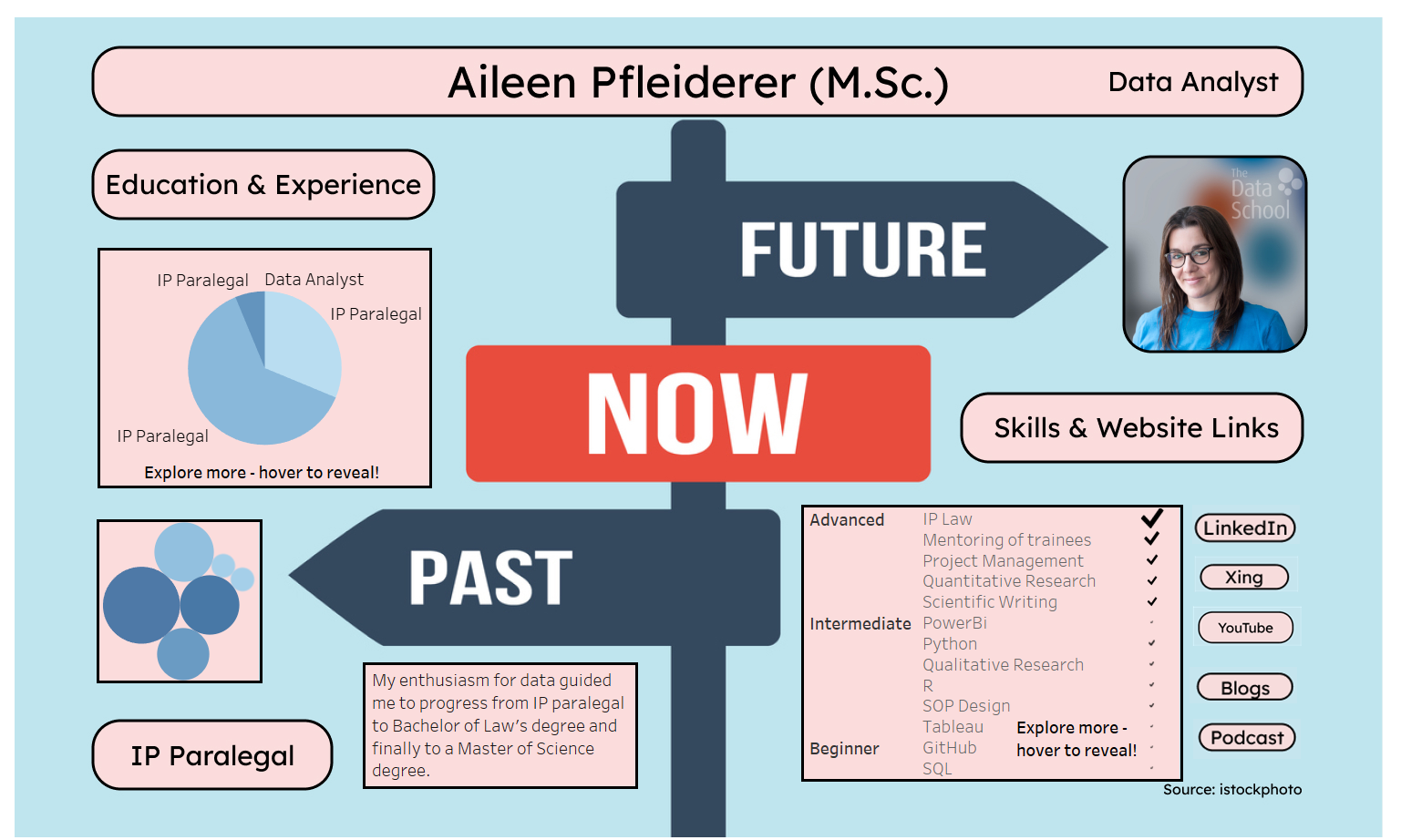
- Work Experience: A pie chart representing various job roles and the duration (size).
- Education: A bubble chart highlighting my academic milestones, showcasing degrees, certifications and duration (size).
- Skills: A table visualizing my skill set, categorizing them by proficiency level (beginner, intermediate, advance) and years of experience (size).
Refining the Design
I chose the colors for the dashboard based on my portrait photo, ensuring that the design aligns with the included TIL branding and adds a cohesive, professional touch.
Final Touches
By the end of the day, I had a nearly polished MVP of my CV dashboard. I published it on Tableau Public, where it’s now live for anyone to explore. The dashboard not only highlights my professional background but also demonstrates how hover details, provided additional insights without overwhelming the viewer.
Here’s what I plan to improve next:
- Add Icons to Buttons: I will incorporate icons (e.g., LinkedIn) on the buttons to reduce text and make the dashboard more visually appealing.
- Include a Flow Explanation Slide: I intend to add a slide that explains the read flow (e.g., life cycle as per the sketch) to provide users with a clear understanding of the data narrative.
- Refine Borders: I will consider using subtler borders to enhance the overall aesthetics and ensure that the design is not overly distracting.
- Harmonize Chart Colors: I plan to standardize the colors in the bubble chart and pie chart, ensuring that related categories (e.g., legal roles in both work and education) use consistent hues.
- Adapt Skills Visualization: I will rethink the skills section to ensure that it adapts over time. Specifically, I’ll adjust the sizing so that it reflects updates in skills and experience over the next six months.
Looking Forward
While this is just the first version, I plan to revisit and refine the dashboard in the future. The ability to showcase my career in such a visually compelling way is an output worth investing more time into. For now, I’m excited to share this snapshot of my professional journey and look forward to any feedback and suggestions.