


Colourful Grey: Why Custom Templates and Personal Branding Are the True Colors of Tableau and Power BI
Today, we tackled a template challenge aimed at creating valuable resources for future projects. My task was to design two templates - one for Tableau and one for Power BI - using the provided datasets (one HR dataset and one Superstore dataset). These templates were designed with simplicity in mind, featuring appropriate charts and a sleek, grey color scheme for quick turnarounds. I focused on incorporating a well-designed title and subtitle with specified fonts and sizes, clear spacing guidelines, and relevant example charts and KPIs. Once completed, I published these templates on Tableau Public and my Power BI workspace.
Why I have chosen grey
Main Reason: Time!
Reduced Design Time:
Starting with a grey template simplifies the design process, saving time and facilitating quick adaptations. While I love color coding, I often find myself spending too much time choosing colors, which can detract from overall efficiency.
- Neutral Base for Customization: Grey serves as a neutral base that doesn’t overshadow data or visualizations. This allows users to easily adapt the template to fit their specific branding or color scheme without clashing with the default design.
- Focus on Content: By using grey, the emphasis shifts from design elements to the data itself. This can help ensure that the focus remains on the insights provided by the data rather than being distracted by colors or complex design elements.
- Consistency Across Projects: Grey templates provide a consistent foundation that can be used across various projects and industries. This is especially useful when you need to create multiple dashboards or reports that need to maintain a uniform look and feel.
- Professional Aesthetic: Grey is often associated with professionalism and minimalism. Using it in templates can convey a polished and sophisticated look, which is particularly important in corporate or client-facing reports.
Overall, designing in grey can streamline the customization process, keep the focus on the data, and ensure a consistent and professional appearance across different dashboards and reports.
Please see below my two templates of today:
PowerBi - Superstore Template
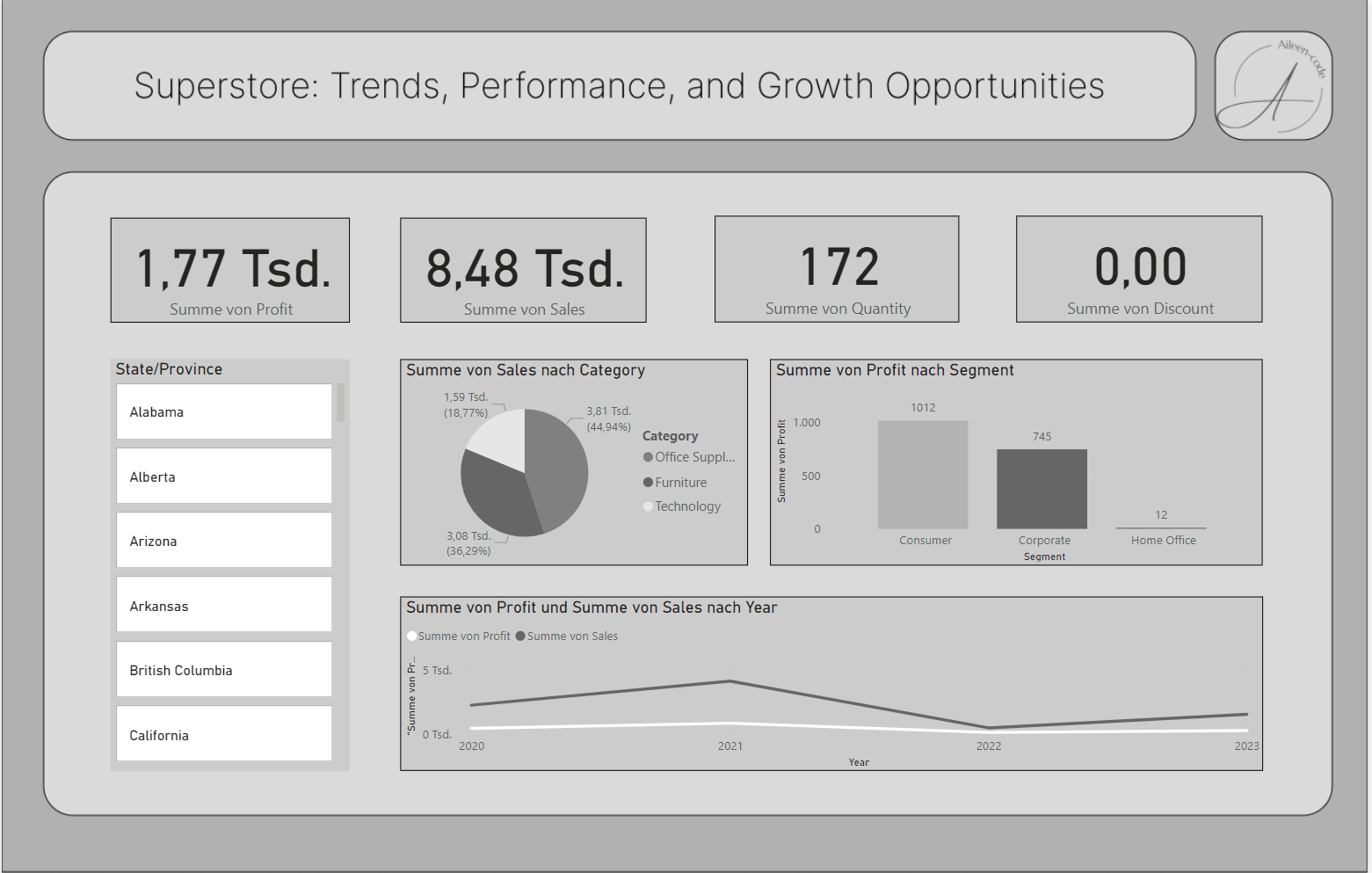
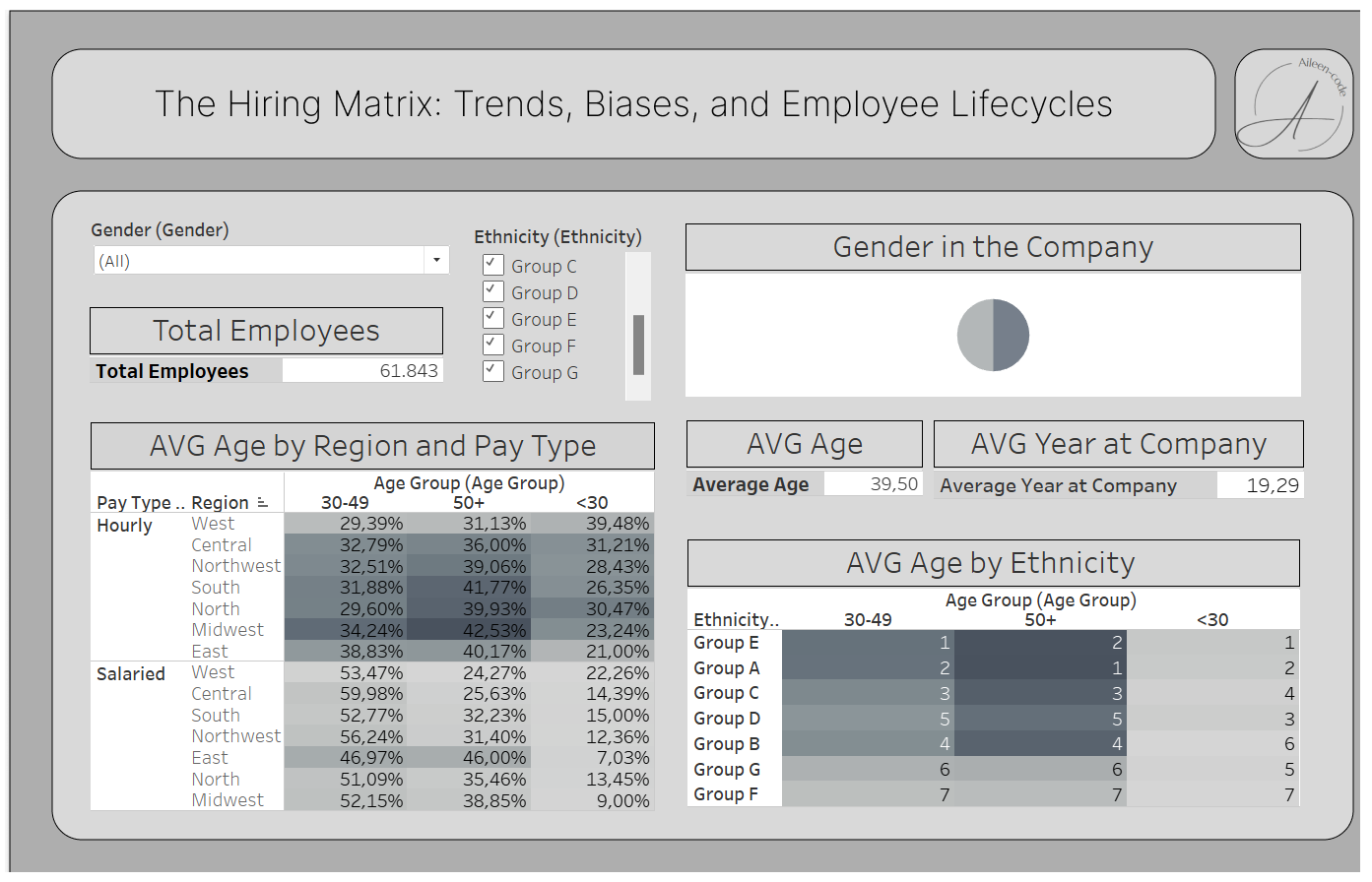
Tableau - HR Template
What I learned
That said, designing in grey can also present its own challenges. Grey, while neutral and versatile, can sometimes become monotonous if not used thoughtfully. It’s important to utilize various shades of grey, as well as white, to create depth and contrast. Properly incorporating these different tones can enhance the visual appeal of the template and ensure that it remains engaging and easy to read, without sacrificing the simplicity and focus that grey design aims to achieve.
I’ll definitely refine the grey template further, ensuring better gradation to avoid overwhelming users with a single monotonous tone.