Dashboard Duel: Will Smith vs. Kevin James – A Figma Design Journey
Today is Day 1 of our intensive Dashboard Week, and we kicked things off with the Tableau "data + movies" Challenge (#dataplusmovies). This challenge invited us to create an engaging dashboard centered around various aspects of the film industry. We had the option to focus on a specific actor's career, a director’s body of work, a film studio, a particular genre, or to compare actors, directors, studios, or genres. It was an exciting opportunity to explore and visualize different facets of the movie world through data.
My Idea
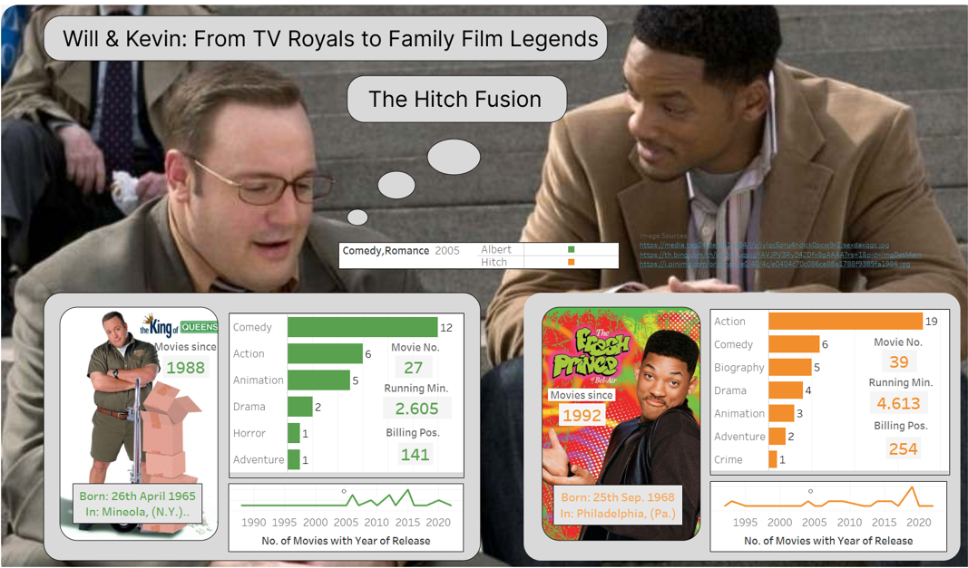
When I first heard about the "data + movies" challenge, my immediate thought was to explore my favorite comedy, Hitch - The Date Doctor. I quickly found the movie in the dataset and began researching ideas for a compelling user story. As I delved into it, I discovered that both of the movie’s main actors, Will Smith and Kevin James, began their careers in sitcoms - Will Smith with The Fresh Prince of Bel-Air and Kevin James with King of Queens. This connection sparked the idea for my dashboard, inspired by the titles "Prince" and "King."
I decided to title my dashboard: "Will & Kevin: From TV Royals to Family Film Legends." Initially, I checked if they had appeared in other films together, but it turned out Hitch was their only collaboration to date. This led me to subtitle the dashboard: "Hitch Fusion," highlighting their unique partnership.
As I sketched out my ideas, I realized that a traditional business dashboard design with a plain background wouldn’t do justice to the dynamic nature of these actors. Instead, I opted for a more vibrant and eye-catching design, incorporating images from scenes featuring both actors. This approach not only enhances the visual appeal but also makes the data more engaging.
Here’s why I chose to use Figma as tool for the first time
The first step was brainstorming. I aimed to create a dashboard that was both informative and visually appealing, presenting the data clearly while providing an engaging comparison. Today, I embraced the art of storytelling by designing backgrounds in Figma for my Tableau dashboards. Just as Kevin James and Will Smith use their unique styles to bring stories to life, I used captivating photos to set the perfect scene for my data. By integrating these visually striking backgrounds with Tableau’s floating objects, I seamlessly blended the data into the design. This approach not only enhances the visual appeal of the dashboards but also effectively communicates the story behind the numbers, significantly improving the overall impact and clarity of the data presentation.
Conclusion
Working on this dashboard was an exciting challenge and a fantastic opportunity to start and further develop my skills in Figma.
My final Dashboard
My final dashboard (see picture below) provides a comprehensive overview of the two actors' film careers, offering a clear and comparative view of their film releases over recent years. Please also check out my Tableau publication for more details.