


or "Rolling the Dice with Power BI: My Dive into an Expert Challenge"
This blog is about the “Working out Wednesday" challenge “Rubiks cube” on Power BI („2024 Week 23 | Power BI: SVG Venn Diagram) and how I tried to break down a big task into small steps. Firstly, I will summarise my experience and findings and then - for anyone who wants to understand what I have tried and learned - my detailed work steps at the very end of this blog.
Introduction
Two weeks ago, I have dared to approach my first Work Out Wednesday (WoW) challenge for Power BI. The choice was purely aesthetic - a captivating image of a colourful dice caught my eye. I didn't realize that this simple decision was about to lead me into a tough challenge.
Choosing the Challenge
The challenge was thrilling right from the start. I was initially drawn in by the visual, not realizing that the small labels like 'Beginner' or 'Expert' were not just casual suggestions ;-) Accidentally, I jumped into an expert-level challenge, what I just realized as I progressed deeper into the task.
The Journey Through the Challenge
As I tackled the challenge, it became more and more difficult. With limited experience for Power BI, I quickly realized I was in over my head. However, determination took over. Instead of looking for easy outs or spoilers, I decided to push through, using every resource at my disposal to piece together a solution. I really wanted to solve the task step by step.
The Learning Curve
This challenge turned out to be a great learning opportunity. It was not just about mastering the technical aspects of Power BI but also about learning to persevere through complex tasks. There were moments of frustration, certainly, when all attempts have failed again. Yet, these moments were crucial in teaching me the value of resilience and patience in learning.
A Surprising Outcome
Despite the hurdles, the outcome was unexpectedly positive. I managed to solve the challenge—not with ease, but with a significant effort that left me with a deeper understanding of Power BI’s capabilities and my own problem-solving skills. It was a reminder that sometimes, stepping out of our comfort zone is the best way to learn maybe.
But now let's get to the task itself
What do Rubik's cubes and data analysis have in common? More than I thought. The first time I held one of these cubes in my hand, I found it quite pleasant to turn the sides back and forth. I didn't seriously try to solve the cube, I mean to make the sides of the cube the same color. I liked the tactile impression and that was it. That brings back memories, doesn't it? In any case, I still like to leave it to the geniuses to intuitively crack the magic cubes of this world.
But what do simple people like me do with the big tasks? Quite simply, we break them down until the pieces are small enough to get to grips with them. And that's an analytical approach, as I understand it. Even though as a teenager I was often on the verge of actually dismantling Rubik's cube, you shouldn't destroy the physical manifestation of the problem. This is sometimes more difficult than it first appears. Anyway, here is already my take-away from this WoW: Whenever you can’t intuitively solve a problem, don't break the-cube, just try to break down the task!
Conclusion
Looking back, diving into an expert challenge as a novice might not have been intentional, but it was undoubtedly beneficial. It’s a journey I’d recommend to others, not just for the technical skills gained but for the confidence that comes with overcoming unexpected challenges. For those embarking on their Work Out Wednesday adventures, don't shy away from the expert challenges; they might just be the push you need.
Call to Action
Feel inspired to take on a challenge today? Choose a Work Out Wednesday problem and see where your curiosity leads you. Remember, every expert was once a beginner.
Summary of my work steps for all those who are curious
In short, the task is to determine the number of participants in the three competition categories "222", "333" and "444" (the number of stones along each edge) using an "event_Id" column in a "ranking.csv" table. In addition, the number of participants who took part in two or even all three events should be determined. The results should be filtered according to the countries of the participants.
So I get started and first look for a visual "Venn diagram", because the title of the WOW suggests this. There is one, but you have to load it from an external source. This works without any problems. But then I can't do anything at all. I simply drag the "event_Id" field onto the visual and hope. Nothing happens. After a few more futile attempts, I take a look at the example of the Venn diagram visual. The visual requires a special format that requires some reshaping steps and additional columns. The categories (222, 333, 444) have to be assigned to the participants using purely binary/binomial columns. To me, this seems time-consuming and confusing. I can create the binomial columns quite quickly, but it is difficult for the intersections. So the first Brut-Force attempt was a failure and I'm turning to smaller analytical steps.
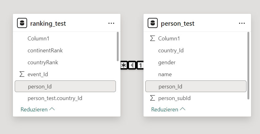
I first want to determine the seven values/measures individually. This means all participants in the competitions 222, 333, 444 and the participants in two of the competitions and finally the participants in all three types of competitions. In order to be able to apply the country filter later, I join the two tables "ranking" and "person" via the Person_Id, as shown in the screenshot:
Person_Id, as shown in the screenshot:
Then I create the following measure for 222:
Personen_222 = CALCULATE(COUNT(ranking_test[event_Id]), ranking_test[event_Id]=222)
It simply counts the rows in which the event_ID has the value 222. The intersections are a little more complicated because I have to use the person_ID to determine whether a person has taken part in several competitions. Here is my calculation for the intersection of all competitions:
Personen_222_333_444 =
CALCULATE(
DISTINCTCOUNT(ranking_test[person_Id]),
FILTER(
VALUES(ranking_test[person_Id]),
CALCULATE(COUNTROWS(ranking_test), ranking_test[event_Id] = 222) > 0 &&
CALCULATE(COUNTROWS(ranking_test), ranking_test[event_Id] = 444) > 0 &&
CALCULATE(COUNTROWS(ranking_test), ranking_test[event_Id] = 333) > 0
)
)
Test-Tables
I am testing with two very small handmade Excel-Tables to see, if the instructions basically work. That seems to be the case. This point, which seems to have so little importance, is very important to me. I am of the opinion that everyone who programs something should definitely look for a way to check their code. With a table like "ranking", which has about half a million lines, it is impossible to recognize whether, for example, the formation of the intersections is correct. For this reason, I have created small test files that have the same columns but considerably fewer rows. You have to think a bit to cover all the different cases, but such test files are absolutely essential.
From Pie Chart to HTML
In between, I take another look at the website (2024 Week 23 | Power BI: SVG Venn Diagram - Workout Wednesday (workout-wednesday.com)) and the instruction to make circles and write the numbers in them.
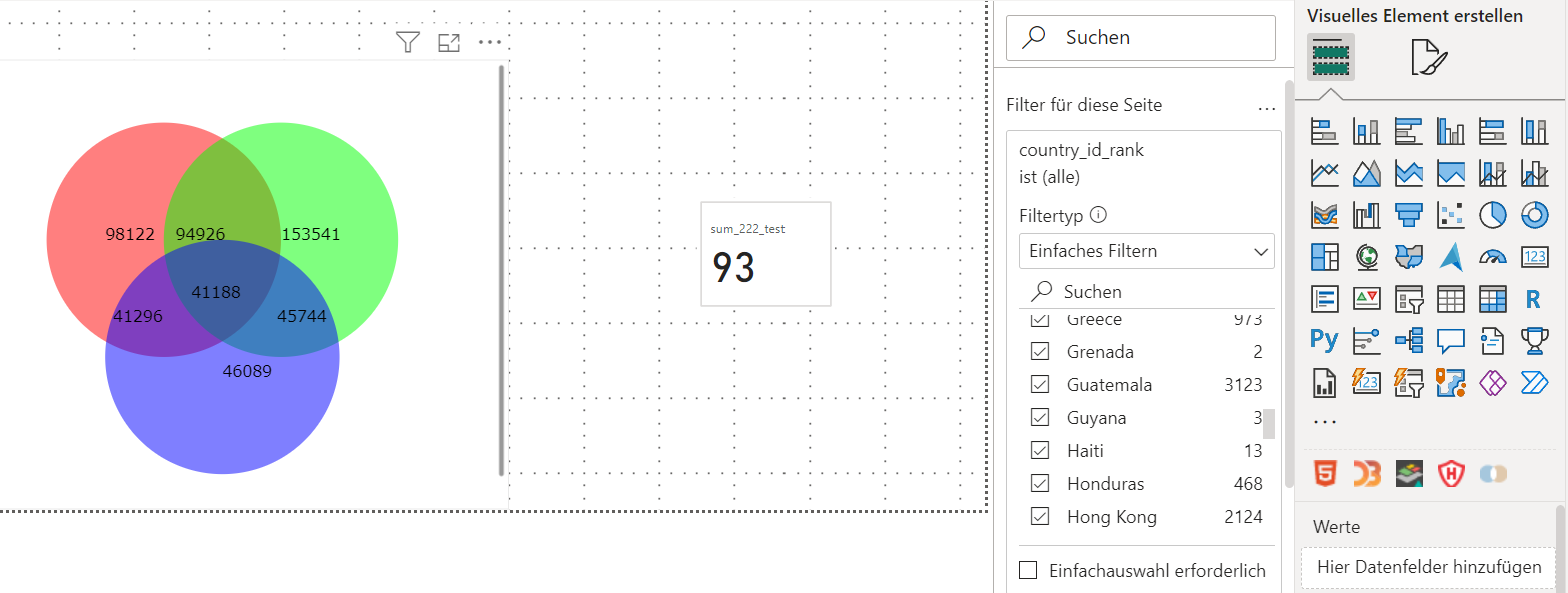
For whatever reason, I first choose the unpopular pie chart and only make one segment (I wanted to add the intersection values later). The problem that actually becomes insurmountable for me is making a pie chart transparent. If the circle area is not transparent, it will be difficult to make the intersection area visually visible. Unfortunately, the pie chart offers no way to adjust the transparency of the fill color. Supposedly there is a way to convert the pie chart to a bar chart, assign a custom transparent color to the bar in the bar chart, and then simply convert it back. Unfortunately, this does not work for me. The pie chart remains untouched by the conversion and remains opaque blue.
In order to create three transparent circles with intersections, I follow a hint to a visual that can convert HTML code (HTML content), which I get. The great charm of the HTML visual is that you can create practically any graphical representation. You create an HTML code (like for a website) and load the code into the visual in the form of a table. You can also insert parameters, i.e. the measures at the top as text. Unfortunately, I was not able to filter by country. The filters were of course available, but the visual did not update or adapt. I came across hints that this could be solved with Java, but that was a bit too much for me.
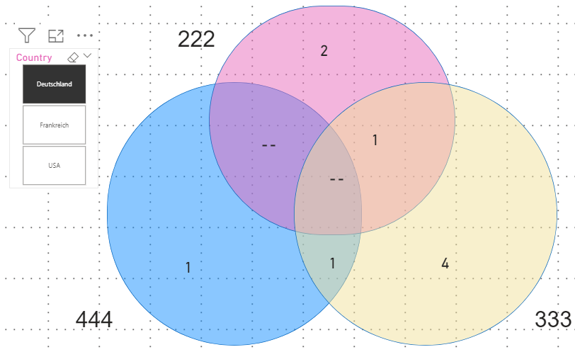
Instead of continuing to work on the HTML version and dealing with suitable Java code, I wanted a simple approach. So I decided to simply insert the three circles as graphic elements. This is very quick and can look exactly like the HTML version (apart from slightly different colors). I try it first with my self-made tables and only three countries (US, FR, DE) for which I create a slicer with buttons:
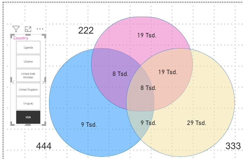
Now I just need to use the long tables I have saved and simply rename them and update the tables in Power Query and the report in Power BI. The long tables are read in without any problems and replace my short tables. So it seems to work. Here is the version with the long tables:
Finally, I take a look at the sample solution. The sample solution uses the HTML variant, apparently with a fallback to Java (but I haven't looked at it that closely yet). What really impressed me was the code for determining the numerical values. The functions "SWITCH" and "SUMX" are used here. Respect! It will take me a while before I can solve this so elegantly.
Conclusion - My main experience
The sample solution is currently still completely out of my reach. I have tried to find a simple and easy-to-implement solution that solves at least part of the problem.
What I can't do with my circles is change their position and size via user input. That was the last requirement of this Working-Out-Wednesday. With the HTML/Java sample solution this will probably work, even if the sample solution does not seem to have integrated this yet.
My advice
Whenever you can’t intuitively solve a problem, don't break the-cube, just try to break down the task!