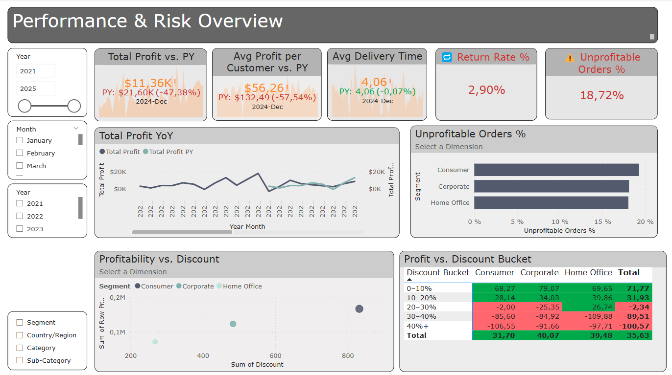
The challenge of Day 2 of Dashboard Week was to create a Business KPI Dashboard using the well-known Superstore dataset in Power BI.
But simply visualizing standard KPIs like Sales, Profit, Quantity, and Discount wasn’t the focus. While Profit was a required metric, we were encouraged to move beyond the usual suspects and explore more meaningful business indicators.
Two key thoughts shaped my approach to selecting KPIs, charts, and the overall dashboard story.
- Profit has something others don’t: it can be negative – and that can deliver deeper insights.
- If we call it a “business dashboard”, then its true purpose should be to deliver value – not just celebrate success, but also highlight weaknesses, gaps, and red flags.
So instead of focusing on “what’s going well?”, I began asking:
“Where are we losing money? Which customers or processes aren’t working as expected?”
The dashboard focuses on analyzing weaknesses across different dimension to uncover critical inefficiencies and risks. I was defining questions, which should be answered:
• Which customer segments are unprofitable?
• Do high discounts lead to negative profit?
• Is our profitability improving year-over-year?
• Where do we see returns impacting the business?
I included five key KPIs:
- Total Profit, as the main performance indicator – with a year-over-year comparison and color indicators to show if we’re improving or not.
- Average Profit per Customer, to understand how profitable we really are on a per-customer basis. This is especially useful when combined with segmentation.
- Average Delivery Time, which helps identify possible operational delays. Longer delivery times can easily affect customer satisfaction and lead to returns.
- Unprofitable Orders (%), a dedicated red flag metric that highlights how many of our orders are actually making a loss.
- Return Rate (%), another red flag, showing where customers are sending products back – which could be a signal for product or service issues.
Besides the KPIs, there are of course some charts, which deliver valuable information and support interactive analysis.
- A line chart to show profit over time and compare it with the previous year.
- A dynamic bar chart that switches between Segment, Region, Category and Sub-Category using field parameters. This lets users explore which areas are most unprofitable.
- A matrix, where I also combined the Dimension Switch Paramerter with discount buckets to reveal patterns: which discounts lead to negative profit?
- A scatterplot to visualize the relationship between discount and profit – often, the bigger the discount, the lower (or negative) the profit.
- And of course, I added slicers to filter by year and month.

This time, I intentionally spent much more time on the planning phase than I have usually done. That allowed me to come up with strong ideas – and more importantly, to actually implement them. I made a clear decision to stick to my concept and finish everything I had planned, even when facing errors and challenges. That’s why I’m proud of my Version 1 – it delivers the core value I aimed for.
Of course, this also meant I had less time left for fine-tuning the layout and formatting. But besides a few minor design issues, there’s not much I could change.
As a feedback: the matrix at the bottom provided such valuable insights that it deserves a more central position. Placing it higher would also reduce horizontal scrolling and improve the user experience overall.
