


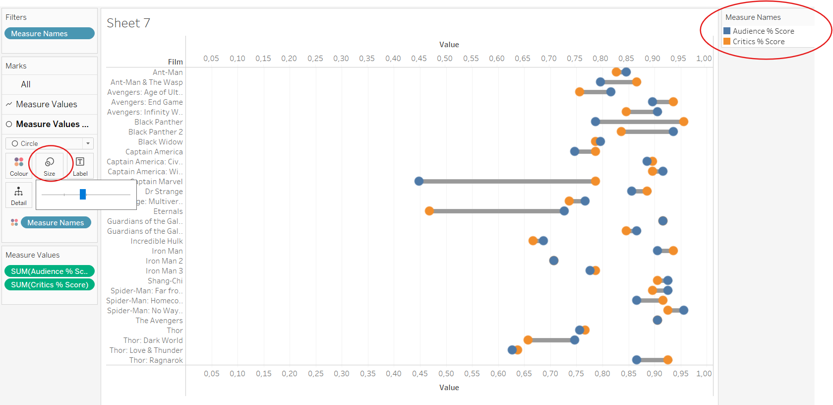
A dumbbell chart in Tableau is a diagram that displays two data points for each category, making it particularly useful for visualizing differences between two variables.
One weeks Makeovermondays topic related to the successes of the Marvel Movies. In order to evaluate the success of a film, various metrics come into play, as these are crucial for answering the question. I wanted to focus on the Audience % Score and the Critics % Score. These scores can be very different, which makes it interesting to compare them.
The primary requirement for creating this visualization is having two measures that you want to compare and one dimension (a categorical field, such as Film in this content).
Step 1: Initial Setup
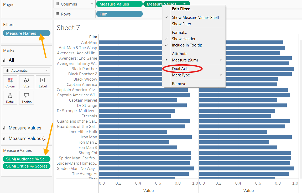
After opening Tableau and loading your data file, drag the dimension (in this example, "Film") to Rows. For a dumbbell chart, I recommend to drag Measure Values twice into Columns. The Measure Names will then appear in the Filter Card. Now you can select your desired two measures (orange arrows). Right-click on the second measure to combine the two separate views using Dual Axis.
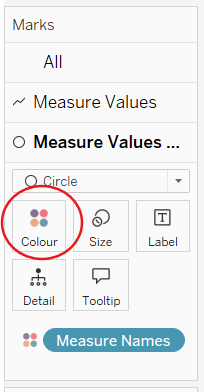
Step 2: Adjusting Marks Cards
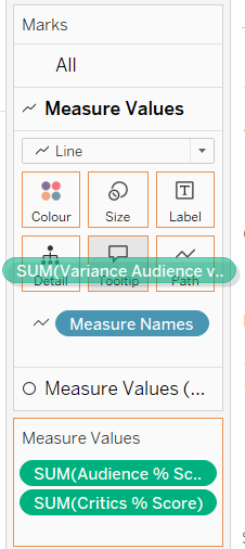
You'll need to adjust the three Marks Cards: one All card and two with the chosen measures, in this example Measure Value. In one Measure Value Card, select Circle from the dropdown and drag the Measure to Colour, and in the other card, select Line and drag to Path, respectively.
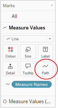
It doesn't critically matter which one is selected as Circle or Line, however I recommend choosing Line in the first Measure Value Card, as this will place the two circles in front of the horizontal line.
Step 3: Customization
Size and colors can be adjusted as desired. To assign colors to both measures in the legend, it's important to have dragged the Measure Values rather than directly selected the desired measure from the Data Pane.
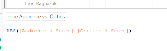
Step 4: Adding Variance
Since I intended to visualize the variance between the Audience and Critics Score (the gray horizontal line), it would be helpful to see this variance as a percentage. First, create a Calculated Field to compute the variance between the two scores. Then drag this field into the Tooltip.
Step 5: Formatting
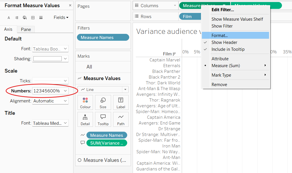
To display the values on the axes as percentages, change the number format of the measures. Since the axes are synchronized, you can make this change for just one measure.
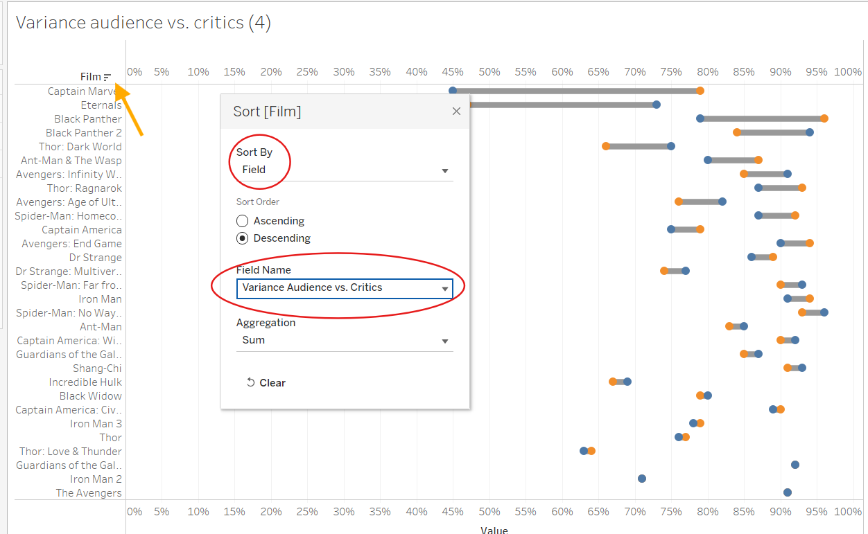
Last Step: Sorting
Finally, I changed the sorting based on the variance size. This places the film with the most contrasting ratings at the top, sorting in descending order. For this: right-click on the dimension (Film), select Sort, and sort by the recently calculated field Variance Audience vs Score.
There are certainly other ways to create a Dumbbell chart. For now, this is an easy method for me, especially when I already have two metrics in percentage.