


The "What did it take to get into DSDE9" blog post from my cohort is now online, and I had mixed emotions reading through it.
On one hand, I felt very proud of how I managed to create an interactive and well-designed dashboard despite my limited background knowledge of Tableau. Of course, we've now gained valuable knowledge during our training sessions, and I can recognize a lot of what we have learned in our dashboards.
On the other hand, I had to think about that stressful but exciting time when I worked ambitiously on the assignments. I always tried to give my best so that I could reflect my drive during the job interviews.
You can find Peter Gamble-Bereford's blog "What did it take to get into DSDE9" here: https://www.thedataschool.co.uk/peter-gamble-beresford/dsde9/
In my Final Dashboard, where all successful applicants received the same dataset, I implemented a feature that I had seen in an application dashboard from previous cohorts. I found this feature fantastic and very useful.
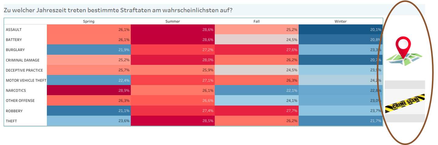
The dataset for the Final Dashboard was about criminal cases in Chicago which contained many data fields that allow various analyses. Of course, after receiving feedback, I knew that a dashboard shouldn't be overcrowded, as this is not its purpose.
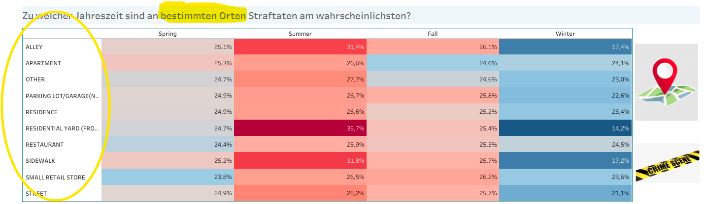
However, for my analysis and my guiding question, it was helpful to analyse both the Primary Type of cases and the various Locations. Throughout my dashboard, I aimed to answer the question "Which places and times should be avoided in Chicago?"
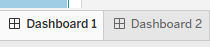
Let's talk about the implemented feature. It's a button that allows the dashboard viewer to switch between two dashboards. The design of both are identical, but in the second dashboard, I focused on the other dimension.
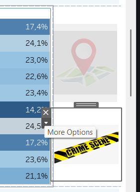
In the image below, you can see that the treemap relates to the type of crimes, the Primary Type. The upper button will lead to the dashboard with analyses about Location. The lower button, on the other hand, is for returning to the current view with analyses about Primary Type.
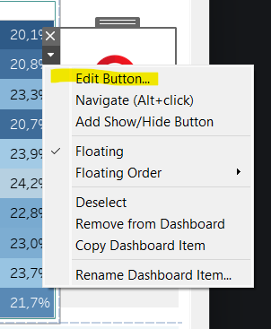
The circled buttons are Navigation objects in Tableau.
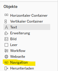
You can drag it to the desired place and then edit it. To do this, click on the small arrow and select Edit Button.
A window appears where you can select the target dashboard (Navigate to) and design the button with either text or an image. Under Tooltip, I wrote a short text that shows up when hovering over the button. This way, the viewer knows they can explore more.
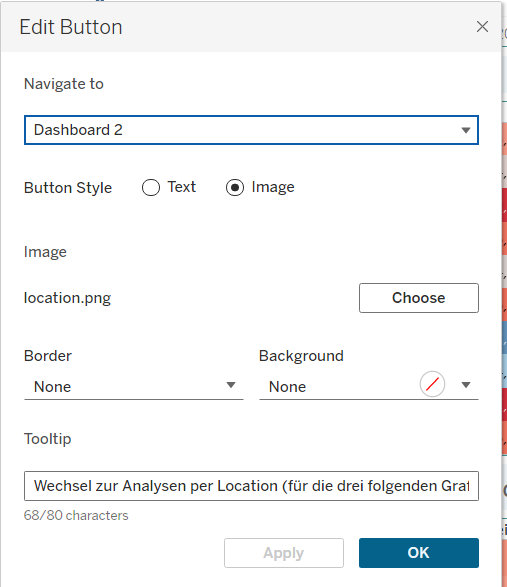
In the second dashboard, the second button has to be edited: Dashboard 1 is selected, an image is uploaded, and the tooltip is adjusted.
Just these few steps are needed to integrate this helpful and interactive feature into your dashboard. I want to thank my colleague for the inspiration from his own dashboard.
If you'd like to explore it by yourself, you can check out my dashboard through the link below.
https://public.tableau.com/app/profile/ahsen.polat/viz/CrimesinChicagoDSFinal-Interview/Dashboard1