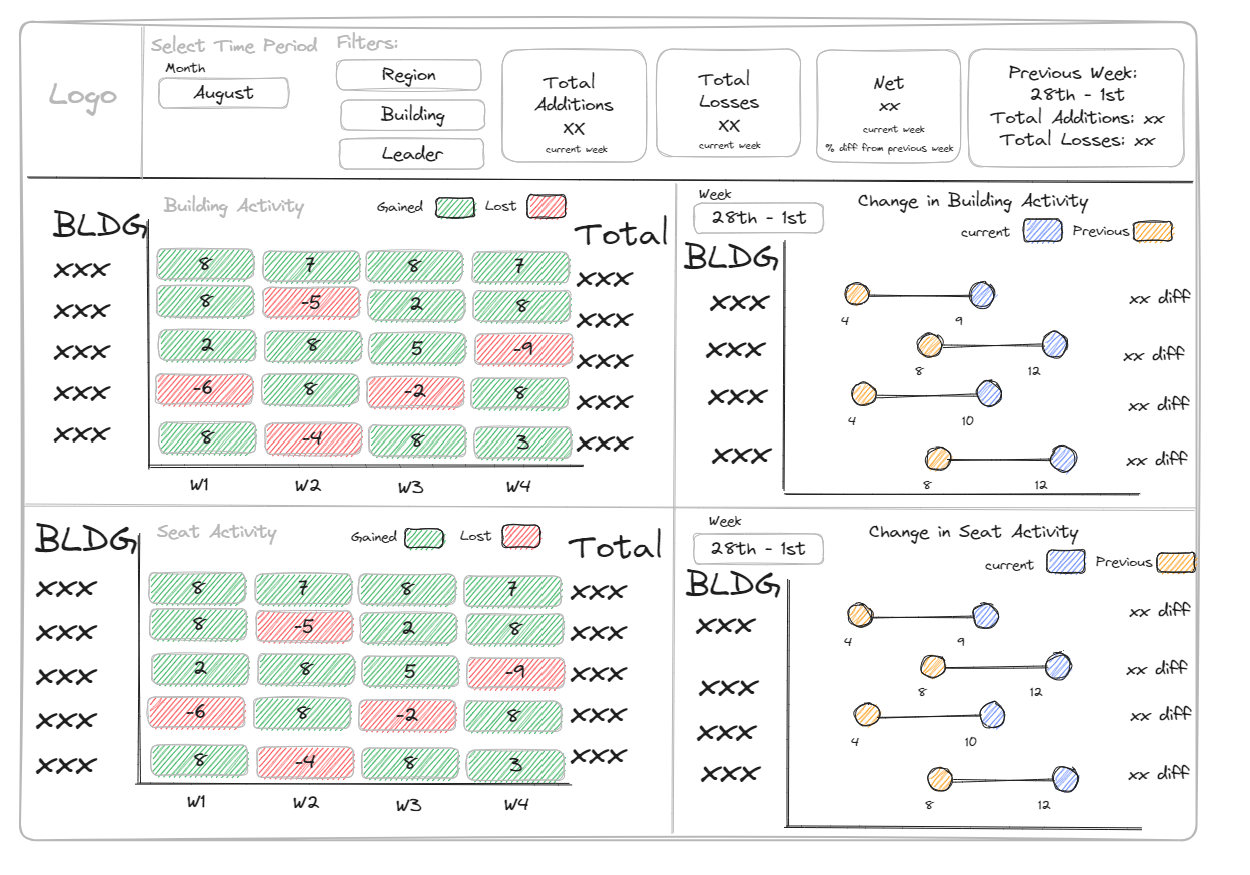
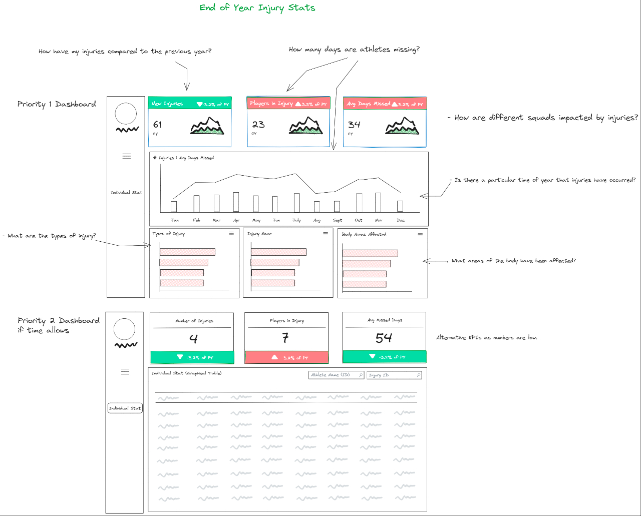
A dashboard wireframe is a visual representation or sketch of how you intend to design a dashboard, usually made at an early stage of the dashboard creating process.
Creating wire frames is the act of putting pen to paper, bringing your ever fleeting thoughts into a cohesive material existence.
It presents itself to you as a roadmap with a destination and directions.
Allowing you to be efficient when you start the process of creating your dashboards.
Wireframes can be as detailed or as general as you like, usually I try to find a middle ground which gives me an overall idea as to the contents and the layout of the dashboard.
Within a wireframe you will find elements that represent the final product, so thought is give to elements such as:
Layout: The wireframe contains visual components, such as charts, tables, filters, and text, across a dashboard canvas.
Data Sources: It can if necessary identify the origins of your data, the lifelines that will breathe life into your dashboard. This can help clarify how data flows into various visualizations.
Visualization Types: Brainstorming which chart types to use in which scenario is crucial and wireframes are a good place to think about what chart types will be the most effective in communicating the data. Thinking this through early on and putting it on the wireframe gives you a target to aim for when actually creating your dashboard.
Filters and Interactivity: This is where you plan the interactivity, where parameters, filters and actions become part of the narrative, thinking through how to enable users to explore and dissect data dynamically. This ties into the other facets of the wireframe, allowing you to see all the puzzle pieces and how they link help to further facilitate a clean final product.
Titles and Annotations: Wireframes also host placeholders for titles, subtitles, annotations, and tooltips giving context to the viewer.
Color Palette and Styling: While not as intricate as a final design, wireframes can also suggest the color scheme and stylistic elements that will uphold your dashboard's consistency, whether that is with your organization's branding guidelines or your personal chosen color palette.
User Experience: Last but not least, the user experience. Wireframes allow you to sketch the user's journey through the dashboard, wireframes consider how users will navigate through the dashboard, accessing various perspectives and levels of detail. This is a strong suit of wireframes, where you are shaping and molding together different elements of a dashboard with the users experience in mind, having this as a constant while designing also allows you to have a more polished final product.
Below you'll find a couple examples of a dashboard wireframes that takes into consideration the elements mentioned above:


Creating dashboard wireframes can be done using an array of tools, whether it's the simplicity of pen and paper or the tools such as excalidraw. Once your wireframe is finalized, you can confidently embark on crafting the actual Tableau dashboard, building worksheets, configuring dashboards, and infusing interactivity using parameters and filters. Note that there might be changes that you make along the way when creating your actual dashboards, this is absolutely normal. The wireframes should give you a general direction to head towards, along the way you there might be realizations that cause you rethink the final outcome, and this is completely normal.
Ultimately, wireframes play a pivotal role in streamlining the dashboard development process, ensuring that the final product aligns seamlessly with your data presentation goals and user expectations.
