


Before the world of data visualization, it was commonplace for information to be stored and analyzed solely through tables and columns; lacking the visual representations that provide a more intuitive understanding of data.
Analyzing data solely through tables and columns could be cumbersome and less intuitive, especially when dealing with large datasets or complex relationships within the data. The emergence of data visualization introduced graphical representations that made it easier to understand patterns, trends, and relationships in the data, enabling more efficient and insightful analysis.
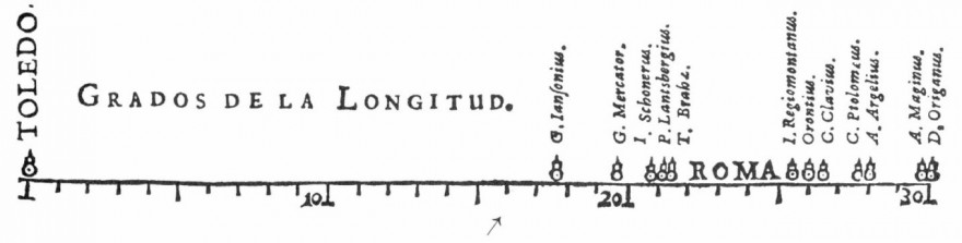
Prior to the 17th century visualizations can arguably be said to be in the form of maps. Flemish astronomer and cartographer Michael Florent Van Langren in 1644, is credited with creating one of the earliest visual depictions of statistical data.

In the 18th century, notable figures like Joseph Priestly, an English scientist and theologian, and William Playfair made significant contributions to the field of data visualization. Priestly published influential data visualizations, including the Chart of Biography (1765), which depicted the life and death of prominent historical figures, and the New Chart of History (1769), illustrating the rise and fall of empires.
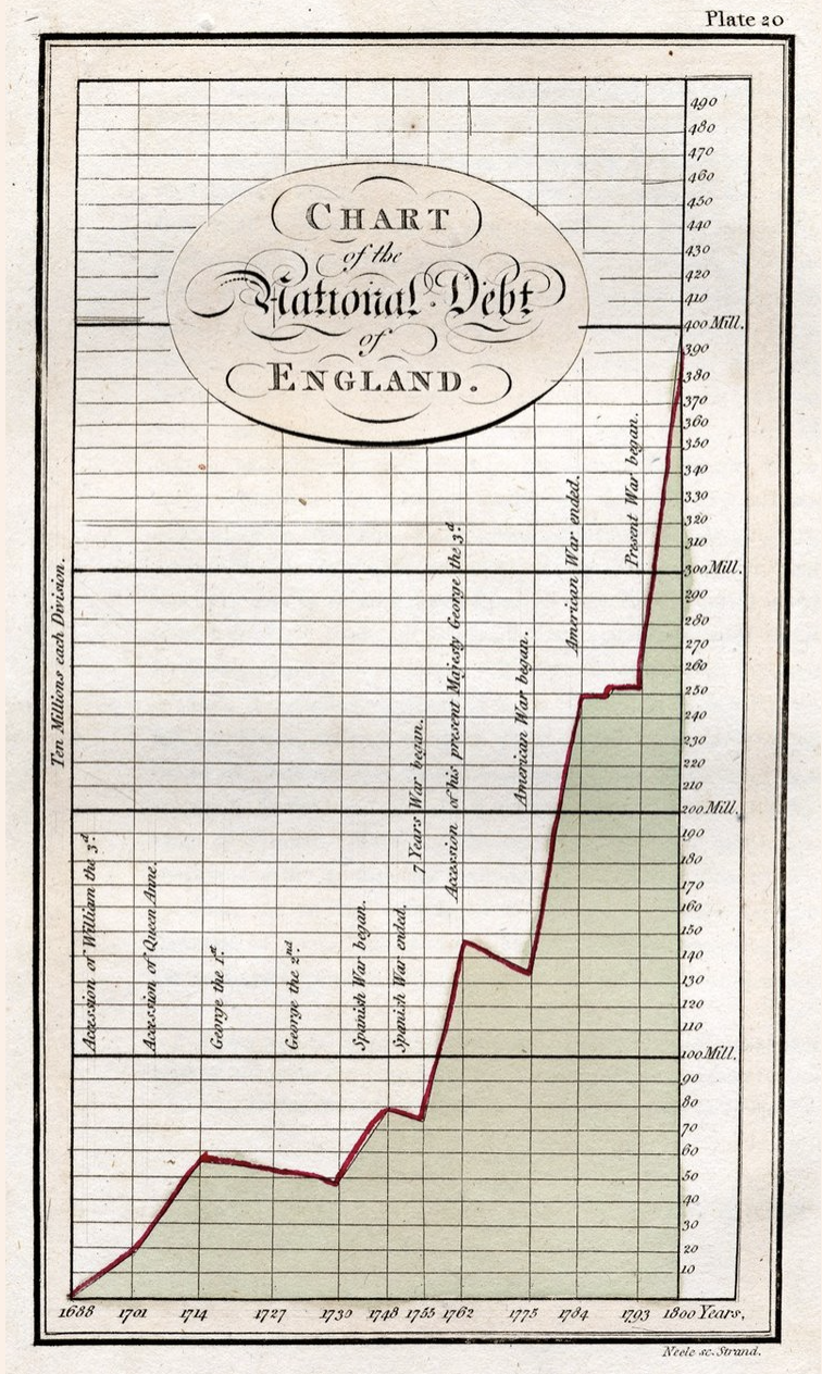
Similarly, William Playfair, also prominent during this era, is widely recognized as the innovator behind several enduring graph types that continue to be widely used today. These include line, bar, circle, and pie charts. The 18th century also witnessed the invention of various other statistical chart types, such as histograms, time series plots, contour plots, and scatterplots. Collectively, these developments marked a significant leap forward in the visualization of data during that period.
Furthermore, in his book "The Statistical Breviary" published in 1801, William Playfair introduced the concept of the pie chart. Within the book, among other circular charts, Playfair included a pie chart displaying Turkish land holdings. Notably, Playfair went a step further by hand-coloring the segments of the pie, which became the initial inspiration for the practice of color-coding data.
Included below is an image of the entire page and a close-up of the pie chart itself.

William Playfair understood the value of data visualization, as it allowed for easy and rapid comparison of a larger number of variables. However, despite his contributions, Playfair's charts did not gain widespread recognition during his lifetime.
He passed away in 1823 in a state of poverty and relative obscurity.
Nevertheless, over the next century, as the availability of data increased, bar, line, and pie charts gradually became more common and widely adopted.
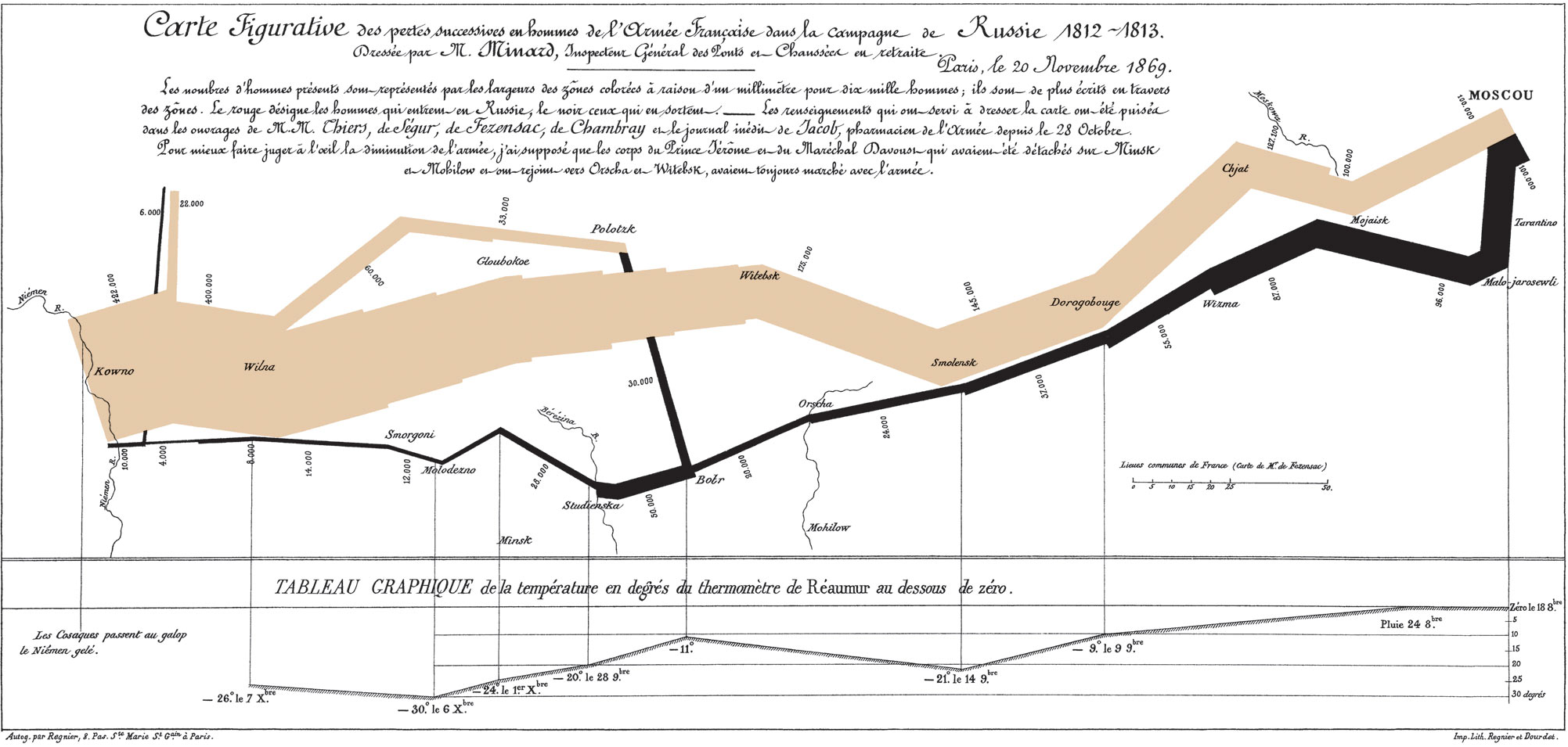
Another Pioneering individual in the history of data visualization was Charles Minard, a famous French civil engineer and statistician. He started by making detailed charts and diagrams to represent complex engineering data. However, his most well-known achievement was the creation of the Minard map in 1869. This map showed Napoleon's failed Russian campaign in 1812, illustrating troop sizes, movements, and the devastating effects of battles, weather, and disease. Minard's map completely changed how people presented data, showing how visuals can tell powerful stories and convey lots of information in a single image.
Another notable figure in the history of data visualization is John Snow, an English physician born to a coal yard worker. In the mid-19th century, Snow used data visualization to uncover the source of a cholera outbreak in London. By mapping the locations of cholera cases on a street map, he identified a cluster of cases around a water pump on Broad Street. This insight challenged the prevailing belief that cholera spread through the air and instead supported the theory of waterborne transmission. Snow's pioneering work in using visual representations of data played a crucial role in advancing public health, and started a whole new field known as epidemiology. His approach highlighted the power of data visualization in uncovering patterns and informing evidence-based decision-making.

In the 19th century, one notable figure in the field of data visualization was Florence Nightingale. Although primarily known as a nurse and statistician, Nightingale played a significant role in advancing the use of data visualization for healthcare and public health. During the Crimean War in the mid-19th century, Nightingale collected and analyzed data on mortality rates among soldiers. She effectively visualized her findings using innovative techniques, such as the polar area diagram or "Nightingale Rose," to highlight the impact of preventable deaths.
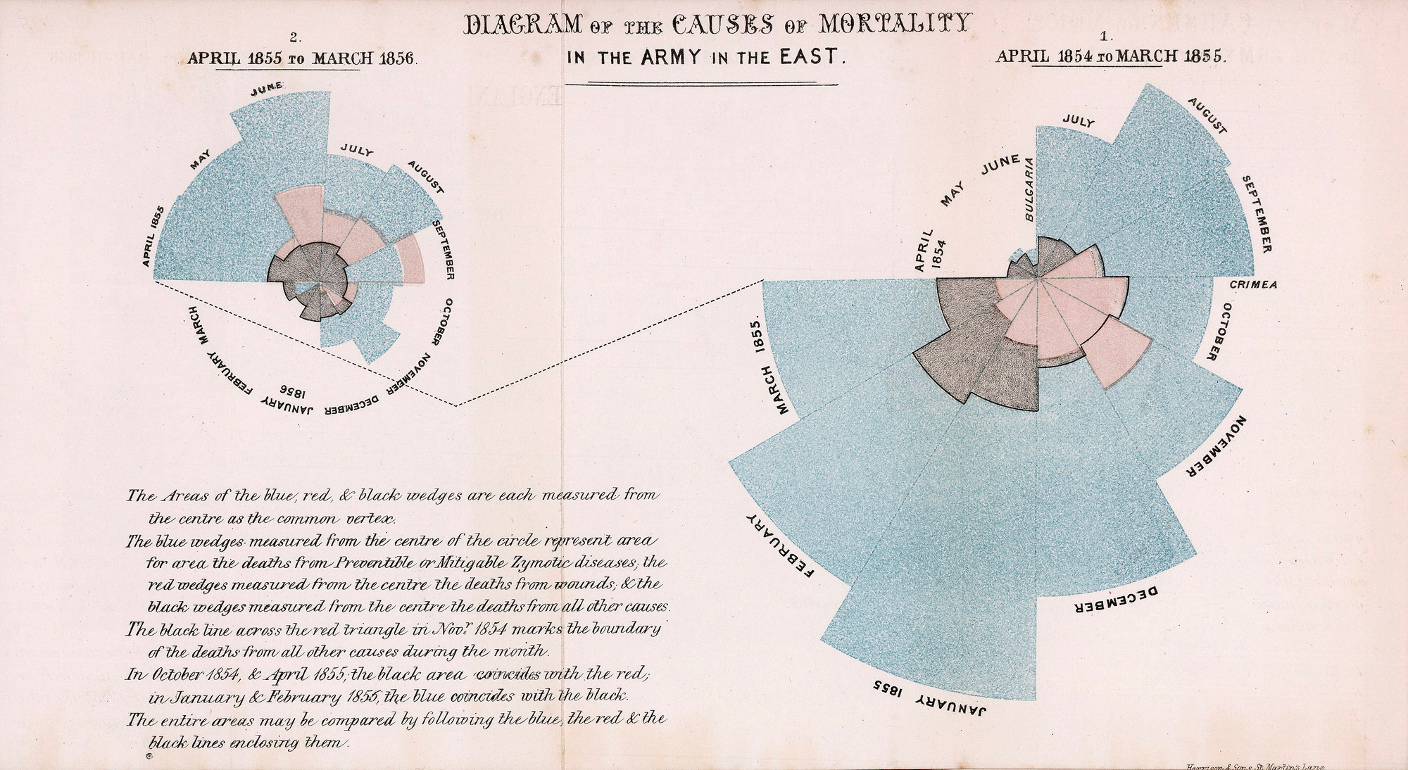
Although Florence Nightingale is often credited with the invention of the polar area diagram, it is important to note that the credit should actually go to André-Michel Guerry. Guerry, a French statistician, introduced the concept of the polar area diagram in the mid-19th century. He used this visualization technique to represent geographic data and illustrate statistical relationships. Nightingale later adopted and popularized the polar area diagram in her work on healthcare statistics during the Crimean War. While Nightingale played a significant role in promoting and utilizing this graphical method, Guerry's pioneering contributions deserve recognition as well.
The world of data visualization has come a long way from the days of relying solely on tables and columns for data analysis. The emergence of data visualization brought about graphical representations that made it easier to understand complex information.
In the 17th century, Dutch astronomer and cartographer Michael Florent Van Langren created one of the earliest visual depictions of statistical data in the form of maps.
In the 18th century, pioneers like Joseph Priestly and William Playfair made significant contributions to data visualization. Priestly's Chart of Biography and New Chart of History provided visual representations of historical data, while Playfair introduced graph types such as line, bar, circle, and pie charts. These innovations opened the door for visualizing various statistical relationships.
William Playfair's book, "The Statistical Breviary," published in 1801, introduced the concept of the pie chart. In the book, Playfair showcased a pie chart displaying Turkish land holdings and pioneered the practice of hand-coloring chart elements. Although Playfair's charts didn't gain widespread recognition during his time, they laid the groundwork for the adoption of bar, line, and pie charts in the following century.
Charles Minard, a renowned French civil engineer and statistician, made significant contributions to data visualization in the 19th century. His detailed charts and diagrams visualized engineering data, but his most famous achievement was the Minard map of Napoleon's Russian campaign. This map revolutionized data presentation by illustrating troop sizes, movements, and the devastating effects of battles, weather, and disease.
John Snow, an English physician, utilized data visualization in the mid-19th century to investigate a cholera outbreak in London. By mapping cholera cases on a street map, Snow identified a cluster around a water pump on Broad Street, challenging prevailing beliefs and advancing the understanding of disease transmission.
Florence Nightingale, known for her nursing and statistical work, played a significant role in data visualization for healthcare. During the Crimean War, she collected and visualized data on mortality rates, using innovative techniques such as the polar area diagram, or "Nightingale Rose," to highlight preventable deaths.
The "golden age" of data visualization can be attributed to the period from the late 18th century to the early 20th century when pioneers like Playfair, Minard, and Nightingale made their contributions. However, data visualization continues to evolve and thrive in the present era with advancements in technology and the growing importance of data-driven decision-making in all fields and industries.
The real-life impact of data visualization in the past is undeniable. The pioneers in the field paved the way for us to build upon their groundbreaking work. Their contributions have empowered us to present data in more meaningful and accessible ways, leading to improved decision-making and understanding across various fields.