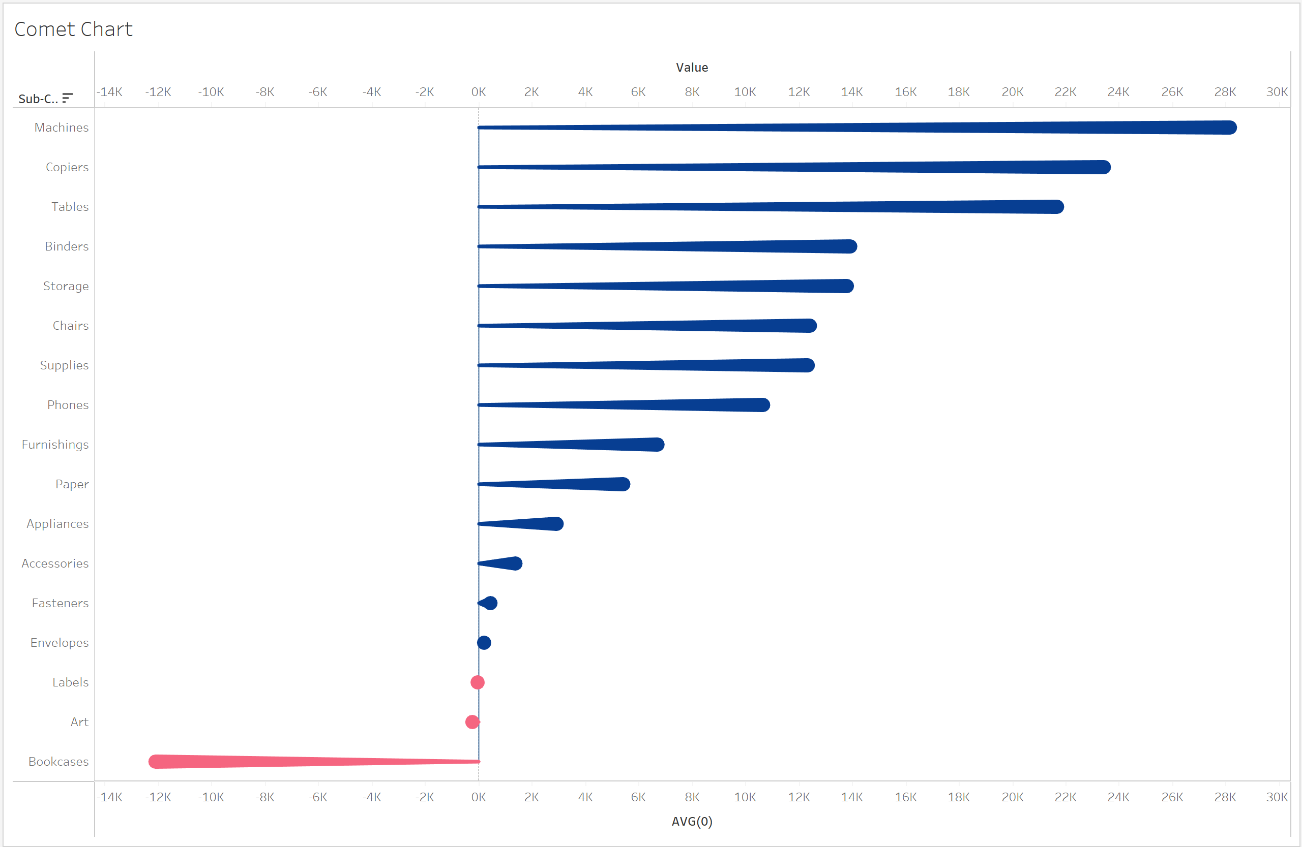
What is a comet chart?
A comet chart, also known as baseball bat chart, is a type of visualization that can be used to show change or difference.
Although it is similar to a barbell chart, a comet chart can be read more intuitively because of its shape.
There are a two ways to build a comet chart, having varied axis/start points or fixing the axis at zero.
In this blog we will be creating a comet chart with a fixed axis.
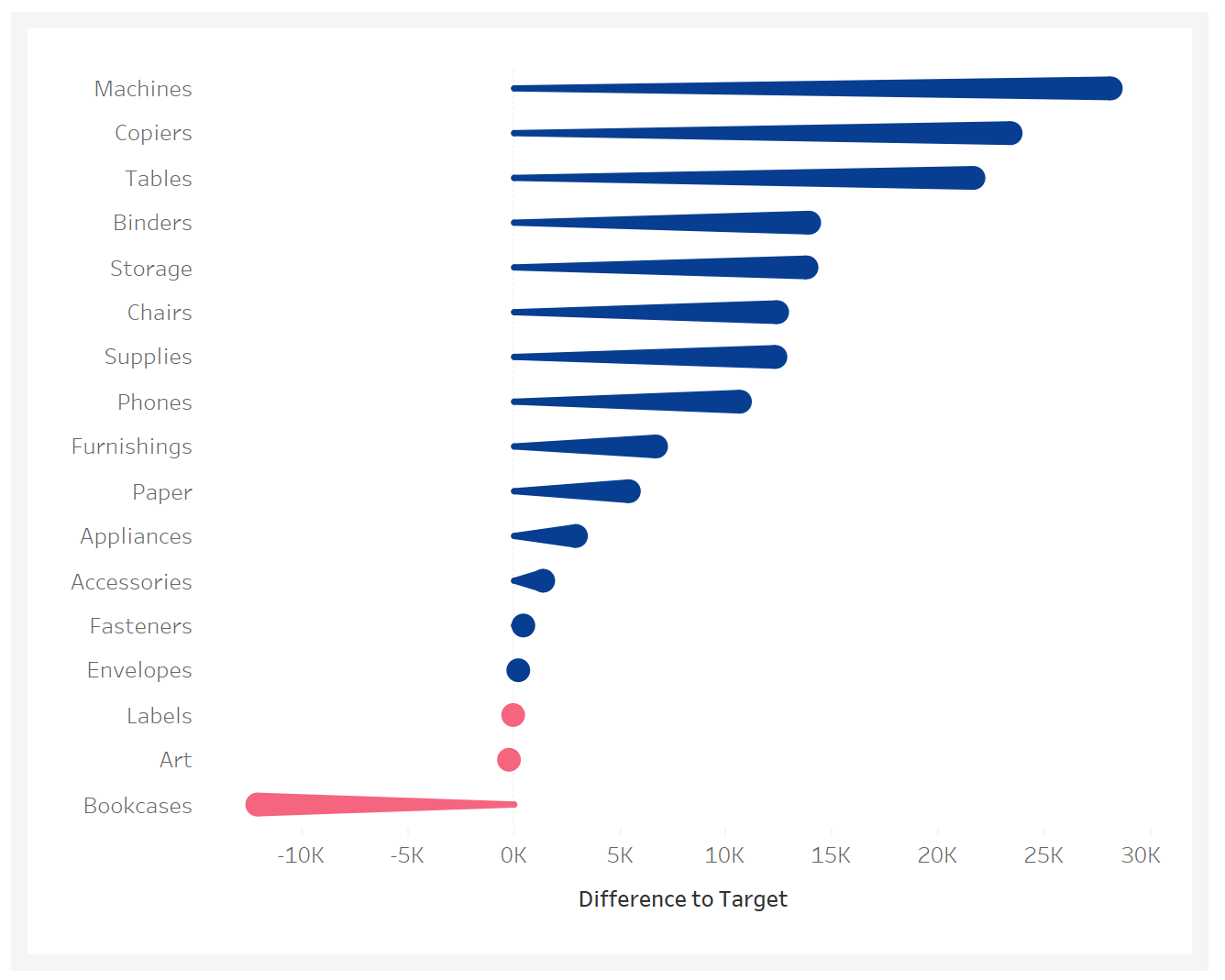
This can be used when trying to compare difference in sales between two time periods for example.
We will be using the superstore dataset to achieve this final result.
Step 1:
First we will create a calculated field that finds the difference in sales between 2021 and 2022.
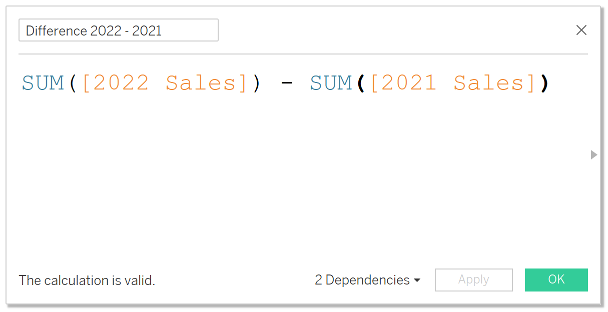
This will be the one of the 2 calculations you will need to create the comet chart.
Step 2:
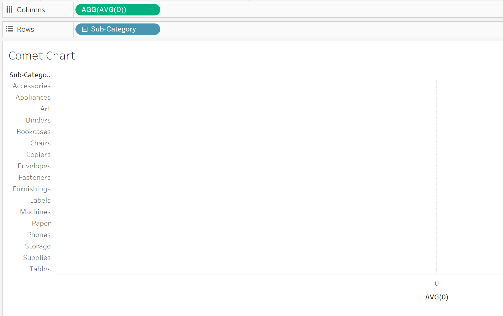
Next we want to create an avg(0) pill in the columns section. Adding this to the columns section will return a column of values that will all be 0 to which we can then fix our comet chart to.

Step 3:
While we are here lets bring in our sub-category to Rows.
Step 4:
Next we want to drag the calculated field we created to the axis.
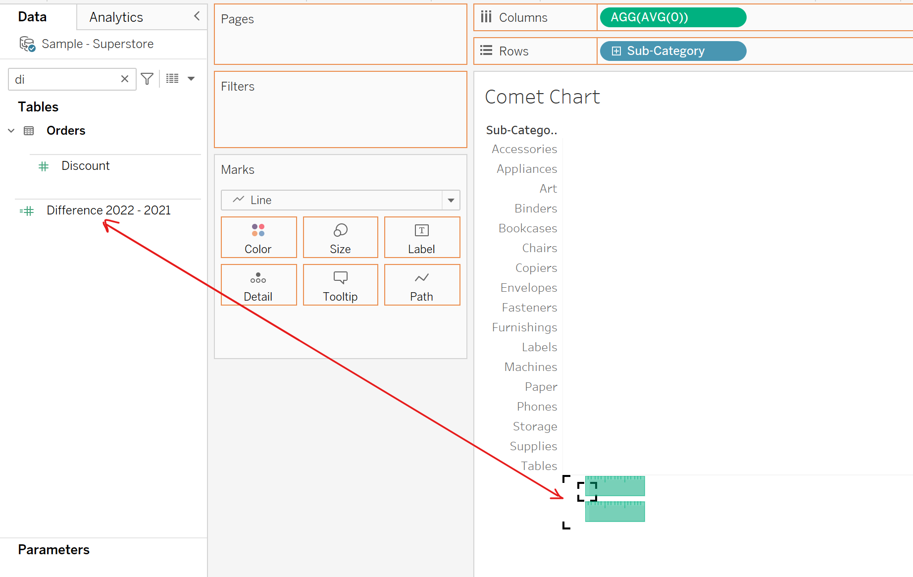
Step 5:
Hold CTRL and drag our avg(0) field to the columns section.
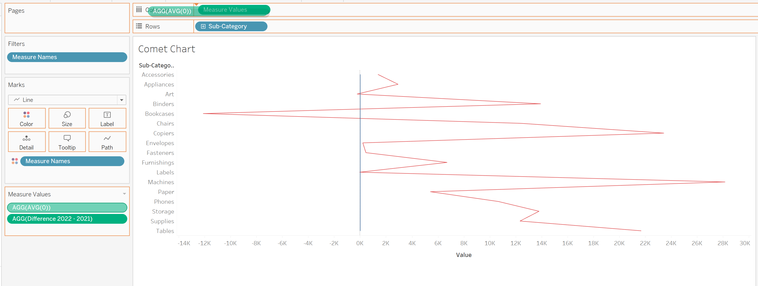
Step 6:
Next want to create a dual axis by right clicking on the pill and selecting "Dual Axis" we also want to synchronize the axis by right clicking the axis and selecting synchronize axis like so.
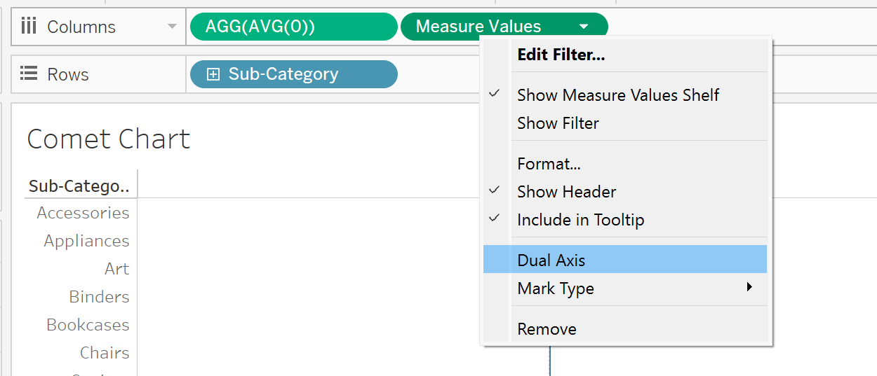
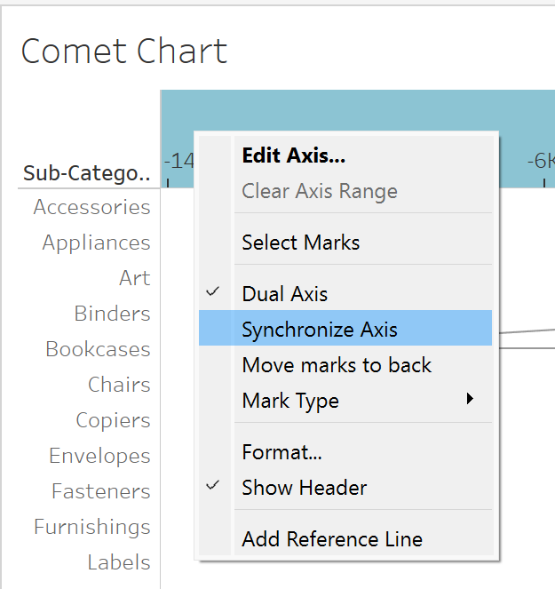
Step 7:
Next we want to configure our marks card to be selected to line, and the measure names to path and size.
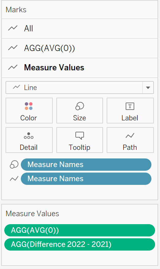
Step 8:
We will now create a calculated field to color based on whether sales were greater in 2022 or not and then add it to color on the marks tab like so.
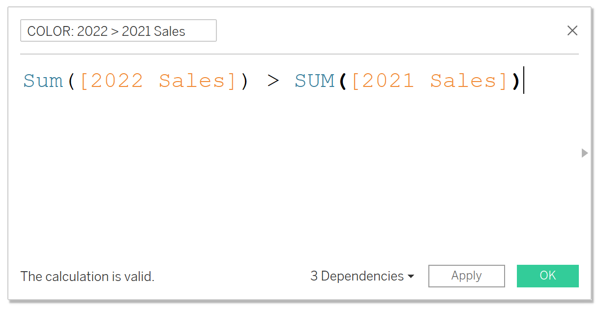
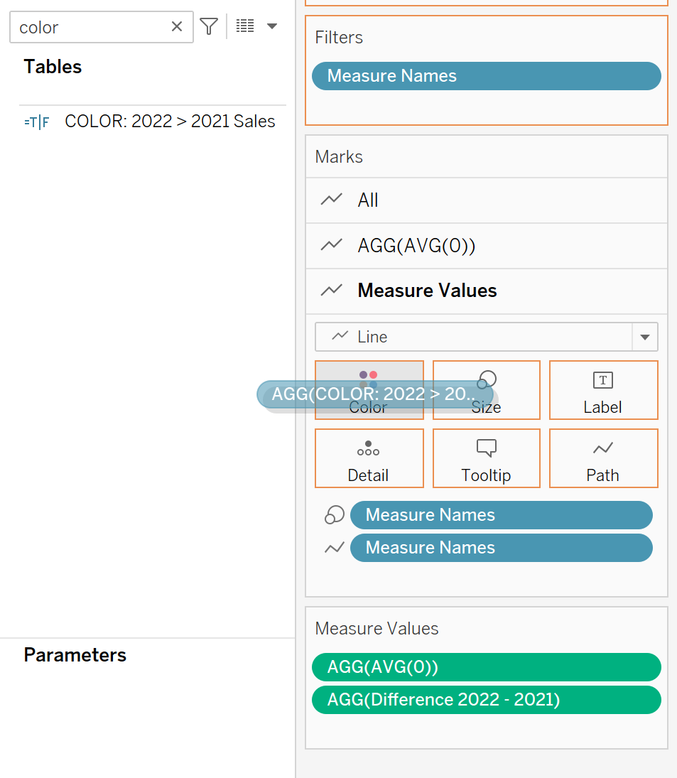
Step 9:
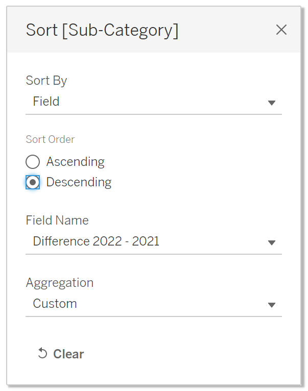
Now we want to sort our subcategory by the difference field we calculated and make it descending,
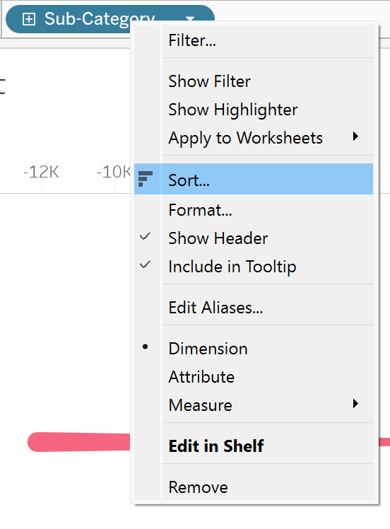
Step 10:
That's it! You have your comet chart, all that is left is a bit of formation such as hiding and renaming axis, column and row headers etc.
I'll leave that bit up to you.
