


Today we were tasked with survey data from Kaggle.
The data consists of questions and their respective responses from Slovakians, aged between 15-30.
Topics are wide in rage covering religion, interests, phobias etc.
The dataset needed very little prep. Although it helped to rename the columns in order to get a proper understanding of the question being asked.
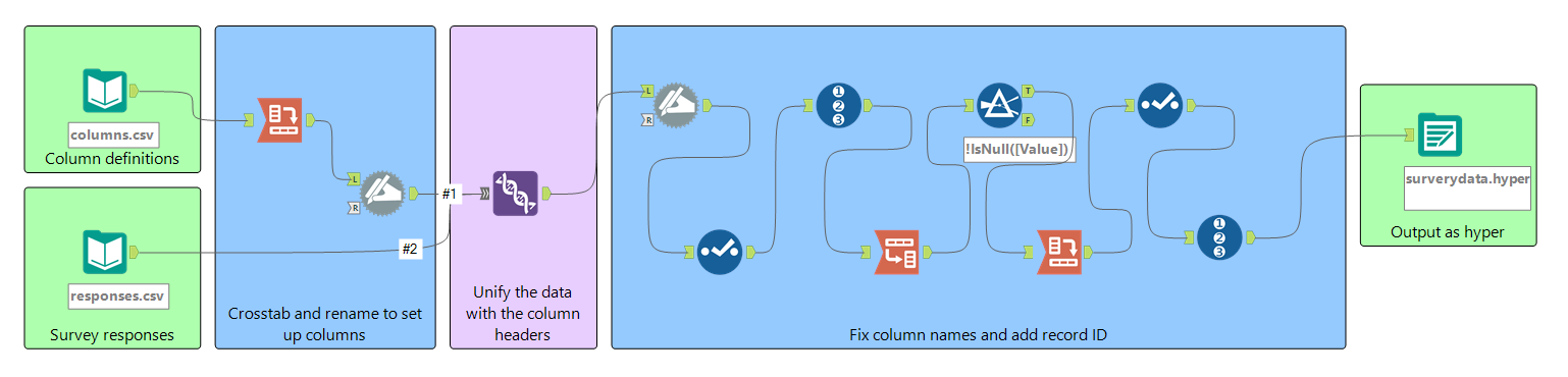
I used Alteryx to take the column headers which are in individual rows and crosstabbed them in order to get them across different columns. Then I used the rename tool so that the columns are named the same as the survey responses csv file in order to be able to union the two based on the column names.
There were some hiccups in the process, Alteryx automatically adds underscores to the column names if there are spaces in between words and some parts of the flow after the union take care of that issue.
Once the data was how I wanted it, I outputted it into a hyper file ready for Tableau.
After which I took to looking at the different survey questions that were presented in the dataset in order to find any points of interest that I can analyze since as I mentioned before there was a wide range of different categories that the survey questions covered.
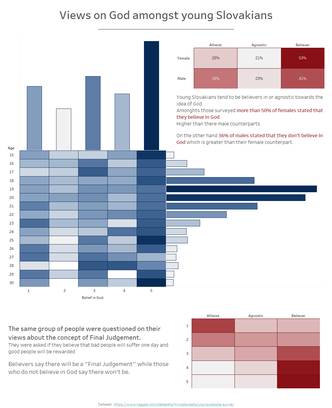
I noticed a question about the belief in God, this intrigued me so I thought about how this can be presented, I looked into the data that was imported into Tableau in order to see if there are correlations with someone's statement on belief and any of the other questions asked.
My wire frame for the dashboard was just a histogram this time, I knew what chart I wanted to use and got straight to building.
The final output was this:
This was a nice experiment for me, I can say after this that I am a bit more familiar now with survey data.