


And so, Day One of Dashboard Week began, a journey into the unknown. We were aware of the daunting task at hand - to produce both a dashboard and a blog post every day. However, what we didn't know was the nature of the datasets we'd be working with, or if they would require extensive preparation. Adding to this, we were informed that dashboards might need to be built using software other than our trusted Tableau.
On our very first day, our mission was to build a dashboard using data scraped from the Bundesliga website, and we were armed with Alteryx to tackle this challenge. I remember when we first learned about web scraping and API's in Alteryx I found that I quite enjoyed it, finding patterns within the html in order to be able to parse out sections using regex was actually fun for me.
There was a thrill in deciphering patterns within the HTML of a website and using regex to extract the necessary sections. I also have a goal in mind while working in Alteryx to accomplish the task at hand with the fewest possible tools in, an approach that often leads to more elegant solutions. This self imposed challenge makes the task more interesting for me. Once I had identified the pattern in the HTML containing the data table, the rest of the journey felt like smooth sailing.
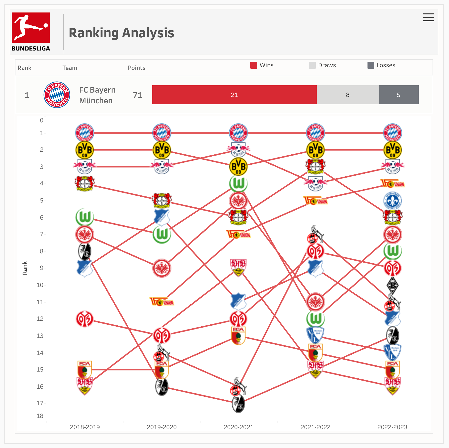
With the data from the past 20 seasons in hand, a requirement that was asked of us in the morning, I turned my attention to visualization. The idea that immediately struck me was a ranking analysis. After all, each year, teams in the Bundesliga are ranked, so why not use a bump chart to illustrate how teams' rankings change throughout the season?
Building the bump chart was straightforward since the table already contained ranking information for each season. Once that was completed, I noticed that the chart, while informative, lacked visual appeal. To fix this, I decided to add images of the clubs to each bump, making the dashboard nicer to look and read.
To add club logos to the bumps, I searched the official websites of the Bundesliga teams. Once I found the logos, I automated a workflow in Alteryx to find the endpoints on the club websites and download all the images. This not only saved time but also ensured that our dashboard would feature the most up-to-date logos.
With the images in hand, I assigned each one to its respective team in Tableau. This not only made the dashboard visually appealing but also allowed viewers to easily identify the teams.
With all the pieces in place, it was time for the final touches. I turned my attention to formatting the dashboard, again making sure that it was not only informative but also visually pleasing. The layout, color scheme, and placement of elements all were all taken into consideration and I think the final output reflects this:
Day One of Dashboard Week was a lot of fun. From re-familiarizing myself with web scraping to creating an engaging bump chart with club logos, it was a day of exploration and creativity. As the week progresses, I look forward to having as much fun as I did today and to implement what we learned over the past four months.