It's Day 3 of Dashboard Week!
During this training week, we’re given a prompt each morning and challenged t0 complete a dashboard by 3 pm.
Today’s challenge was especially interesting: migrating a Tableau workbook to Power BI.
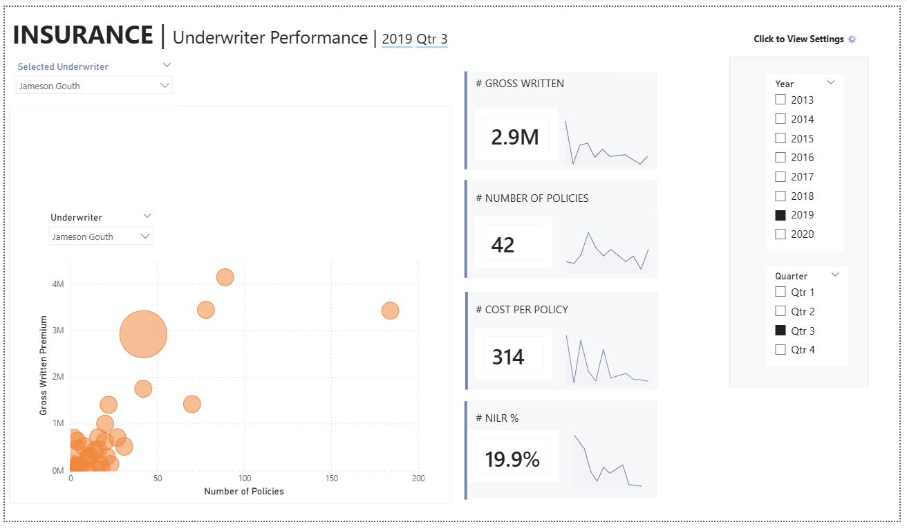
We were given a pick of three dashboards from Ellen Blackburn. As you may know, her dashboards are visually stunning and technically/mechanically complex, which made today especially challenging (and fun!). I opted for her Insurance Underwriter Performance Dashboard.
I'll walk through my process and the lessons I learned below.
Step 1: Understanding the Original Dashboard
Before opening Power BI, I spent time studying the underlying logic behind the Tableau dashboard to understand how it functioned. This included understanding:
- Where were filters being used, and what kind of filters were they? (Context filters, regular dimension filters, etc.)
- Which elements of the dashboard relied on parameters?
- Were there any LOD calculations?
- Which interactions would be easy/difficult to reproduce in Power BI?
This step ended up being incredibly important, as I discovered that the dashboard contained many layers of calculations and technical components that would be important to consider.
Step 2: Exporting and Understanding the Data
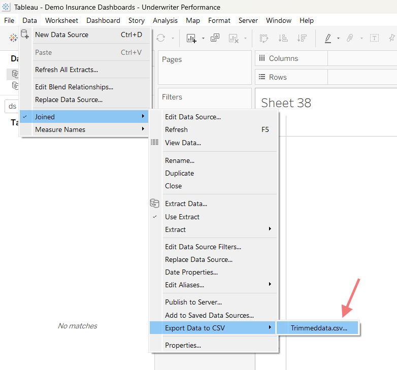
Next, I downloaded the data directly from the Tableau workbook.
To do this, I navigated to the data pane --> located the underlying data source --> export data to CSV --> select the dataset.
Once I had the files, I spent time studying the datasets and understanding how they related to one another, to make sure I understood (1) what one row represents, (2) how are the datasets connected, (3) whether there were any data quality issues.
Step 3: Defining Scope
One of the biggest lessons from this exercise was realizing that some functionalities translate easily between tools, while other functionalities requires completely different approaches.
Given the five-hour time limit, I had to realistically assess what was feasible in Power BI and what I could reasonably complete well within the allotted time.
Rather than trying to rebuild the entire dashboard imperfectly, I decided to focus on
- The four KPI cards
- The scatterplot
- Key calculations and formatting
My priority was accuracy over quantity. I wanted the metrics and logic to match the original dashboard as closely as possible, while also creating a clean enough structure so that more visuals could be added later.
Step 4: Loading Data into Power BI
At this p0int I loaded in the data to PowerBI and verified all the data types were classified correctly (e.g., string, decimal number). Small data type issues can cause problems later, especially when building DAX calculations.
Step 5: Building the Dashboard
Once the data was ready, I started recreating the visuals.
This was the most technically interesting part of the challenge because Tableau and Power BI approach interactivity and calculations so differently, and the underlying mechanics often need to be rebuilt from scratch.
A Few Challenges I Encountered
- Parameters Work Differently in Power BI
In Tableau you can easily add string parameters. For example, you can create a parameter that lists all the underwriters, like so, which can then be used in calculations:
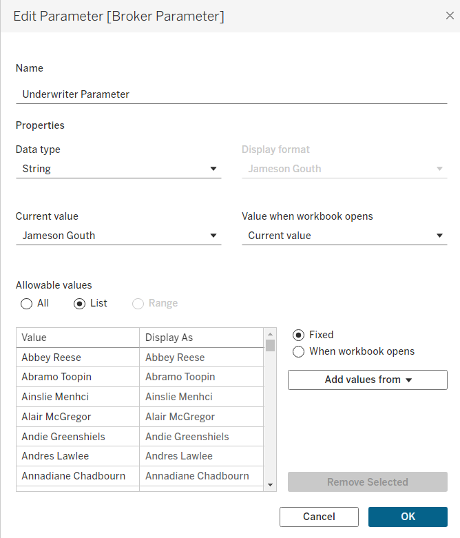
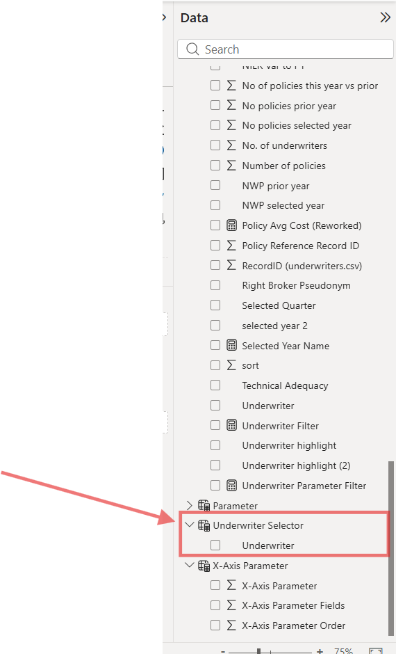
I wasn't able to find a way to create string parameters in PowerBI, so instead I created a table, not connected to the main table in the data model, that could be used in calculations.
- Missing values seemed to behave differently.
For example, suppose I was creating a line chart based on the following values:
- January = 50
- February = null
- March = 90
In Tableau, the timeline on the x-axis may still visually preserve February depending on configuration. In Power BI, February sometimes disappeared entirely from the axis, causing the trend line to connect January directly to March.
I'm sure there is a way to account for this in PowerBI, but I didn't have time to get to it today!
- The DAX syntax for LOD calculations was very different from Tableau.
This required quite a bit of digging and research to understand how to use the CALCULATE() function in combination with filter modifiers.
Final Thoughts
Overall, this was an incredibly valuable challenge!
It reinforced that migrating dashboards is not simply a copy-and-paste exercise. Moving from Tableau to Power BI often requires rethinking the underlying logic, interactivity, and even the structure of the data model itself.
Here’s my progress on the dashboard so far. I’d estimate that it’s about 20% complete. There are still several charts to build – and, of course, a bunch of formatting and polish remaining – but I was able to match the numbers on the KPI metrics, line graphs, and scatterplot calculations to the original Tableau workbook, which was a big milestone!