


We started dashboard week with an interesting challenge: Building an app to let the user pick a specific date range, category, and area (using a map interface tool) or postcode to update a data source onto Tableau server. Here is how it went and the lessons I learned!
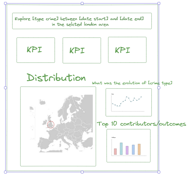
Sketch:
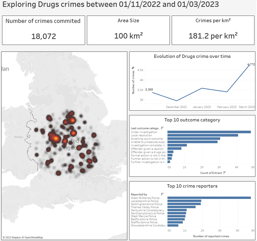
Final Dashboard:
1) Don't forget to cache and run: As the amount of data was big and the processing power required for the workflow was intensive, caching before running was essential to avoid waiting 5 min each time you ran the workflow
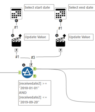
2) Date range: I used this very useful blog to create a date range filter
3) annotate workflow: took some time but was useful in the end
4) populating crime type filter: Don't forget to crosstab
5) map interface: Weird bug in Alteryx needed to be fixed which took a while but otherwise pretty straightforward
6) Don't forget to save!! Luckily, the crash caused by the map interface bug was not too damaging because of a handy feature called autosave.
7) Spatial data processing: My favorite! Map radius is a cool way to select an area based on a point location. Add a spatial match and you can easily select points based on proximity to a point
8) Outputting data to google drive: Very frustrating part of the project where the app is finished and functional but it is impossible to get the output to work properly. Ended up having to use a tableau hyper file instead of an updatable connection.