


This blog will take you through how to create a sun burst chart as seen in my End Of Year Overview dashboard.
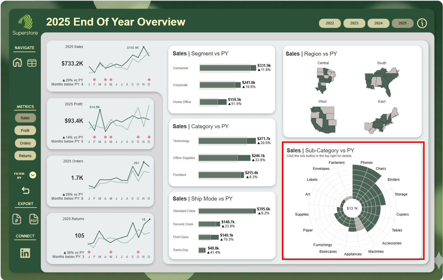
Take a look at it here.
Creating The Chart Structure
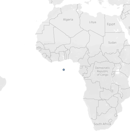
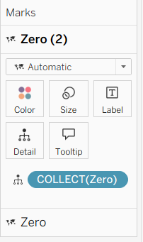
The first step to creating the chart is to create a calculated field that uses the makepoint function to create a point at 0,0. Name this Calculated Field "Zero"
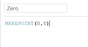
Double click on this field in the data pane and a map should appear in the sheet with a point off the coast of Africa.
Change the mark type to Pie to make this point a pie chart. Next click and drag the Zero calculated field onto the map and drop it onto "Add a marks layer"
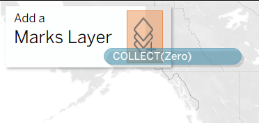
This will add another point on top of the one originally had and add the new points to your marks card.
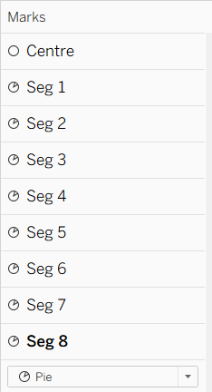
Keep doing this until you have the desired number of rings for the chart that you would like.
In this example we need 8 rings so we will do this 8 times. Do not forget to change all of the mark types to pie.
We also need a circle in the centre so drag zero into the view one last time and make the mark type a circle. Do not forget to rename the segments so you know which one is which.
The next step is to create the segments for the pie charts. In this example we are looking at sub category so we will add sub category to detail for each segment mark. This splits the pie chars into 17 different segments.
The next step is to remove the longitude and latitude pills from the columns and rows. This will remove the background map and just keep the pie charts stacked on top of one another. Then set the view to entire view.
This will leave you with what looks like one circle in the middle of the screen. This is actually all of the pie charts in the marks card stacked on top of one another. In order to be able to see them, you need to adjust the size of each one individually using size in the marks card. Giving each pie chart a different border or colour makes it easier to differentiate between them.
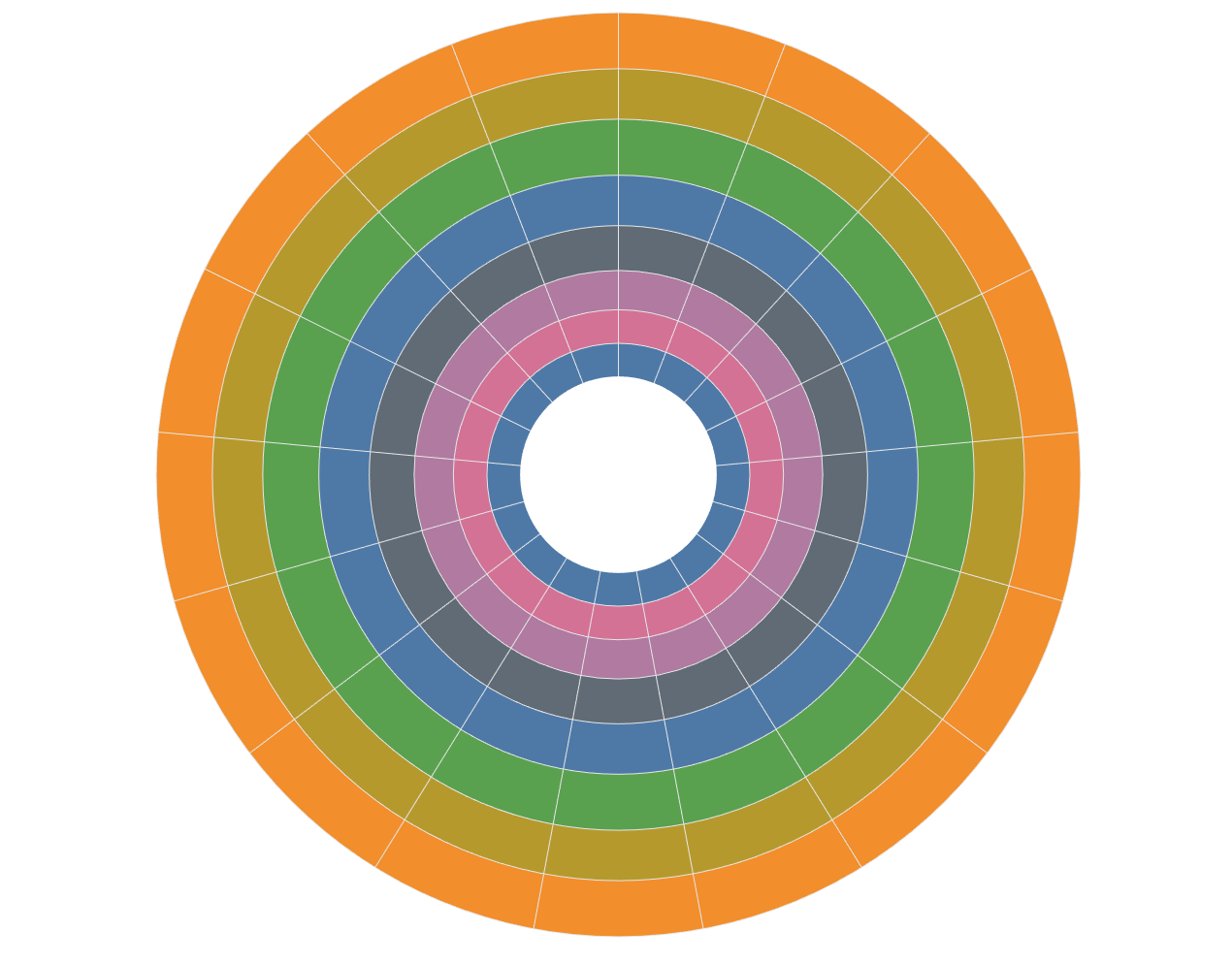
Once you have each pie chart sized so that the segments are as close to even as possible, we can start to build the calculations to colour the segments.
In this example, each segments value is determined by the following calculation:

This takes the difference between the maximum of the selected metric and the minimum of the selected metric in the view divided by 8. We divide by 8 here because we want each segments value to be such that when added 8 times, it reaches the window_max. This is so that each segment has an equal value and the outer pie chart will be the window max.
This value for segment size will be used in the colour calculations for each pie chart.
The colour calculations:
The calculation for the first pie chart is slightly different to the other 7 so we will look at that first.

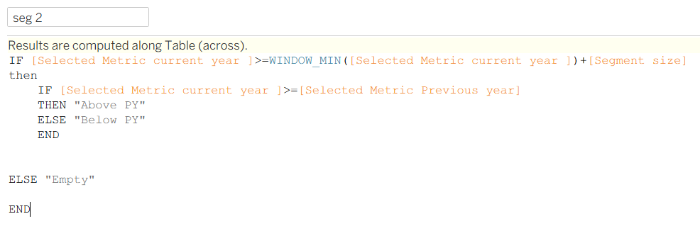
This calculation works by checking if the metrics value for the current year is higher than the window_min of the metrics value for the current year (always true) then looking at if the current year metric value is greater than or equal to the previous year metric value. If it is then it returns "Above PY" and if not then "Below PY". If the first condition is not met then it returns "Empty"
This first calculation will never return "Empty".
Having it return these 3 strings allow you to colour the segments.
The calculations for the the other segments look slightly different to each other but follow the same pattern.
The only difference here is that in the first if statement, we add the segment size to the window min to see if that metric value is more than the window_min + the one segment. This allows us to check if that sub category has enough metric value to fill the next segment. If it does, another check is done to see if the metric value was above or below the previous year. If the metric value was not more than or equal to window_min + segment size then the calculation returns empty.
The third segments calculation is very similar to segment 2:
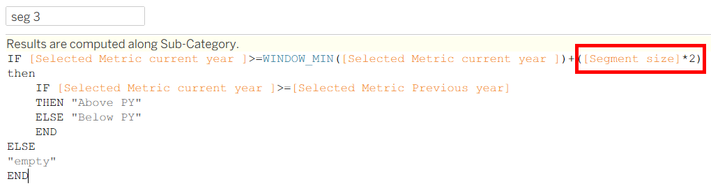
The only difference is we multiply segment size by 2 to see if the metric value is enough to fill the next segment. The rest of the calculation is unchanged.
The next step is to repeat this for all of the other segments increasing multiplier for segment size by 1 each time.
segment 8 calculation:

The next step is to add each segments colour calculation to the respective marks card. This will look like a mash of colours at first. To fix this, edit the colour legends that appear on the right side of the worksheet page.
Labeling
The last step is to show the value for the size of one segment in the middle of the sun burst chart.
This is done by adding a label to the "Centre" mark which is the centre circle.
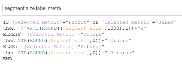
I required 2 calculations in order to do this as I have 4 metrics to swap between that need the labels to be formatted differently.
The first calculation checks what metric is selected in the parameter and then returns the correct label.
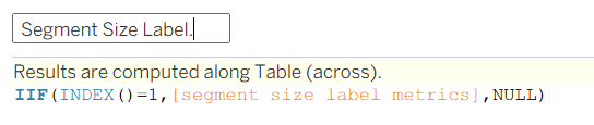
The second calculation says if the index is 1 then return the label and if not then return NULL. This prevents you from having the same label stacked on top of one another multiple times (one for each sub category).
You can then drag sub category to label in the marks card on the outer pie chart to show what sub category each slice is referring to.
Sorting
To make the chart easier to read, Right click on sub category in detail on one of the marks cards and select sort. Change the sort to by "Field" and then select selected metric current year and change the sort order to descending, This order the sub categories by the selected metric value, giving the chart a spiral look.
Hopefully by the end of this, you have a better idea of how to make this sunburst chart.