


The task we were given today for dashboard week was to design a dashboard for people that may have different accessibility requirements. We were given a data set on London attractions and we had to make specific design choices in order to make the dashboard suited for people with different accessibility requirements.
The requirements I was focusing on today were tailoring a dashboard for someone with dyslexia and dyscalculia.
My first step for creating this dashboard was to do some research into dyslexia and dyscalculia in order for me to get an idea of how I need to format the dashboard to accommodate.
What is Dyslexia?
Dyslexia is a neurobiological difference that changes how the brain "decodes" visual information, particularly letters and symbols. It isn't a problem with vision itself, but rather a processing glitch where the brain struggles to map sounds to their written forms. This can make text appear to jump, blur, or swirl, making it difficult to recognize words quickly and accurately.
What is Dyscalculia?
Dyscalculia is a neurobiological difference that affects how the brain perceives and processes numerical information. It is often described as "number blindness," where digits and mathematical symbols can appear as a chaotic or meaningless jumble. When viewing information, an individual might struggle to distinguish between similar-looking symbols (like + and ×) or transpose numbers (seeing 12 as 21). This makes it difficult to "see" quantities or patterns at a glance, often causing graphs, tables, and equations to feel visually overwhelming or impossible to decode.
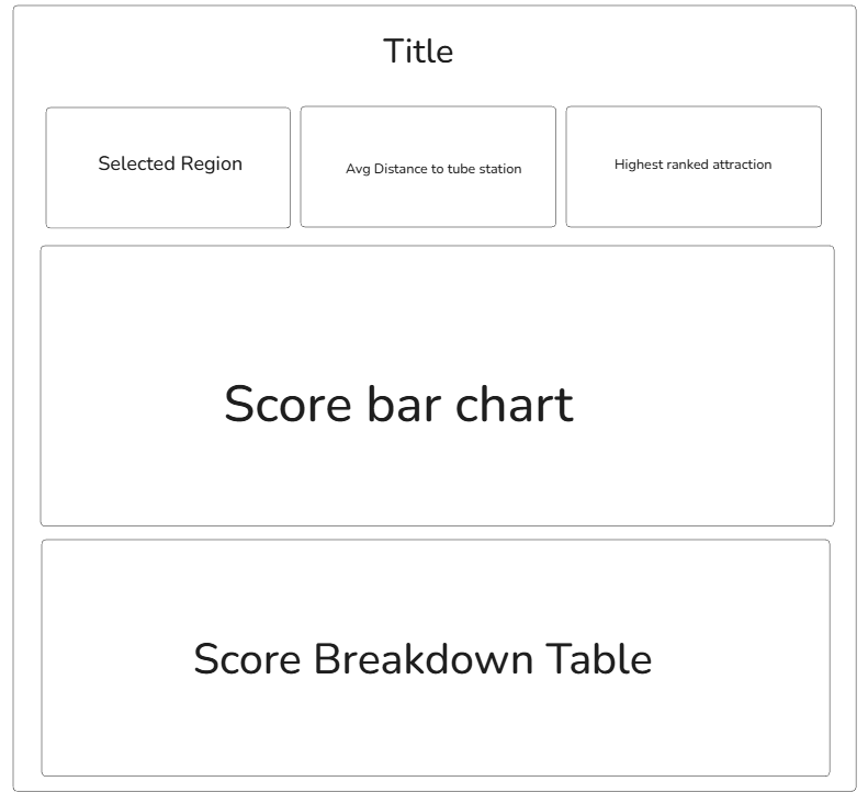
After I had dome some research, I started to make a very basic sketch to give myself an idea of what charts I wanted in the dashboard.
I then opened Power BI and started making the charts and KPI's.
Once all of the charts had been made, I started to make changes to the formatting of them.
The formatting changes I made to the dashboard:
- The background of the dashboard was an off white instead of white. This is because it is easier to read for dyslexic people than black text on a white background.
- The font for all of the text in the dashboard was switched to verdana as it is a very clear and easy to read font.
- The text size was made as big as possible to make it clearer.
- The KPI's were spaced out.
- A bar chart was used to show the accessibility score of the attractions. This allows the user to make an assessment based on the size of the bar rather than having to read a number.
- For the table, icons were used instead of text. This reduced clutter and made the table simple and easy to read
- The bars of the bar chart were dark grey with a black outline to contrast them well with the dashboard background colour.
- The legend was made big so the user can easily see what each shape in the chart is referring to.
- Whitespace is used throughout the dashboard to spread out elements.
My Power BI dashboard:
Overall, this project showed me how much of a difference it makes when you design with specific accessibility needs in mind from the start. By researching dyslexia and dyscalculia, I was able to move away from a standard layout and create something that prioritizes visual clarity over numerical complexity. These formatting choices make the information much easier to digest, and it proves that making a dashboard accessible doesn't just help one group of people, but actually makes the data clearer for everyone.