With today, dashboard week comes to a close.
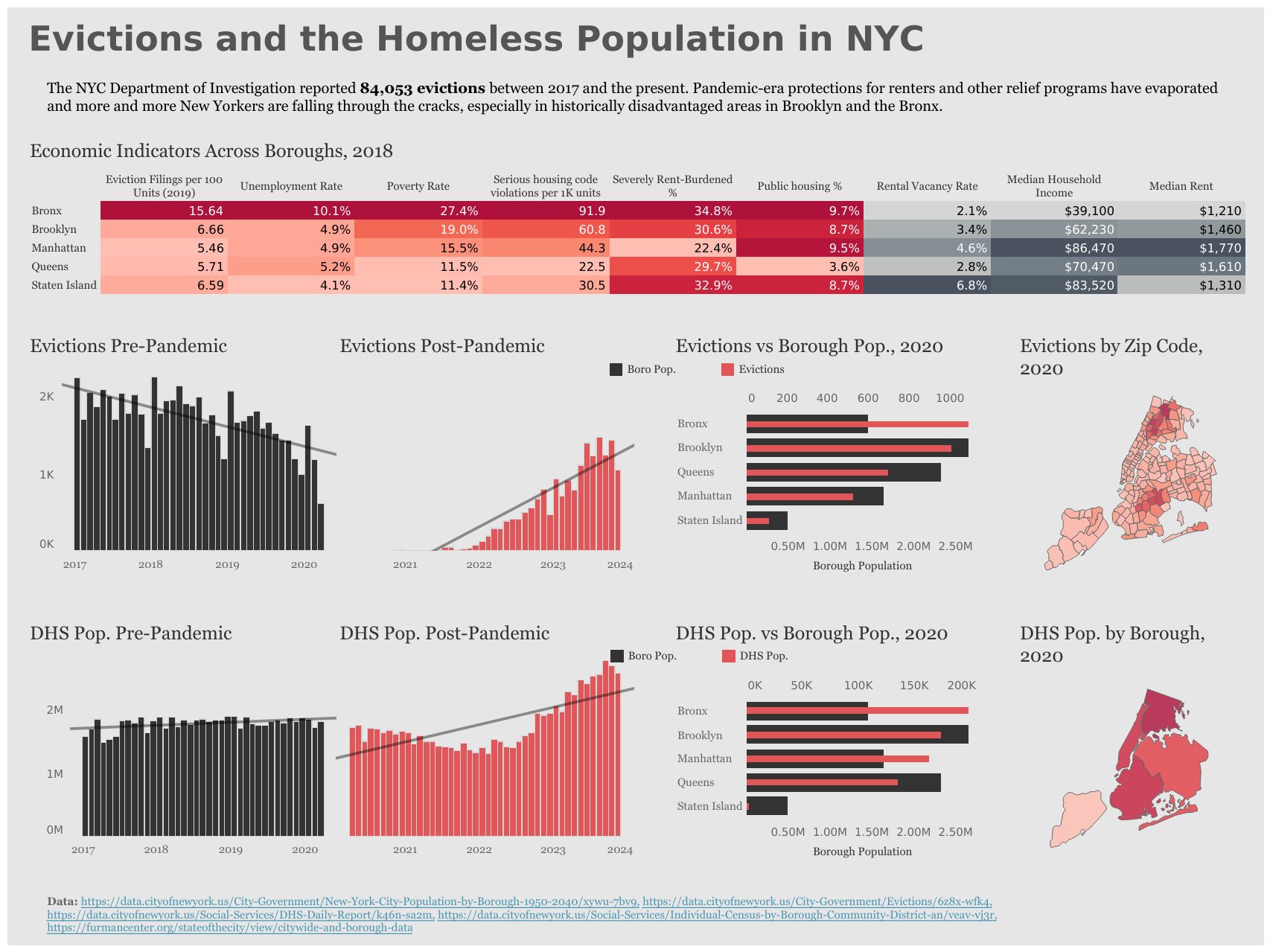
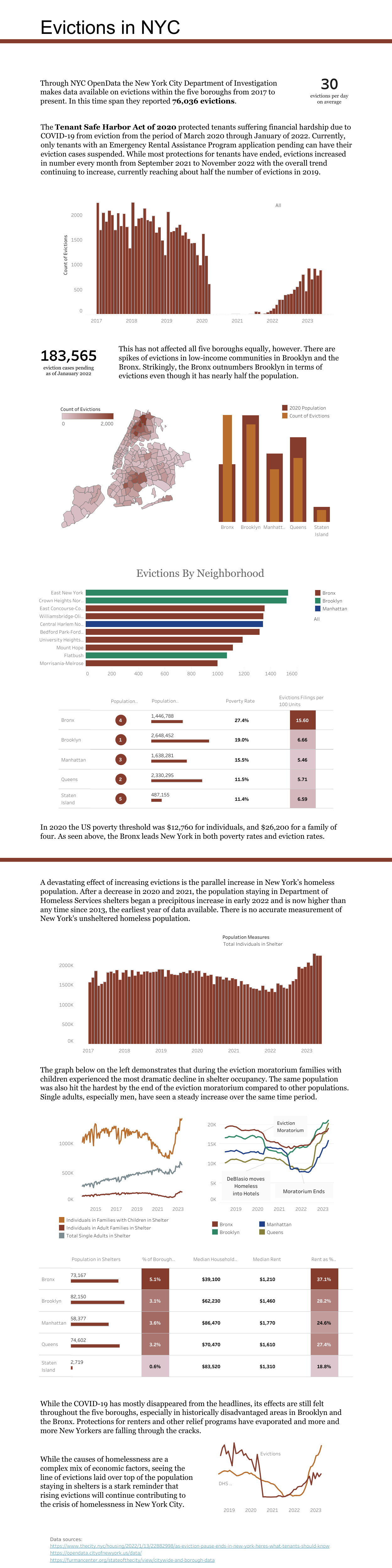
Before we go, though, we have one last viz to revisit: our own application submission from over four months ago! Here is mine in full:
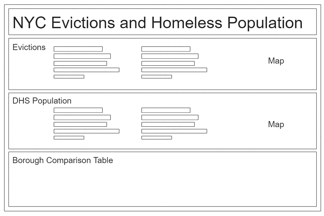
The challenge I posed to myself today was to convert my original dashboard into a single-page business style dashboard while retaining it's original message and impact. This meant the original had to be compressed into a space a sixth of the size without losing the information being conveyed. My first step was to open my old data sets and give them another look as most of them are updated live by New York City Open Data and so contained a few months worth of new information. Then I drew a sketch to keep my ideas organized.
Excalidraw Sketch:
The next step in the process was going through my original dashboard and determining the key graphs and metrics. The dashboard had two main themes: evictions across the five boroughs and the population housed in Department of Homelessness shelters. I knew my new dashboard would be super information dense so I wanted to make sure that the data I was carrying over was super relevant to my main idea, which was linking these two themes together. I realized a lot of my talking points were around the COVID-19 pandemic even though the dashboard was not explicitly about that topic, so I decided to make that the theme of my four main graphs in the new version. I had some interactivity that felt tacked on so I simply took that out.
I really liked the chart in the original that overlaid the count of evictions over borough populations - I think the contrast here between the bars was really effective so I decided to carry this over, and make a copy for the DHS population as well. I love maps so the maps had to come along as well. I combined and expanded my tables that contained background economic information, but displayed it in a more compact way. I still like the color scheme I used from the original, it feels very municipal, but I wanted something a little more punchy in the final version. Overall I'm pretty happy with what I produced, and I feel like the new version does 90% of what the original does in a fraction of the space, while doing away with a lot of extraneous information that didn't support the main ideas.
Final Product: