For our second day of dashboard week we have been given – a single URL! Cheese.com. And a complimentary video to accompany it (helpful). This gave us way more freedom than day 1, but also meant a lot more work in terms of scraping the web to secure the data we needed. So pretty much the first half of the day was devoted to Alteryx, figuring out how to download and parse cheesy data, and to extract enough information to create a dashboard.
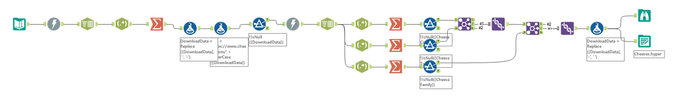
First, I used the Download and Text to Columns tools to get the raw HTML from cheese.com into Alteryx. Then I used RegEx combined with the Summary tool to isolate the names of specific cheeses pulled off the front page. These had to be converted to lower case and the spaces converted to dashes for the names to work as additional URLs to query from the site. I then repeated the download/convert process with the 95 cheeses I had so I could use RegEx again to pull out certain pieces of information. I ended up extracting the country of origin, cheese type, and the cheese 'family' that each cheese belonged to. Not every cheese had every piece of information listed so there were some nulls in the data, especially in the family category. Here is the final Alteryx workflow I created:
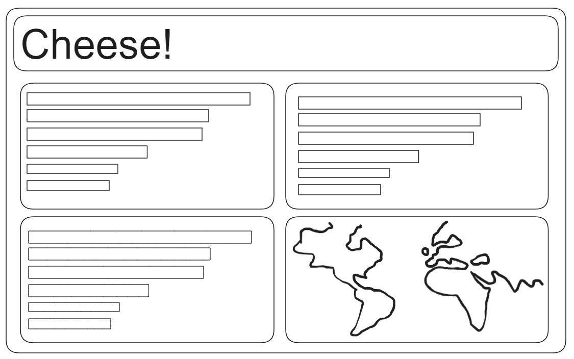
From here I did some quick data exploration in Tableau before drawing up a sketch for my dashboard. There were only a couple of hours left to create and format a whole dashboard so I kept my idea really simple, especially after having taken so long just to get the data I needed to create something with.
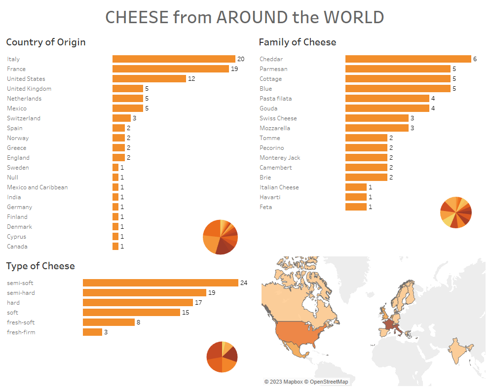
From here it was off to the races, and I spent the next few hours shaping the data into the charts I wanted to show. I had three categories to choose from: country of origin, family of cheese, and type of cheese. I equipped each of these with a set, a relevant calculated field, and a dashboard set action so that the user can drill down each chart to see the individual types of cheese being tallied. Although I didn't intend this from the start I realized Tableau had imported the country category as geospatial data, so I thought it would be a great idea to include a map (everybody loves maps). I included a sheet-in-tooltip and a filter action on the map to further increase the overall interactivity. I also decided to add some little pie charts for visual flair and a (perhaps cheesy) reference to wheels of cheese. Then I tightened up the tooltips for everything else and called it a day. Presentations were imminent! Final dashboard: