


Welcome to Dashboard Week!
For our first day we have been given a data set from a survey conducted in 2013. It follows young people aged 15-30 from Slovakia, along a huge list of questions and metrics. You can find it here. It covers everything from music and movie tastes to phobias, personality traits, and hobbies, as well as demographic data. Our job was to find some insight in this data and create a compelling dashboard within five hours.
My first priority was to do some exploratory data analysis. With a data set this large (1000+ rows and 150 columns) I knew there would be some interesting trends, so I immediately opened up Tableau and began poking and prodding the data. One of my initial ideas was to identify and focus on individuals who could be deemed psychopaths based on their survey responses, as there were a number of questions about lying, empathy, compassion, and trustworthiness alongside the music genre rankings. This idea didn't last very long however and I jumped to music ratings by gender, then dog phobias, before finally settling on looking at happiness.
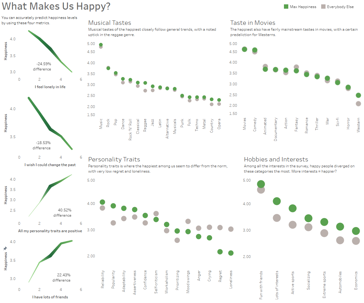
I thought happiness was an interesting metric to compare to other values in the data set, specifically media choices, personality traits, and various hobbies and interests as indicated in the survey. After testing every question in the data against average happiness scores I discovered there were four metrics that most accurately predicted happiness responses: loneliness, regret, self-image, and popularity. I like to formulate my dashboards organically depending on what I find in the data instead of having a defined layout from the start so it was at this point, once I knew exactly which columns and charts I wanted to work with, that I developed my sketch.
Here is a picture of my sketch for the dashboard:
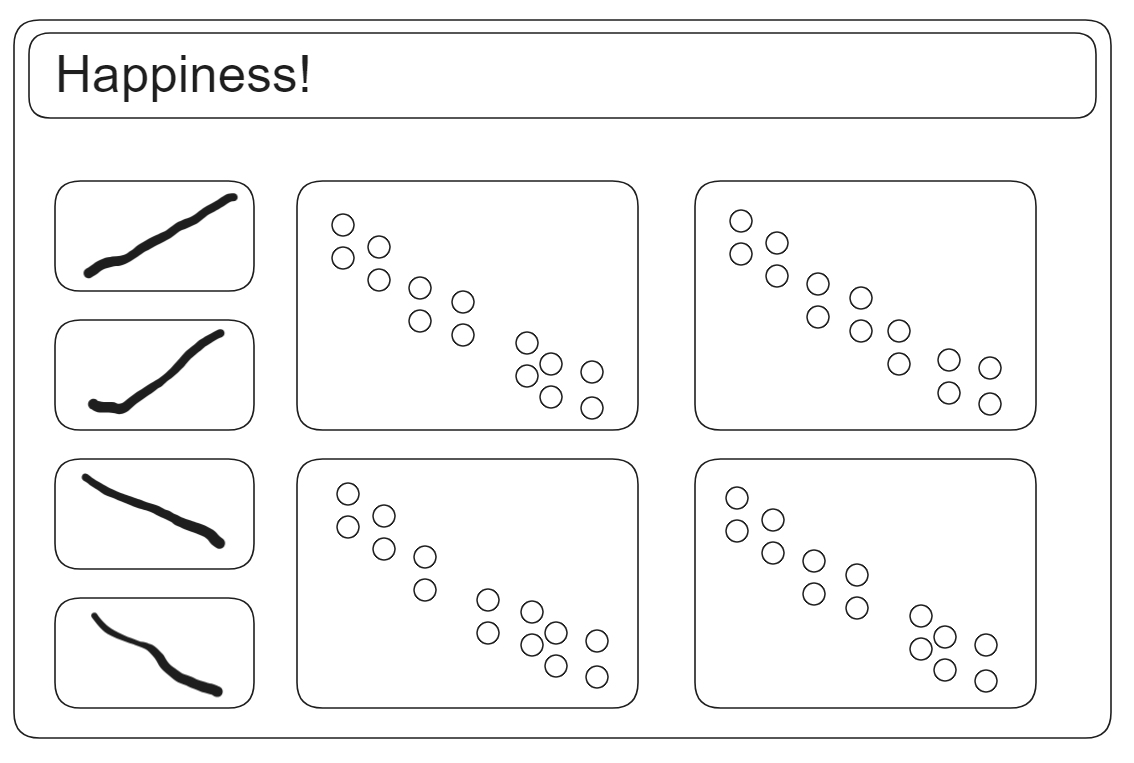
From this point I laid out my line graphs for my four predictions metrics, and calculated the difference between the highest and lowest happiness scores. I double-encoded the line to give a general idea of the number of survey responses for each score. I then created a variable that captured the segment of the surveyed population that responded with a 5/5 for their happiness score, so I could compare them against the rest of the population. Then I plotted these variables against the different categories of questions I had outlined earlier. It turns out the happiest among us especially like reggae and western films, enjoy socializing with their many friends, and have a multitude of hobbies and interests compared to the general population.
Final dashboard layout:
Thanks for reading!