


Just a quick trick today. I discovered this quite early on in my Tableau journey and it made me feel like a wiz, despite being only a small formatting change.
When you have a distinct field on the columns shelf Tableau displays these values across the bottom of the view in the conventional x-axis position.
But if you wanted to have them across the top for some design reason, perhaps to draw more attention to them then follow these steps:
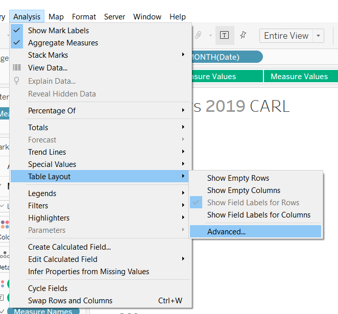
Go to Analysis > Table Layout > Advanced as shown:
Which opens this window:
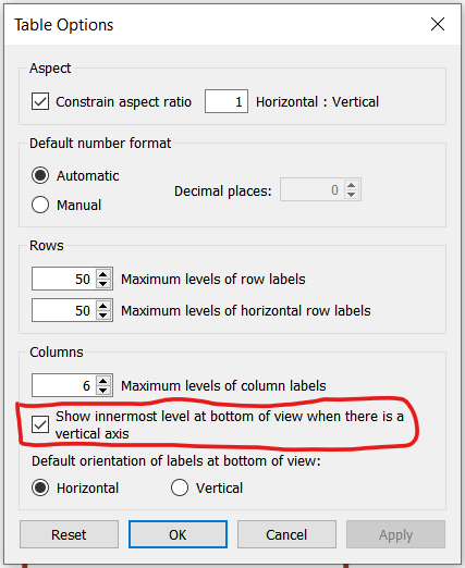
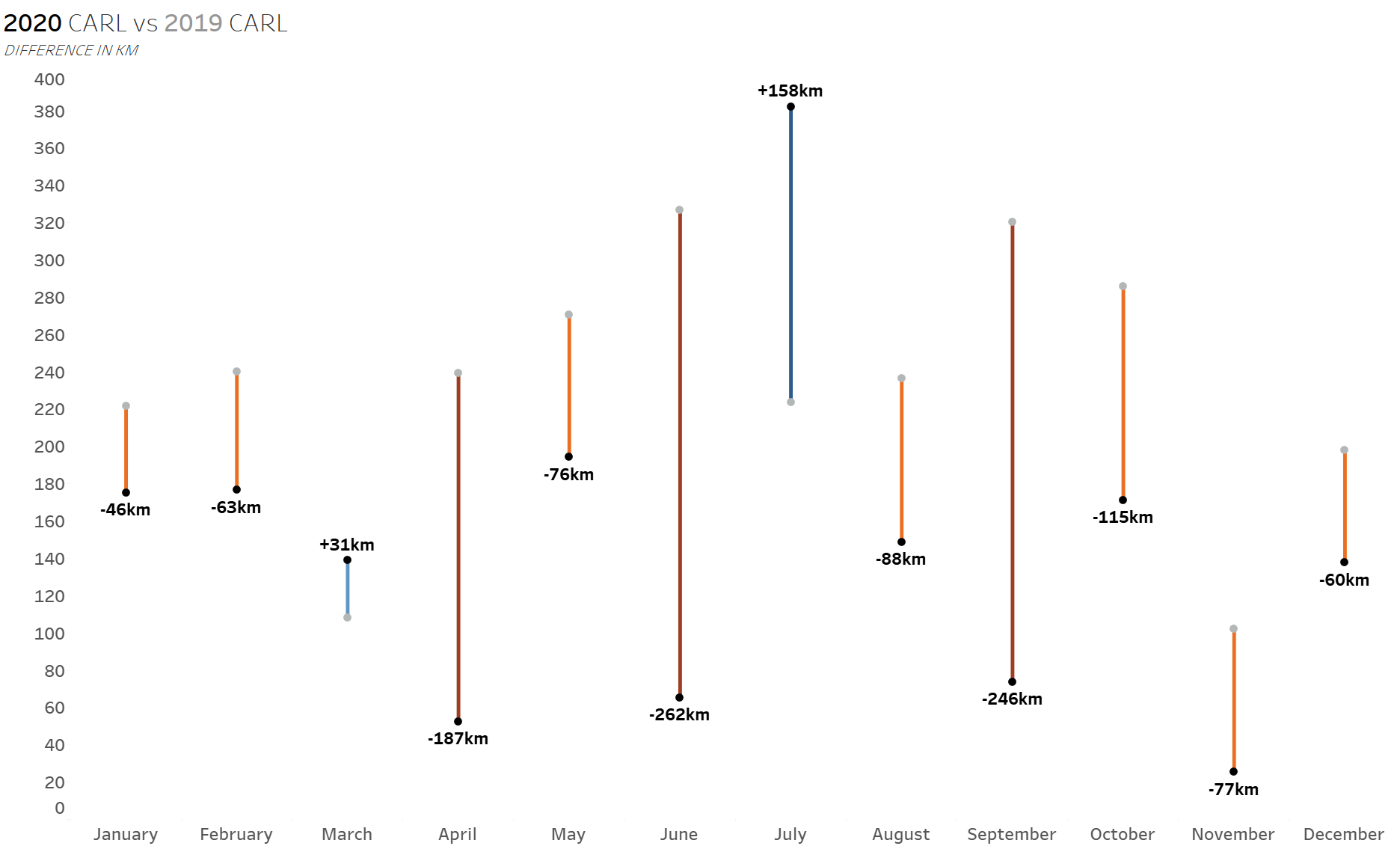
Uncheck the highlighted box and the labels will appear at the top of the view like so:
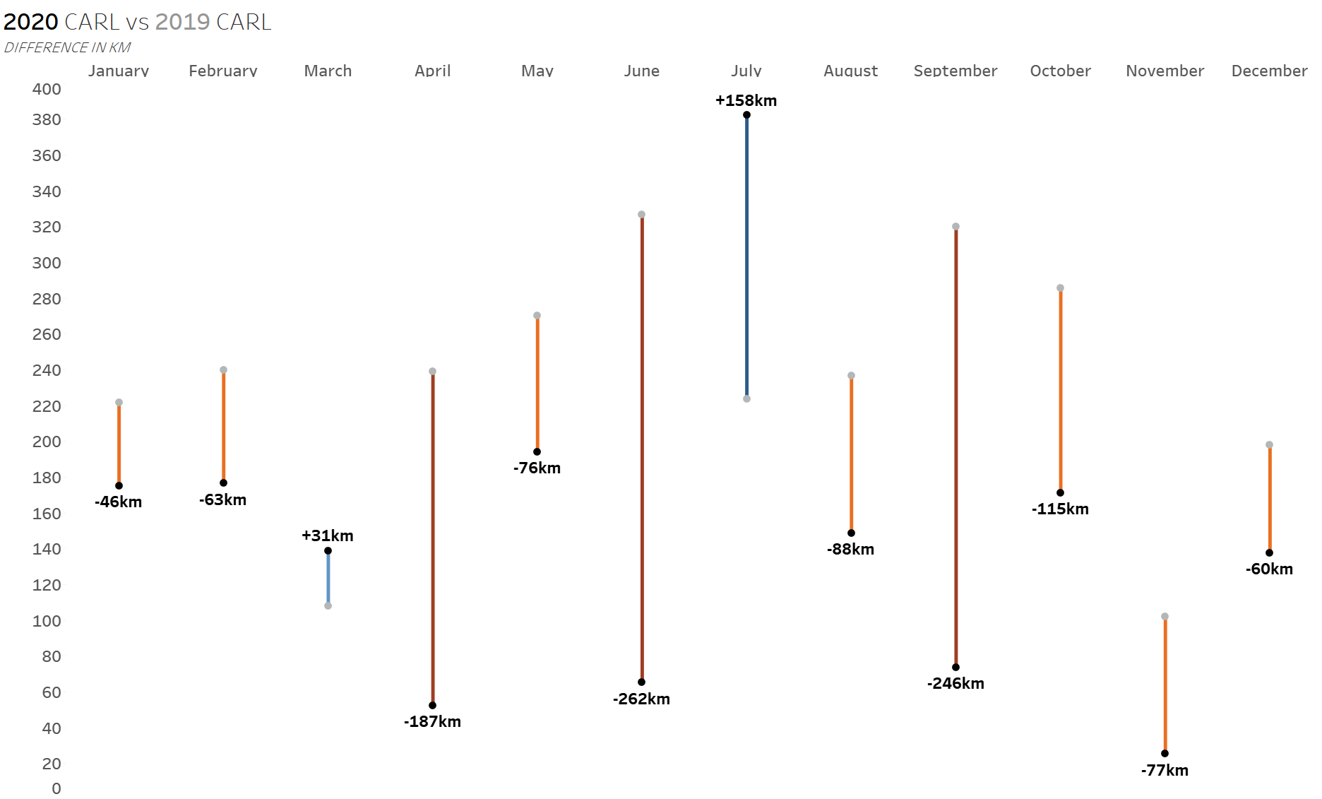
As the name of the check box suggests this works on charts with a vertical axis and is particularly useful for categorical data.
I like this trick as it imbues the user with more control over how their charts look and that's always a good thing - though it is a bit tucked away so I thought I'd share for anyone who might make use of it.