


What is Cognitive Load?
Cognitive load, for the purpose of this blog, is the amount of information that our brains can hold at one point in time. I’d like to come up with some sort of creative analogy to illustrate this, but it’s a bit harder to do in blog format. So instead, let’s have a look at a table I created which shows this off quite nicely…
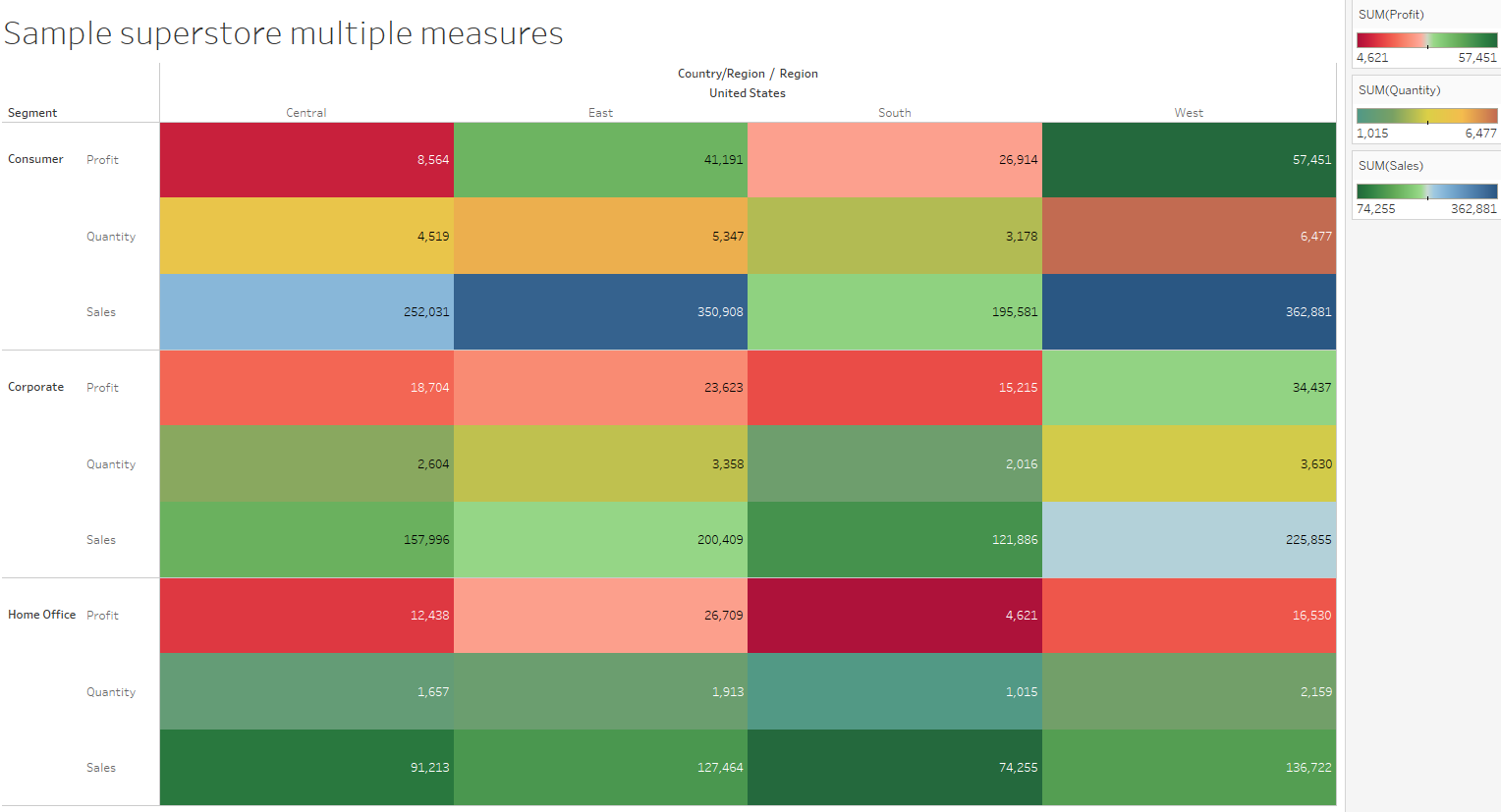
This isn’t the nicest table ever designed but it does make for a good starting point when discussing cognitive load. The specific type of cognitive load that this table creates is known as the split attention effect. There is so much going on across this table, that the viewer’s attention is being dragged to multiple different parts of the table, each competing for a finite amount of brain capacity. This is made even harder since I intentionally (I promise it was intentional) used the colour green as part of the gradient for all three measures, making it awkward to distinguish them.
Colouring out
Now if only there was some way to get around this… Maybe we could make three separate tables to show each one of the measures? Doing that would make it a bit easier to focus one measure across all the different regions and segments. I’m four weeks into the data school process however, so one would hope I could come up with a more creative solution than that. Instead of making 3 separate tables that we would have to look at individually, let’s make one table with the ability to switch between all measures. I’ll take advantage of parameter actions (which we learnt about this week as it turns out) to do this.
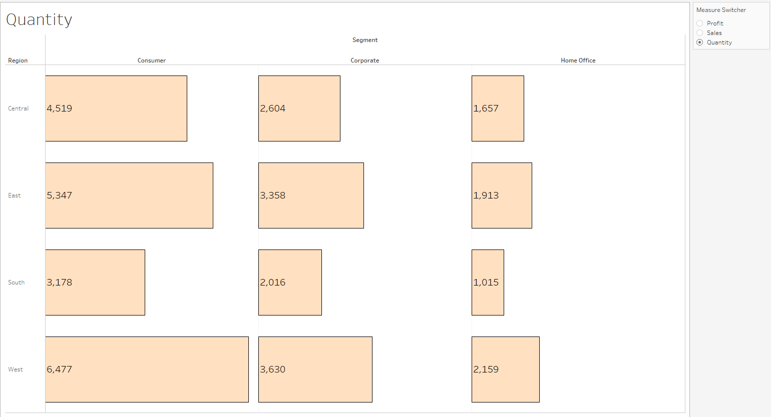
Obviously this isn’t tableau so the measure switcher doesn’t actually work, but clicking on the different measures will change the values in the table accordingly. More of a general comment, the colour format of the cells is less than helpful. I instead chose sized bars to show the same thing with a flat colour. Hopefully it should be clearer to see that within the west region, the consumer segment has the highest quantity (ignore that we have no idea what that actually means), compared to on the other table.
Grand Designs
This simple example should help you see how being mindful of cognitive load can massively clean up your presentation. Beyond tables, you can apply this sort of thinking to graphs, design, anything really – you just can’t make “table manners” jokes as easily. To make your own work look better, you can just follow the process I’ve walked you through in this post. Start off by listing things you’re not proud of in your visualisation, then start tackling them one by one. I find it easier fixing things I don’t like rather than trying to conceptualise the perfect visualization – it’s a lot easier to polish some good ideas than demand you start out with perfection.