


Unlike yesterday where we had a goal we were aiming for, today's dashboard had no restrictions. We were given a lot of data w.r.t. previous FIFA World Cups and the only requirement was to be as creative as possible.
When given creative freedom I tend to get a bit stuck. So the initial process of figuring out what I wanted to do was very tricky - in fact the image below sums it up best.

But as I was going through the fixtures I started to get a bit nostalgic. Seeing the results of certain games was taking me back to when I was watching them. So, I wanted to reflect upon that, and the idea I came up with was a view of all the knockout stage brackets (that I witnessed), with the ability to filter between the different years.
Below is what it looks like;
The slider picks the year and from that point you can see the entire bracket.
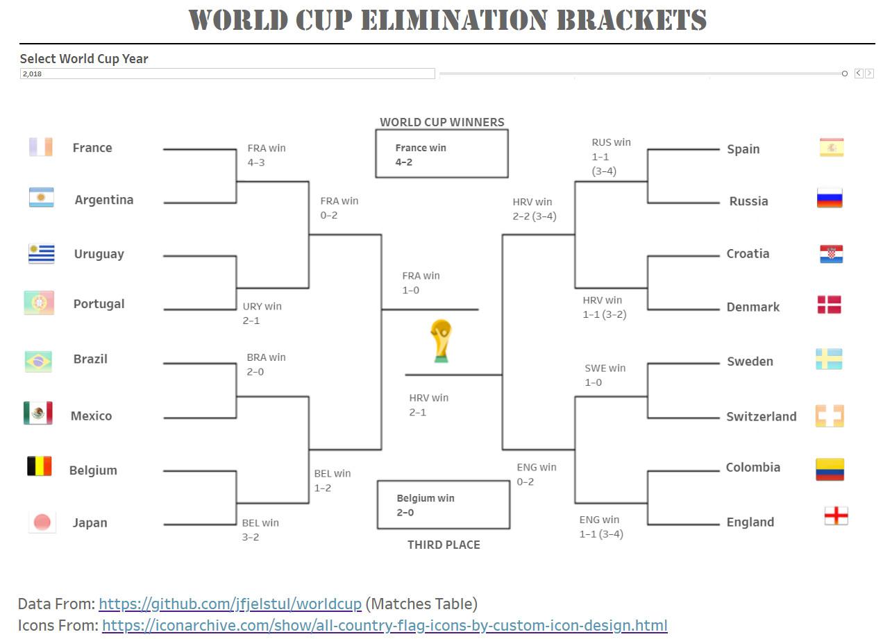
I had lots of fun building this, and unlike most of my other visualisations, there is no analysis to be done. Just the games, the fixtures and the memories.