


In data visualization, Tableau offers powerful tools to uncover insights from your data. One common scenario is comparing differences between different years. In this guide, we'll walk you through the steps to achieve this using Tableau.
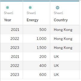
Assuming you have a dataset like the one below:
- Create Calculated Fields
We'll start by calculating the energy difference between two specific years for each country.
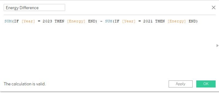
Create a new calculated field called "Energy Difference.
SUM(IF [Year] = 2023 THEN [Energy] END) - SUM(IF [Year] = 2021 THEN [Energy] END)
2. Build the Visualization
Now, let's visualize the energy differences between the years 2021 and 2023 for each country.
Drag "Country" to the Rows shelf.
Drag the "Energy Difference" calculated field to the Columns shelf.
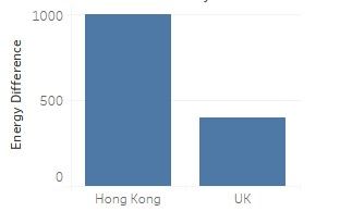
Here you go!
If you want to allow users to dynamically choose the years for comparison, you will need to apply parameter which will be discussed in the future post.