


Step one: Create a parameter called "Sales Above?"
You can do it by selecting Modeling > New Parameter > Numeric Range > make the name to "Sales Above?" > Change the max and min to show the range> Click Create
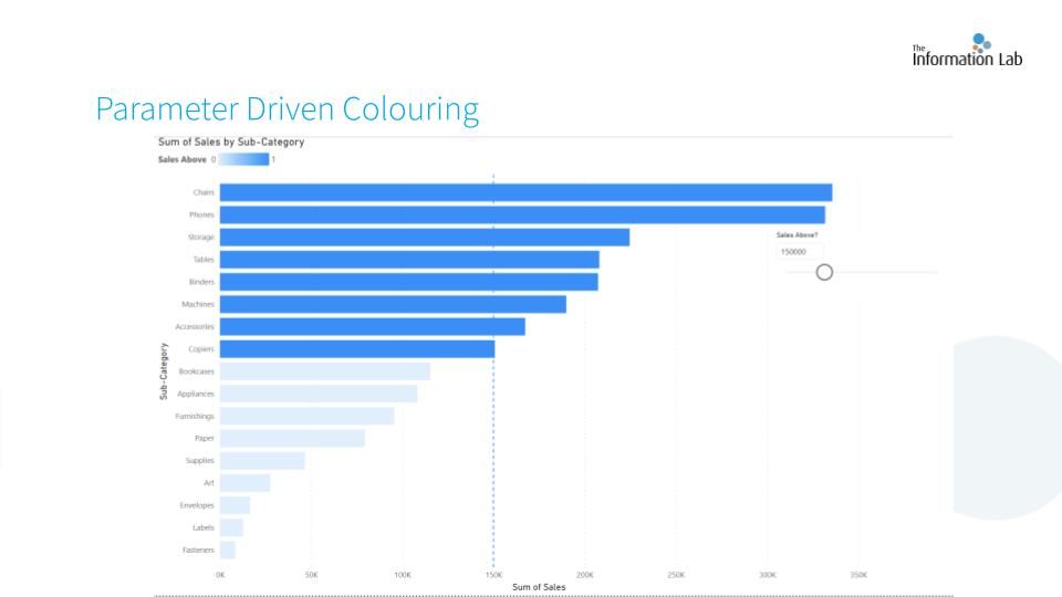
A slicer should appear on the visualisation panel and a column called "Sales Above?" should also appear on the data table. At this stage, nothing will happen when we drag the button because we have not navigate it with our chart.
Step two: Create a measure
By clicking Modeling > New Measure
Then you will be able to write DAX. DAX is similar in syntax to Excel formulas but is optimized for working with large datasets. Here is the formular:
Measure = IF(SUM(Orders[Sales])>'Sales Above?'[Sales Above? Value],"Ocean Blue","Light Grey")
It means if the sum of sales is higher than the our sales above, it gives our bar chart Ocean Blue in colour, otherwise, it shows in grey.
Step three: Colour Formatting
Select your chart > Format your visual (click the brush) > Visual > Bar > fx > choose field value in your Format Style > choose Measure (the measure you have just created)
Step four: Set a Constant line using Analytics Pane
Select your chart > Analytics Pane > Constant Line > Add line > fx > choose Sales Above? (the parameter we have created) in what field should we base on > change the summarisation to sum > ok
Here you go! You have created a Parameter Driven Colouring Chart :)