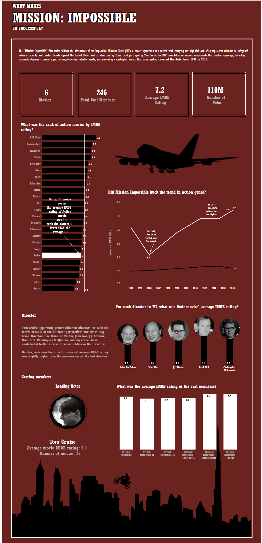
We are going to use two days to build a infographic dashboard using the Tableau challenge dataset! I pick my favourite movie - Mission: Impossible series. I wanted to know what made them successful.
However, after data exploratory, there were not much in-depth in sight i can find. I started to re-scope and tried to spend more time on finding interesting insight from the data.
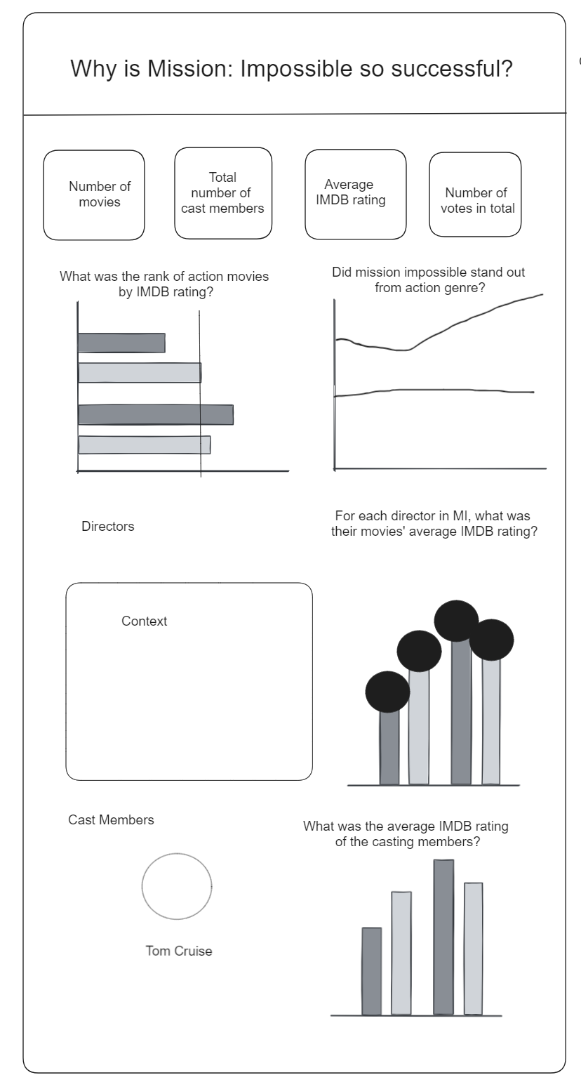
This is the sketch:
Dashboard:
WHAT MAKES?MISSION: IMPOSSIBLE ?SO SUCCESSFUL? | Tableau Public