


Today is the most technical day in the dashboard week! We need to create a report using Alteryx. To get the data, we need to connect the tool with Aviation API and use the spatial tools in Alteryx to perform some spatial analysis.
I started with the plan:
I ended up spent a lot of time just to get the data as i did not use API so often during the training. The website was not stable, it took me a couple of minutes to run my workflows. Also sometimes it gave me error 500 (means their server was not available) and i need to re-run the workflow again, which was very annoying.
I scoped down the topic to make sure i have enough time to create a report. I planned to create a Distance of direct flight routine in the US from JFK airport Report.
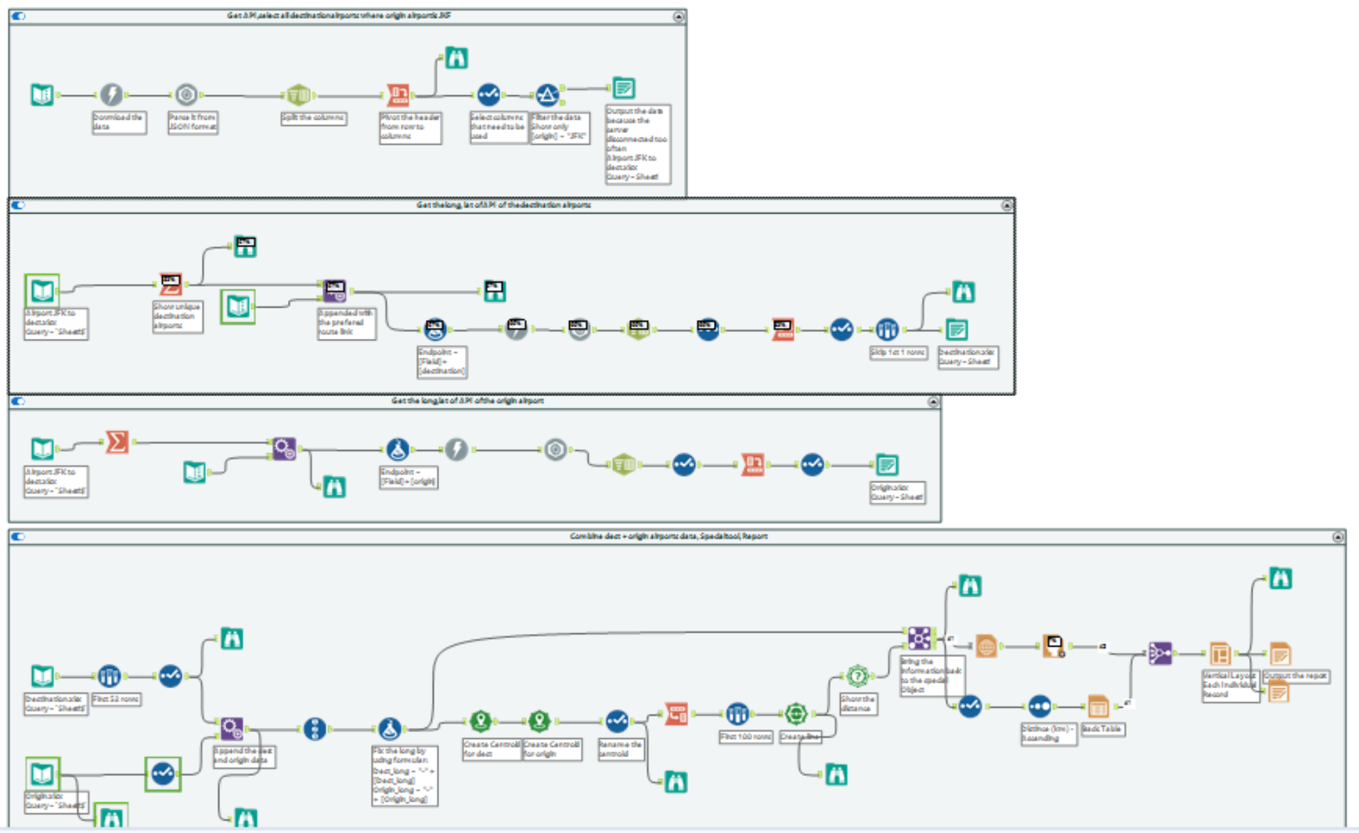
This is the Alteryx workflow at the end:
I tried to separate the workflows and out the data one by one. With this I do not need to get the API from the website each time when i ran the workflows so that I can avoid the error message.
1st container: get the name of all the destination airports from origin airport (JFK) 2nd container: get the latitude and longitude of the destination airports
3rd container: get the latitude and longitude of the origin airport
4th container: append the latitude and longitude of the destination airports and origin airport, create spatial object and report
This is the report I created at the end:

It will be great to have the airport name and city in the report. Also better to use a bar chart to show the distance instead of a table. Given that the time I wanted to prioritise the most important parts first. However, it will be good to have these features.