


This morning we received a task from Jenny and have been told to visualise OECD data using Power BI. We need to use at least 2 tables and bring it to the Power BI.
I started with a plan:
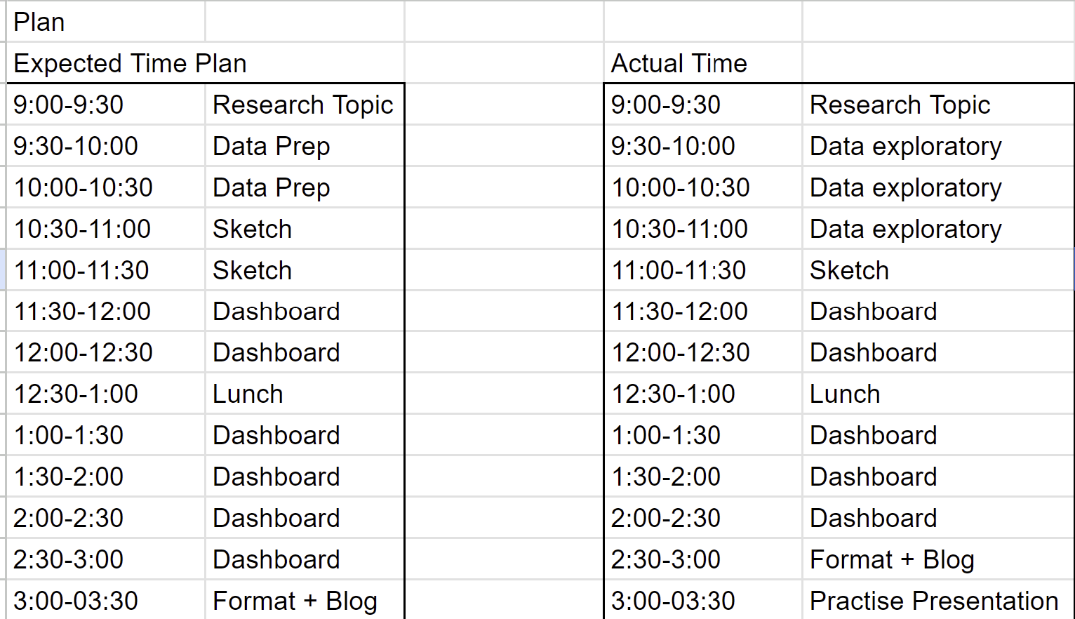
Based on yesterday's experience, I planned to spend more time on data exploratory this time, given that the data today was more massive and to choose 2 tables out of 8 tables in the dataset was not easy.
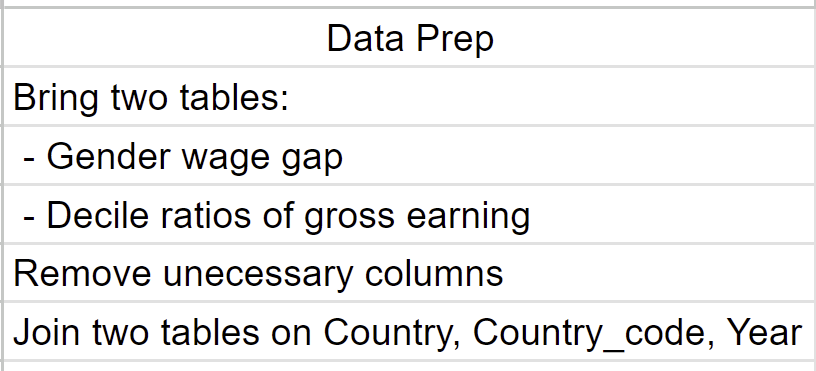
I decided to use the following 2 tables and did some data preparation using power query:
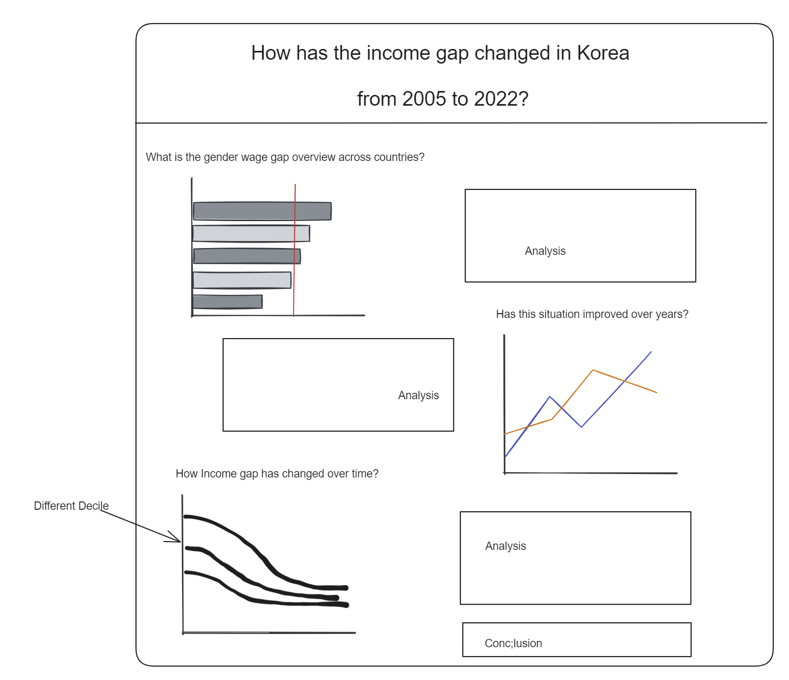
After connecting the tables, i started to sketch:
This is the report i created using Power BI (Link):
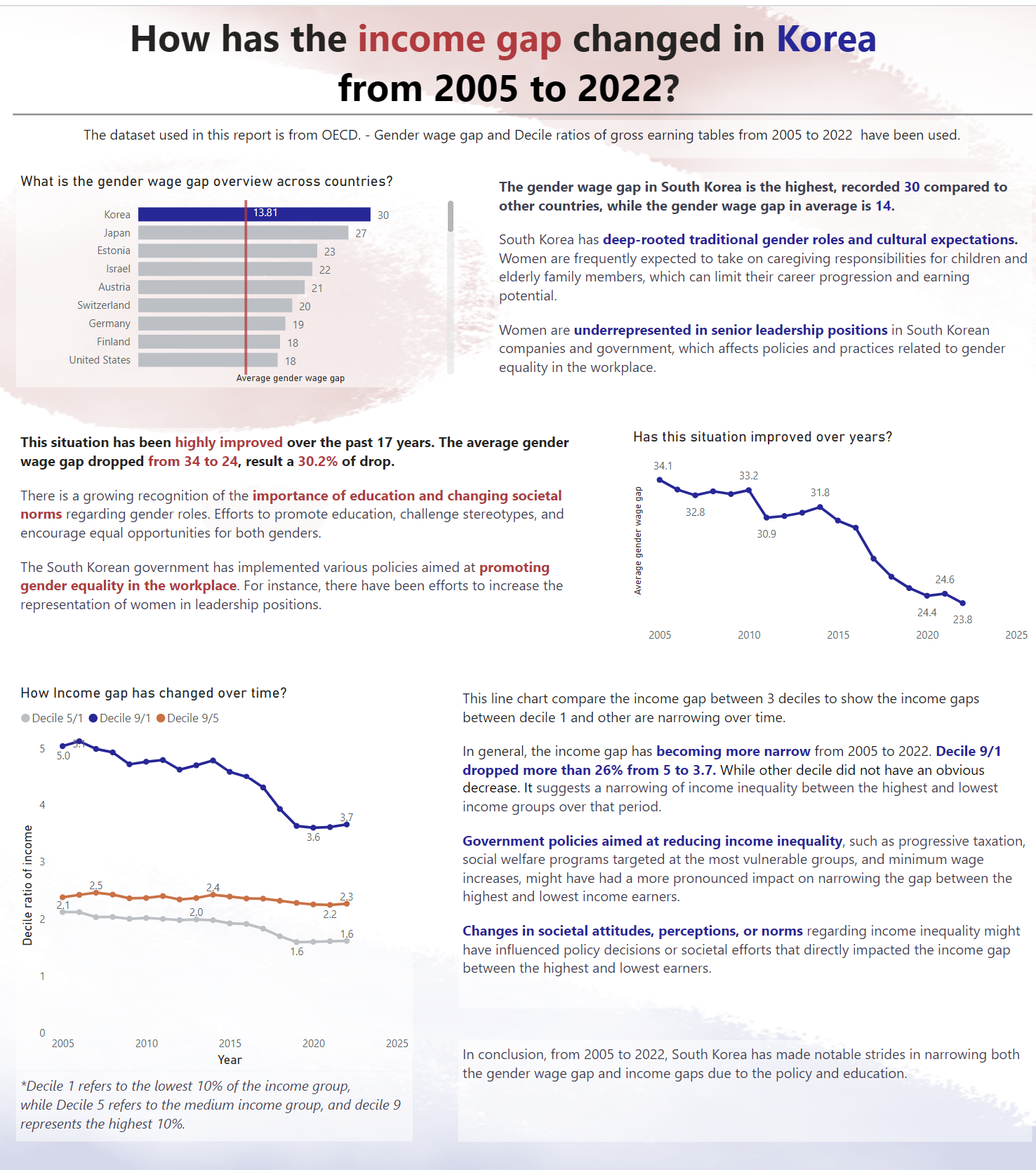
I pretty enjoy today's task, given that i achieved what i could not do yesterday (make the dashboard more explanatory). I am able to find some interesting insight with the dataset. Also managed to format and design the report within the limited time.