


Today we are required to visualise the data from this Shopping prices comparison tool.
I started with a plan:
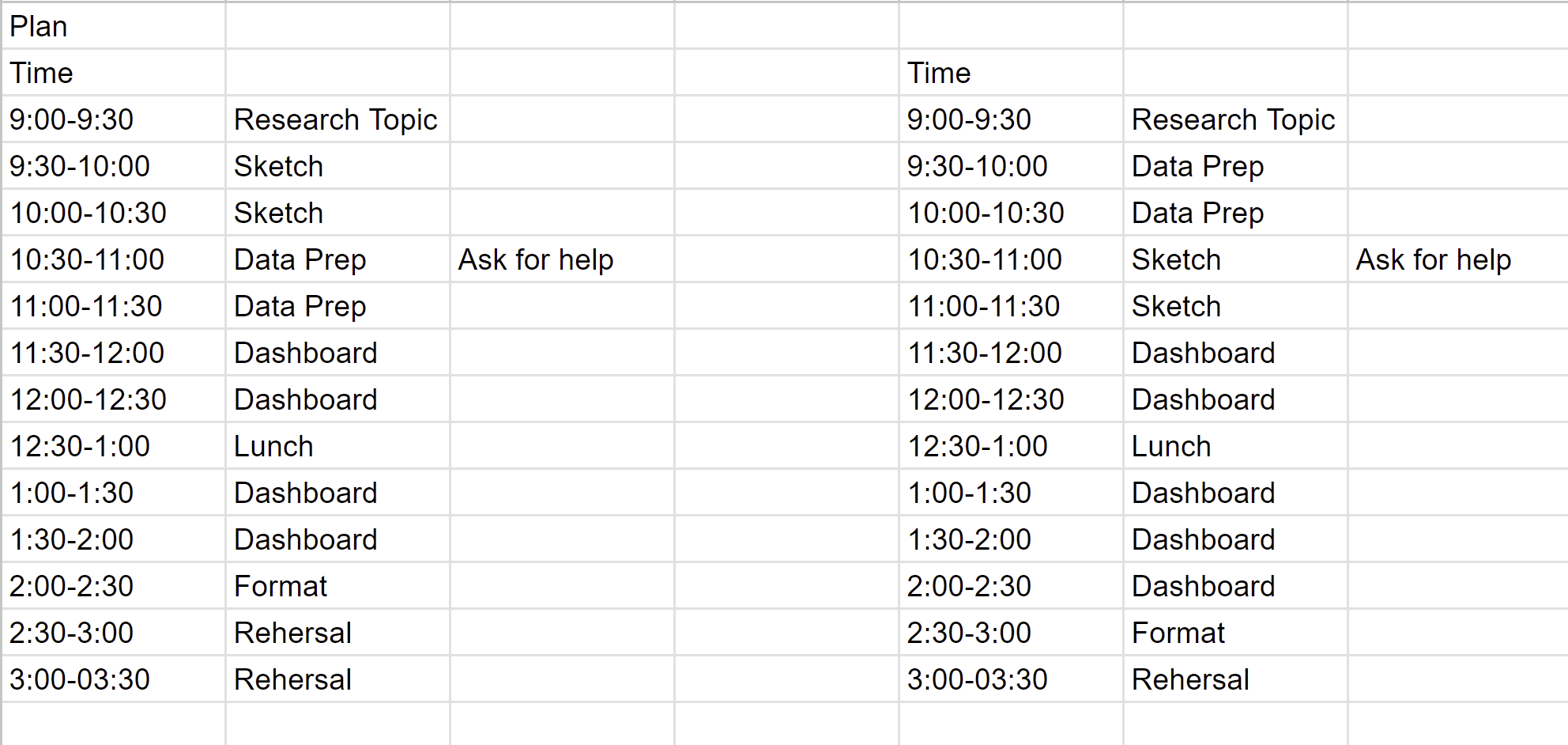
The left was what i expected and the right was what turned out at the end. I swapped the sketch and Data Prep in my original plan, which allowed me to understand more the dataset before i started to think what i wanted to show on my dashboard.
In term of the data prep, it was pretty strict forward. I expected to spend an hour on it but it only took me arounf 30 minutes to get it done. I planned to do the following:
Here is the sketch:

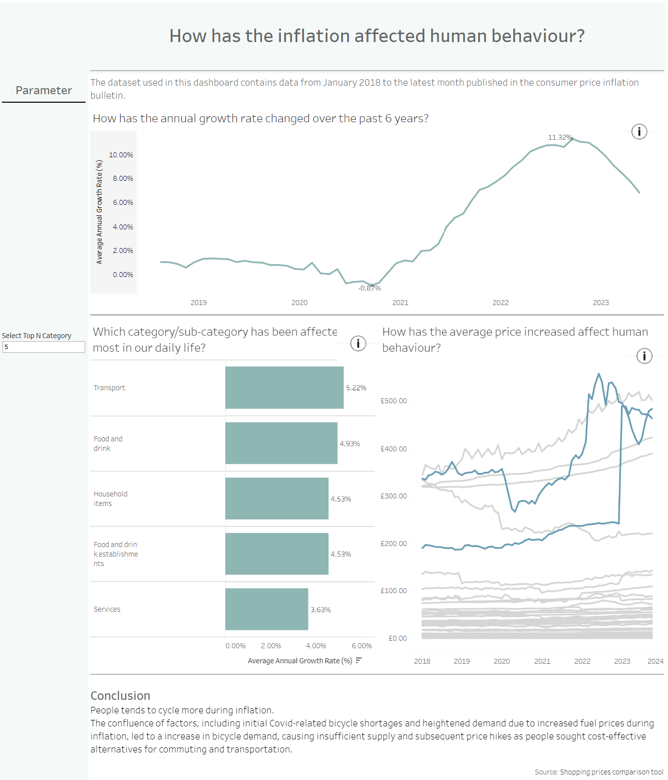
This is the end product (link):
There are some improvement to be made. The dashboard is quite exploratory instead of explanatory despite the last chart. It will be good to spend more time on understanding the data, finding some insight before started to sketch.