


When working on a time-sensitive project for a client, I was tasked with making sure that missing values were represented as zeros in various graphs. You might be thinking "Aaron, why not just click 'Show Missing Values' on the axis? This is easy peasy." Well, theory and practice are different. Missing or null values can mean different things, and be interpreted in different ways, in Tableau. The following represents some of the solutions I tried, and some of the pitfalls or contraindications for those solutions.
Show Missing Values - Cureall or Snake Oil?
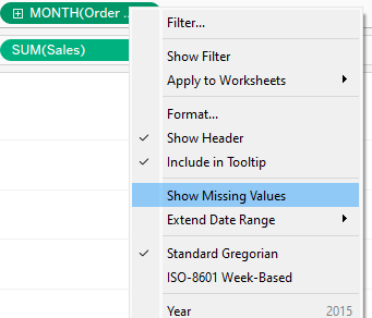
A feature that many Tableau users are aware of is the "Show Missing Values" option on time axes. This should show where values are missing. I mocked up a version of Superstore with all values for the entire month of April missing from the dataset, threw on the continuous Month of [Order Date] and Sum([Sales]) into the axes, hit show missing values and...
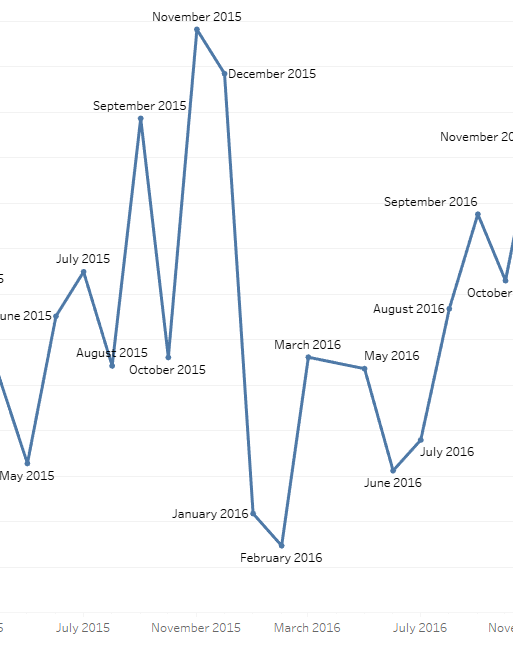
Unfortunately, this doesn't solve the problem - April's values are interpolated and without careful labelling you might not even notice that the values are missing at all. But maybe the problem is the date format - it's set to Month, so let's switch it to Exact Date. And on top of that, let's wrap Sum of Sales in a ZN function, since ZN turns null values into zero:
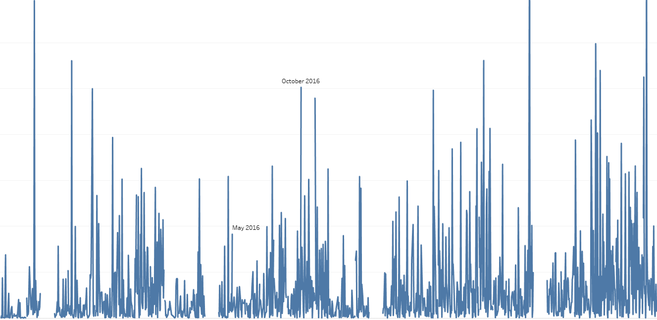
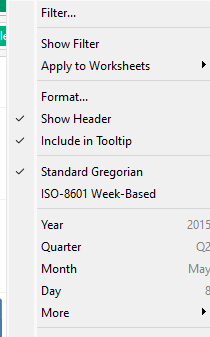
Now it's hard to see patterns, but you could make a field with DATETRUNC('month', [Order Date]) and do Exact Date with it. Still, though, all we see now is the gaps, even with ZN. ZN handles certain types of nulls, but if there are values missing from the dataset, as opposed to null values being present, it can't function. Furthermore, "Exact Date" gives you zero option to Show Missing Values:
Unfortunately this doesn't meet our needs. We're going to need to find a better option, something that tells the ZN() function that there's a null that it needs to turn into a zero.
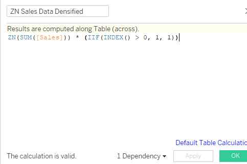
Are You Dense? Data Densification and You
Data densification fills in the gaps - makes data more "dense" - by creating values. In Tableau, if you can use a densification method and can also enable "Show Missing Values" - in other words, not using "Exact Date" - you can represent the missing data as zeros or however else you're handling nulls. The method I used relied on the INDEX() table calculation - as long as INDEX() > 0, I had it return 1/TRUE; it also (in theory) returned 1/TRUE even when INDEX() <=0. Nice idea, in theory. Applied to the ZN(SUM([Sales])) measure, the calculation looked as follows:
Applied to MONTH([Order Date]), I finally got my desired outcome:
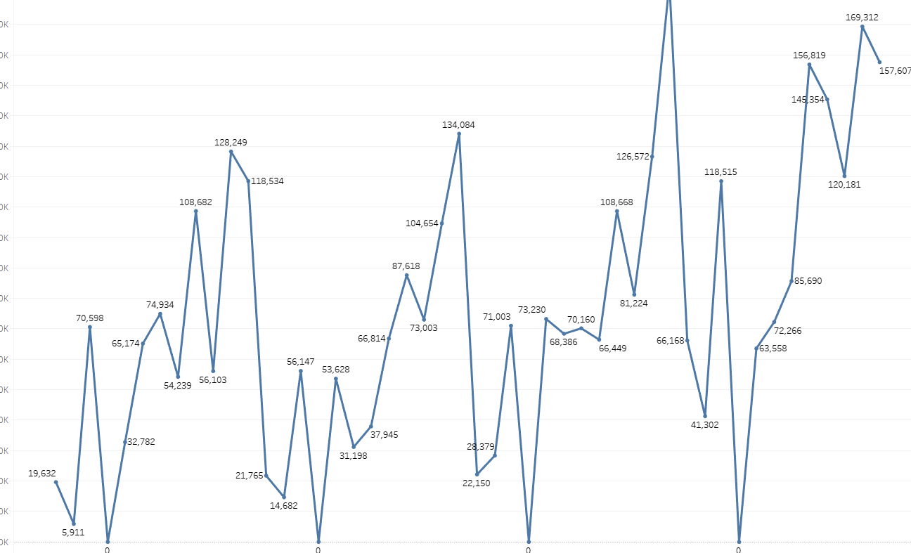
This solves the problem, you'd think. I have my zeros, I've met the client ask, everything is good. Right?
Ah. There is also data missing from the start of the time series. Tableau has no way of knowing to put an index there. Also, the client wants a switchable date axis with month, quarter, YoY, and other time series, and that requires using Exact Date or the line chart won't work. Very well. It's time for something we at the Data School New York office are very familiar with in our walks around town: Scaffolding.
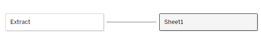
Scaffolding Dates and Supporting Your Data
In construction, scaffolds provide additional structural integrity to objects that lack it. In data science, that's what data scaffolding does with data sources. Computers generally don't magically intuit dates. They need to be told that particular dates exist. To do that, you construct a date table - a calendar - and join it to your data source. In my case, I built a month table - the lowest level of date aggregation I needed - and joined it to the [Order Date] field. Because Superstore stores the [Order Date] field as DateTime, I changed the relationship calculation to match my created [Date] field with DATE([Order Date]), but this isn't necessary in all datasets.
And the result was:
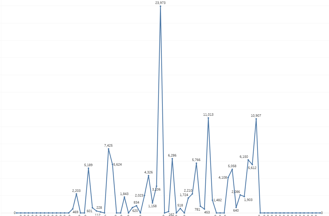
Fully densified data. It worked in Month, Quarter, and Exact Date views - and because of that last feature, I didn't need to worry about enabling Show Missing Values. Date scaffolding with a calendar requires a tiny bit of preparation, but many databases already come with a calendar table for precisely this purpose, and they're easy to create in Excel. I still needed to use the ZN function, but I didn't even need to bring in the extra calculation capacity of the data densification function - every month had a null, so every month could use ZN. Although I still needed to take that step on my client's project, the important bit was that after months of incorrect visualizations they finally had a good handle on the actual trends and values in their data.
Takeaway
The long and short of it is that it is generally a good idea to build a calendar and join it to your data, just so you don't accidentally miss any values. For some datasets it doesn't matter, but unless you're looking very carefully you or your stakeholders may not notice the existence of missing values. ZN, Show Missing Values, and data densification are all good for different use cases, but the calendar is your most reliable solution. If you become familiar with this method, you too might be described as a data sorcerer. Go forth and do some calendar magic.
Photo by Bruno Figueiredo on Unsplash