#Thisweek we have a blog-post-every-day week at DS5 so If you follow this blog, book some extra time for reading all 40 pieces 😊 I will keep my first one short and sweet for you.
To create an appealing data viz there are quite a few things to consider like the aim, audience, questions, best practices, design and so on. You can dive deep into the data, create some complicated calculations and discover amazing insights, but if your dashboard is an unaesthetic chaos (or a piece of art with all axes and labels hidden) then no one will really benefit from it.
Tip 1
How to make sure the audience will benefit from your dashboard?
The best way to make sure your dashboard is well designed is to ask for feedback. Show your work to a friend and see if he/she understands it without any further explanation. Make sure you ask about understanding first and then if he or she actually likes what they see.
Tip 2
How to trigger a creative idea?
That’s when Caroline Beavon comes to the rescue on a white horse.
Caroline – a professional infographics designer – has recently taught a whole day class for DS5. Amongst many useful things, she has showed us, this was my favourite: the grid. The grid is nothing more than a blank piece of paper with a layout split by 2 vertical and 3 horizontal lines. For me a game changer. How to use it?
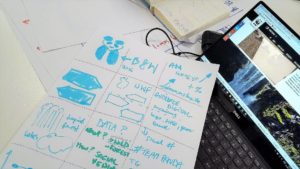
The idea is to fill as many squares with as many ideas as you can before you even deep dive into the data. It can be anything: from ideas for overall layout to just putting down a colour or font you have in mind. If you immediately realize that something will not work, just cross it out and move on to the next blank square. The beauty of it is that:
- you won’t be intimidated by the big blank piece of paper
- it will help you boost your creativity
- you won’t just selectively focus on one idea and loose the smaller, potentially better ones
- you will be able to better assess ideas and won’t waste time on the ones that wouldn’t work
- it will organise your work and the final outcome
I personally go back to the grid also after looking at the data and scribble over it throughout the whole process of developing a dashboard. I love it.
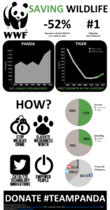
Below you can find the infographic I designed after classes with Caroline for the World Wildlife Day
https://public.tableau.com/views/WWFWildlifeinfographic/WWFWildlife?:embed=y&:display_count=yes
Wiktoria