In this post I’ll be covering how to make a compass map. I’ve attached a link to a downloadable workbook at the bottom and have included all calculations throughout the blog.
So lets begin with some context,
It’s day 2 of dashboard week and we were tasked to look at flight information.
An aspect of my dashboard was to look at delays and if there were any trends occurring with wind direction and weather related delays.
The first thought of visualizing this was to create a bar chart;

However that’s really not very interesting engaging.
After completing the project and when cleaning everything up I thought about if it could be represented on a compass.
After some googling, and help from other blogs, I found a way to create this in Tableau;
And will now share with you the the steps it took.
PS please ignore the name of my dataset – it was a tough day.
Step 1 – Converting direction to degrees
Since wind direction was already shown in my data set I created a calculated field to assign the relevant degrees to each value.

I’ve attached the formula at the bottom of the blog if you’d like to copy it;
Step 2 – Converting degrees to radians
I then created a calculated field which converted degrees to radians. I didn’t want to do this without step 1 just incase I made an error.
Step 3 – Creating Eastings and Northings
After creating the radians I created 2 more calculated fields for the Eastings and Northings using some trigonometry. The formulas are as follows;
Eastings;
SIN(SUM([Radians])) * SUM([Wind Speed])Northings;
COS(SUM([Radians])) * SUM([Wind Speed])Step 4 – Assigning Northings and Eastings
Drag Northings into the columns and Eastings into the rows and add what you’d like to separate onto detail in the marks card.

Now you should have a radial map!
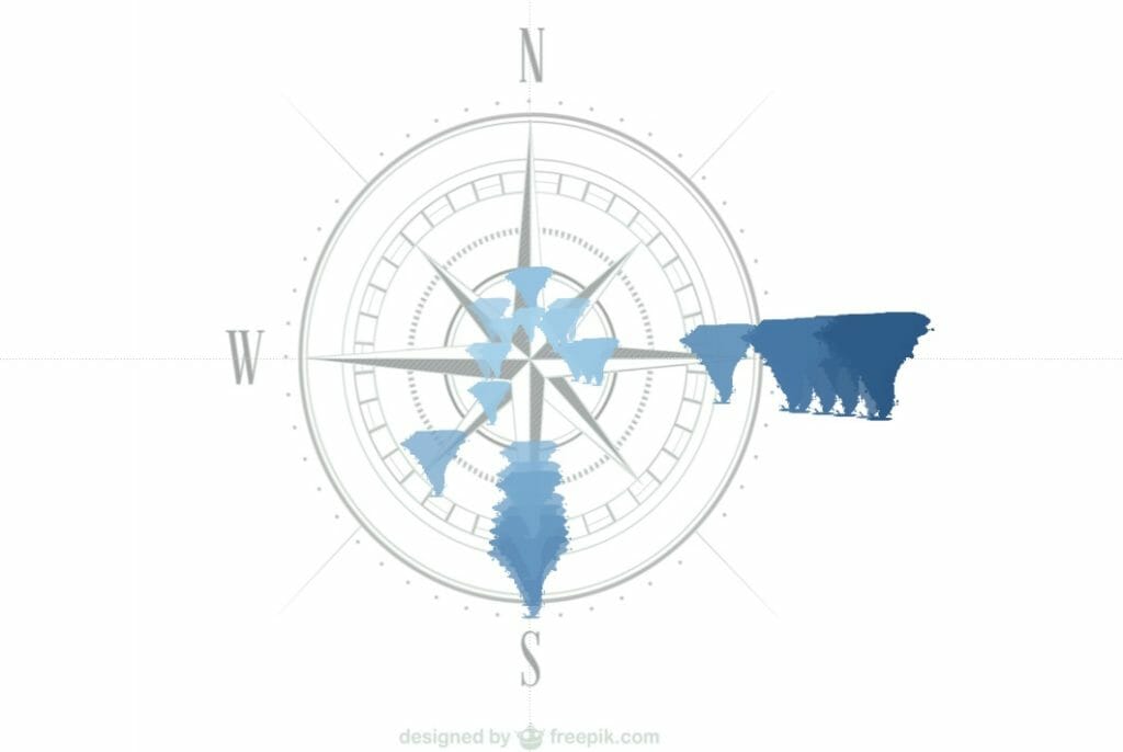
Step 5 – add the compass background.
Firstly, find a compass you’re happy with (I found mine on freepik.com). Now ensure the ratio of the image is 1:1 and that centre of the compass is in the exact centre of the image.
Now go back into your worksheet and follow the diagram – selecting the data source you’re using

In the window that appears select “Add Image” and the following window should then pop up;

Select the image you would like from the ‘Browse’ button and edit the axis. Be mindful for the scale of the axis as you would like the compass to be in the center of the screen.
Step 6 – Touching up
Edit the marks and you’re done! I added some hurricane icons as shapes and also put windspeed on size to further emphasis where the wind doth blow.
The worksheet I’ve used is available to view and download on Tableau Public if you’d like to view, download or pick apart.
I hope this post has allowed you to see that there are always different ways of visualize data and makes you think of searching for new ways in the future.
If you wish to go out If you have any comments, tips or suggestions please feel free con contact me on Twitter or Linkedin.
Thank you for reading!
As promised, the calculation for assigning degrees;
IF	[Wind direction]	=	"Northest"	THEN 	315
ELSEIF	[Wind direction]	=	"North"	        THEN 	0
ELSEIF	[Wind direction]	=	"Northeast"	THEN 	45
ELSEIF	[Wind direction]	=	"East"    	THEN 	90
ELSEIF	[Wind direction]	=	"Southeast"	THEN 	135
ELSEIF	[Wind direction]	=	"South"	        THEN 	180
ELSEIF	[Wind direction]	=	"Southwest"	THEN 	225
ELSEIF	[Wind direction]	=	"West"	        THEN 	270
END