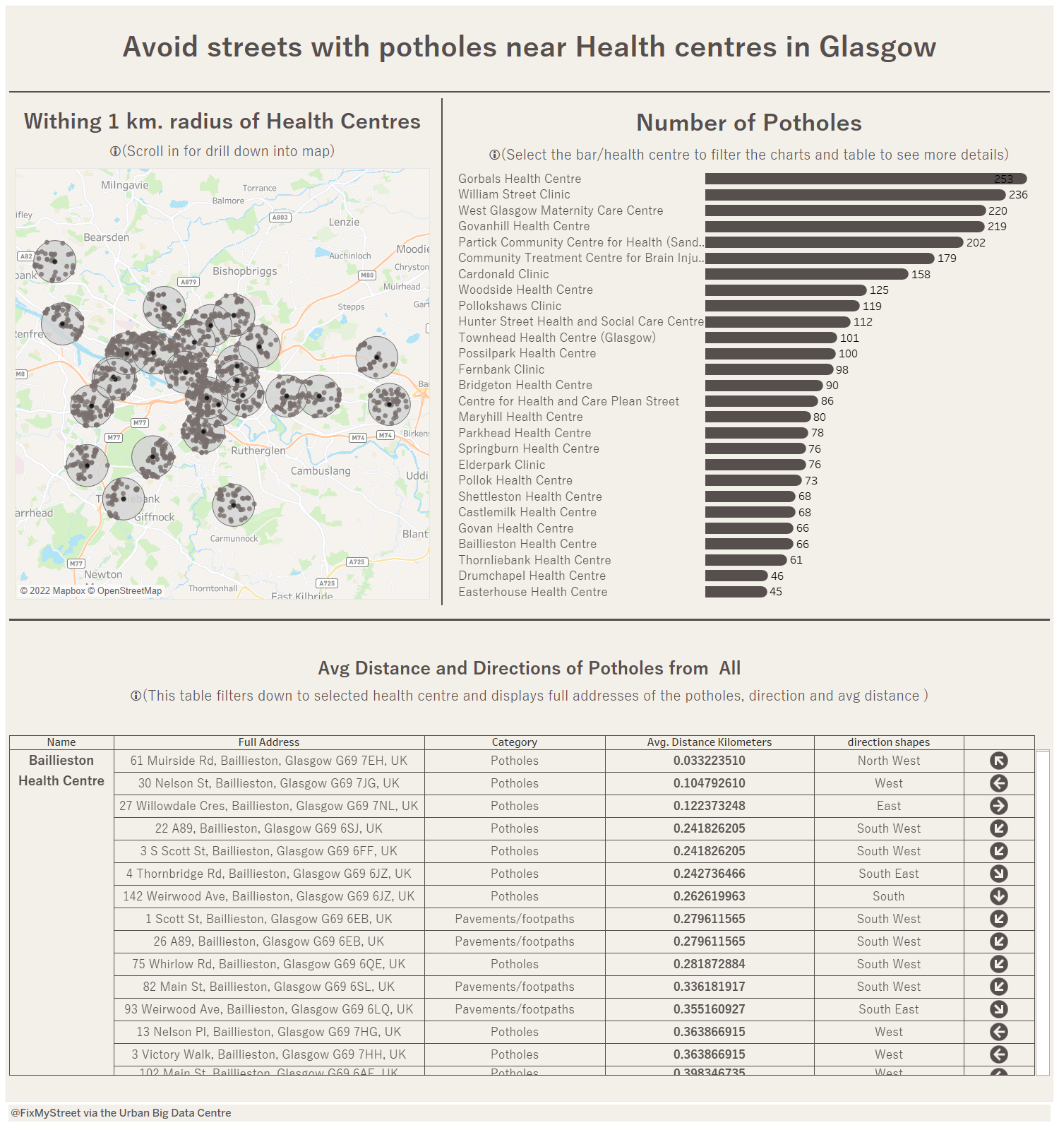
Today's task objective was to create and design the dashboard with the broadest set of users in mind, and be usable by people with motor and/or visual disabilities. We used potholes in Glasgow city data from 'FixMyStreet via the Urban Big Data Centre'.
To start the designing, i decided look into color blindness and motor disability. My plan was to use minimum colours and less interactivity with visual cues for the dashboard.
I started with data prep with Alteryx. To begin with, these dataset did not have enough information to produce analysis. To add more content to data i decided to extend with more datasets like health centres in Glasgow. The list of health centres dataset is downloaded. I used spatial tools to get more information out of the datasets.
Design decisions: I tried to stick on one colour dark brown which is safe with colour blindness. Another idea was to explain the interactivity with words and icons. Also, i used very less interactivity with one filter action on dashboard. To make it even simpler for motor disability, i created the table with visual cue of direction and bold letters for draw the attention on important measures.
Here is the dashboard with simple and intuitive design: