Using parameters is a great way to improve your viz by allowing users to interact with your work and make their own choices about how they would like to explore the visualisation.
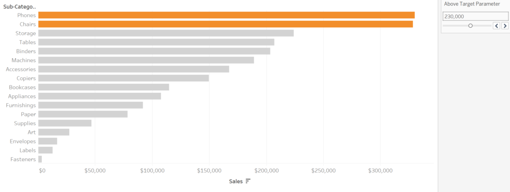
Here’s a guide to creating a parameter which will automatically change the colours of a bar graph depending on whether a target has been met or not. The aim of this visualisation is to be able to quickly and easily identify what sub-categories have met their targets in the graph below:

Here’s a step by step guide to creating parameters that you’ll need!
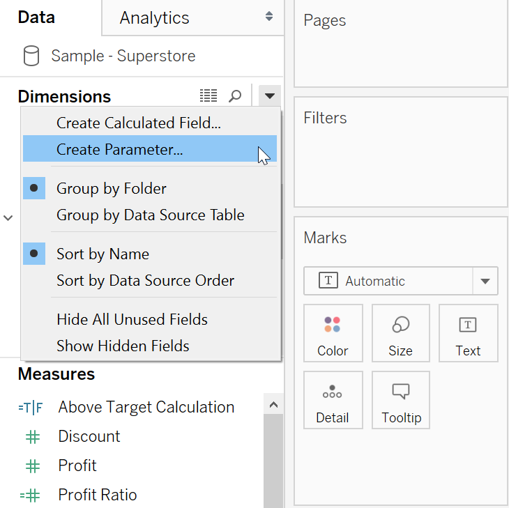
Step 1 – Create Parameter
The first step is to actually created the parameter itself. From the data pane, click the drop-down menu and choose ‘Create Parameter’.
This will then open up a dialog box from which you can make some choices about what needs to be included in your parameter.
You will need to set the parameter up with the following information:

Top Tip – Writing a ‘k’ after a number, means that Tableau will automatically create this into thousands for you. This also works for ‘m’ – Millions & ‘b’ – Billions. It’s a great time-saver and makes sure you are accurate when the numbers get big!
Step 2 – Show Parameter Control
The next step is to show the parameter controls on your view. This is nice and easy! This is done by right-clicking on the Parameter in the data pane, then pressing ‘Show Parameter Control’.

Step 3 – Create Calculated Field
Up next is to create a calculated field that can be used by the parameter. Again, this is completed by clicking on the drop-down menu on the data pane (same as creating a parameter), and then choosing ‘Create Calculation’.
Within the calculation we need to identify when the ‘Sales’ are greater than the value within the ‘Above Target Parameter’ that we have just created. This is a simple calculation below:

Step 4 – Bring the Calculation into the View
Now that we have all of the necessary elements created, we need to bring the newly created calculation into the view. As we want the colour of the bars to change depending on the value in our parameter, we need to drop the ‘Above Target Calculation’ onto the colour mark.

This is the final step needed and you will now have a bar chart which changes depending on the sales target set within the parameter.
To make this even better, we can add a reference line to give even more visual emphasis for the viewer. This again can be linked to the parameter so that when the parameter is adjusted, the reference line will also change to reflect this.
Below is what’s needed for the reference line:

And here’s the final result!

I hope you have found this blog post useful and can now get stuck into the wonderful world of parameters!