It’s dashboard week!
Well the curse of dashboard week has hit already. This morning we were locked out of the parkrun website due to hitting the site too many times, oops!
Then, unfortunately I had to go to the hospital due to an abrasion to my cornea (eyeball) which I somehow managed over the weekend – double oops.
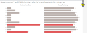
So I came back to the DS just as people were leaving to find out we had a new dataset with Andy’s food travels in Rome. I had 45 minutes to make my viz – so it’s a pretty simple and basic one today. But hopefully one you can enjoy. Here it is:
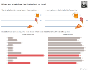
If you go to my tableau public you can see how the charts filter whenever you click on one of the bars. This is a dashboard quick filter – a really easy and quick way to add some interactively to your tableau vizzes. All you need is two or more charts that have common fields. Take the example in my viz. I have food types in the top two bars, and times in the bottom. I want to filter the charts so that when you click on a food type it filters the times Andy eat that particular food, and vice versa. All this takes is two clicks. OK. I lie, I’m adding them to three charts so it’s 3×2 which is 6. Simply click on the chart you want to use as a fitler, and hit the little egg timer shaped icon. Voila – it’s done. Yes, that easy.
If you didn’t already know how to do that then now you do. And if you already did then apologies – I hope to learn and share some more valuable tips later on in the week. Keep posted!