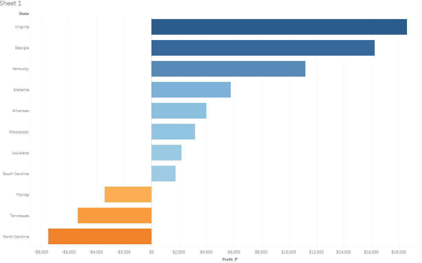
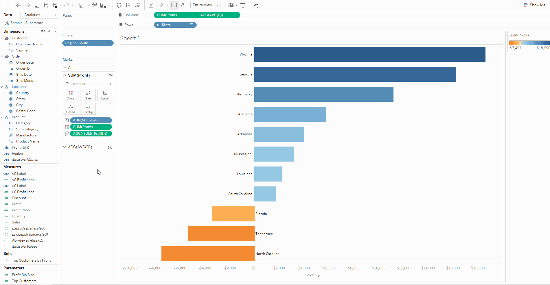
For our most recent client project, I created a chart that looked something like the image below, but I wasn’t happy with the formatting.
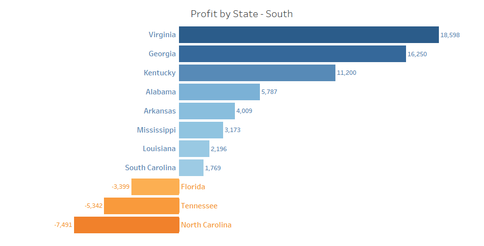
In this blog, I’ll explain how I made (with Andy’s help) the following, recreating it with the default Superstore data set. The images and GIFs should illustrate the process, but I’ll describe it with text too if you need more detail.
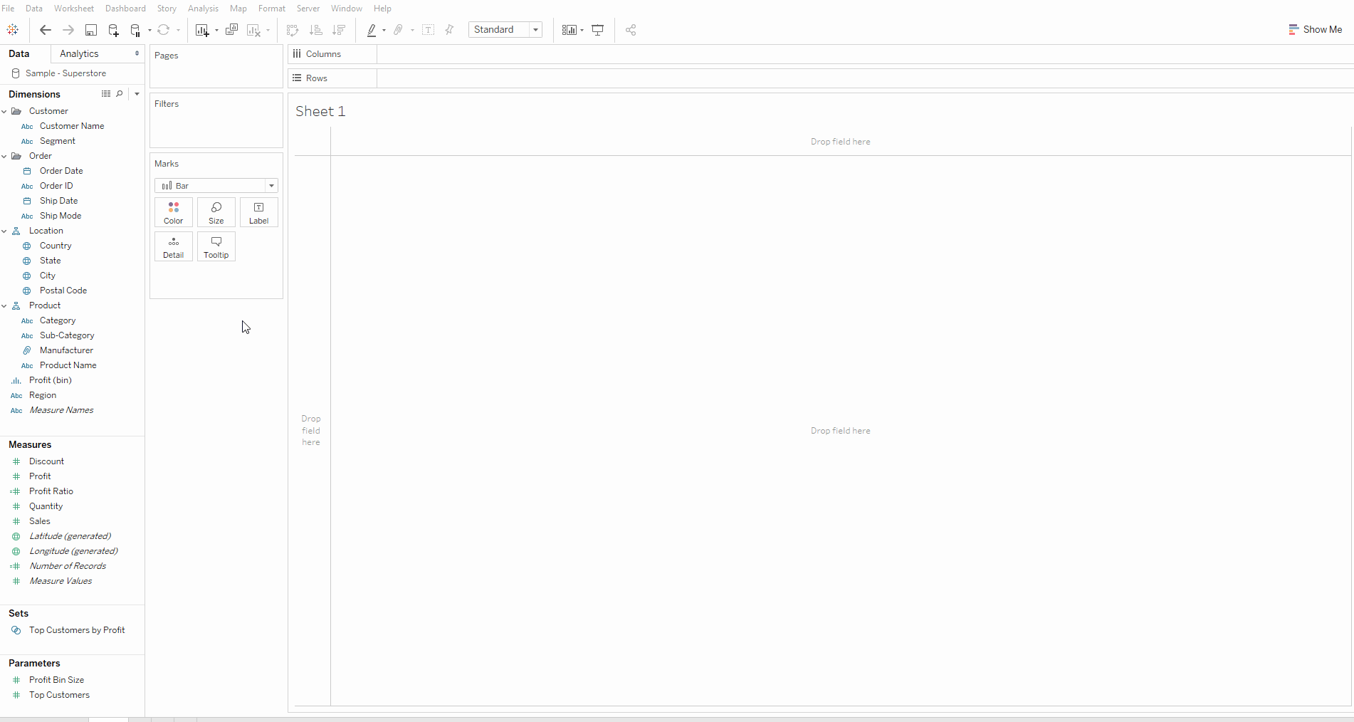
1. Make the Chart + Basic Formatting
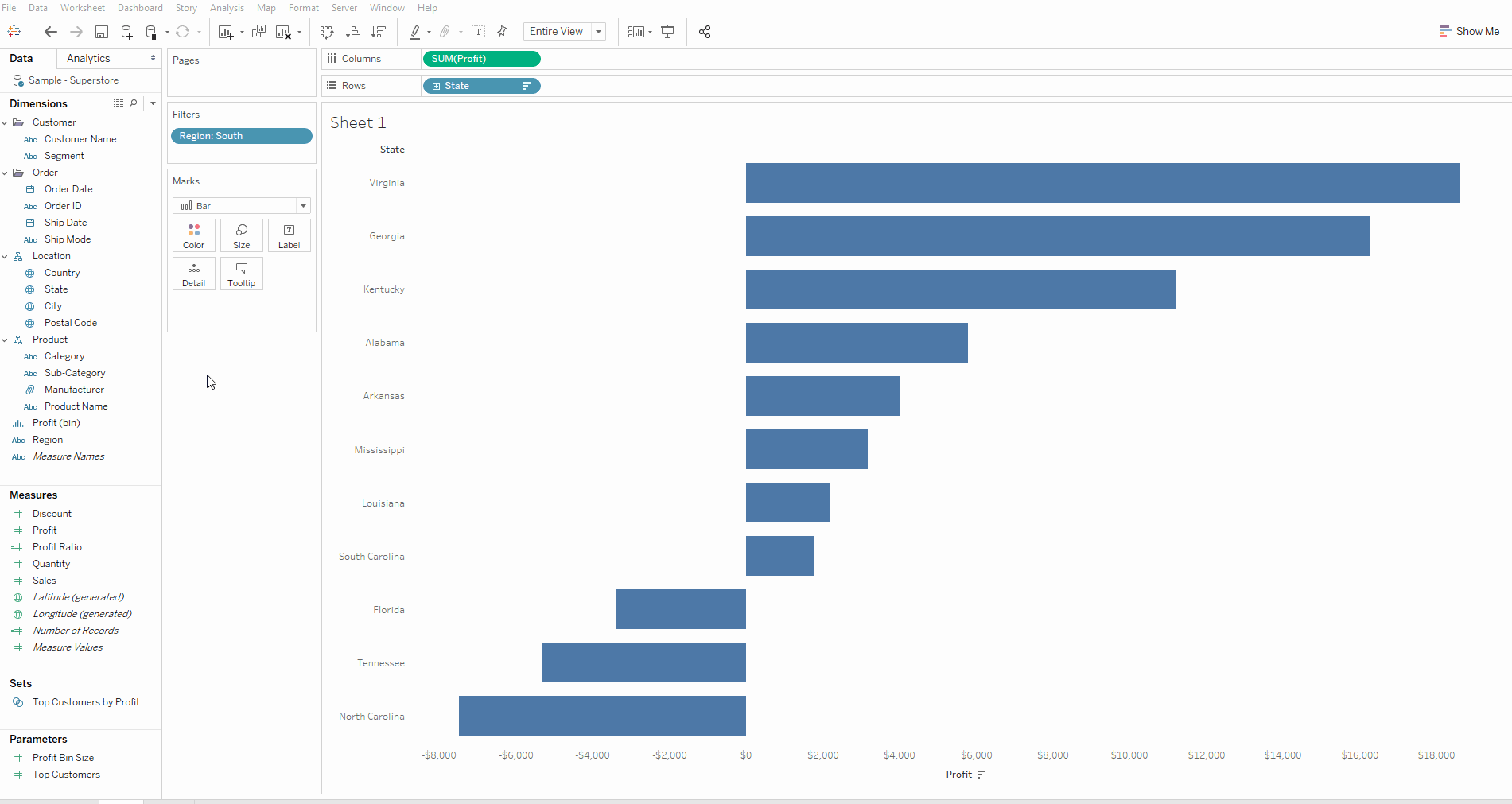
a) Drag ‘State’ to the Rows and ‘Profit’ to the Columns
b) Filter by Region
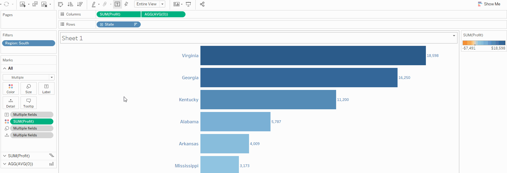
I only did this for the purpose of this demonstration so that there were fewer bars to look at.
c) Remove Gridlines and Zero Lines
Here I formatted the whole workbook as I think it’s a neat trick to know, but you could just format the sheet as described in my previous blog post. I also changed the view to ‘Entire View’.
2. Label the Bars Using AVG(0) and Gantt Bars
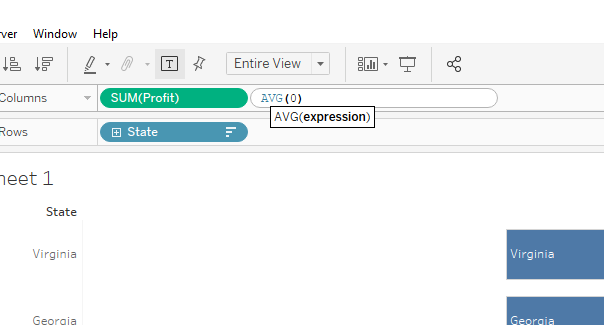
a) Prepare to Make a Dual Axis With AVG(0)
We want the labels to be on opposite sides of the zero line and also next to the bars, however we cannot do this with a single axis bar chart. As we see in the first GIF below, the labels rest within the bars, not outside them. (Top tip: you can hold CTRL and drag a field to copy it whilst leaving it in the view)
Therefore, to get around this fact, we can create a field consisting of the average of zero, which assigns a value of 0 to every row. It needs to be a measure as we want it to ‘fill the view’ (see here), not group the data, so we must aggregate it to some level. I chose an average, but a sum, min, max etc would have worked fine too as any aggregation of zero is zero.
b) Create Label Fields for ‘Profitable’ and ‘Unprofitable’ States
Now we have our AVG(0) field, we are a step closer to labelling our bars correctly.
We need two sets of labels so we can separately align them on our chart; we want to left-align profitable labels and right-align unprofitable labels. Here are the formulas I used:
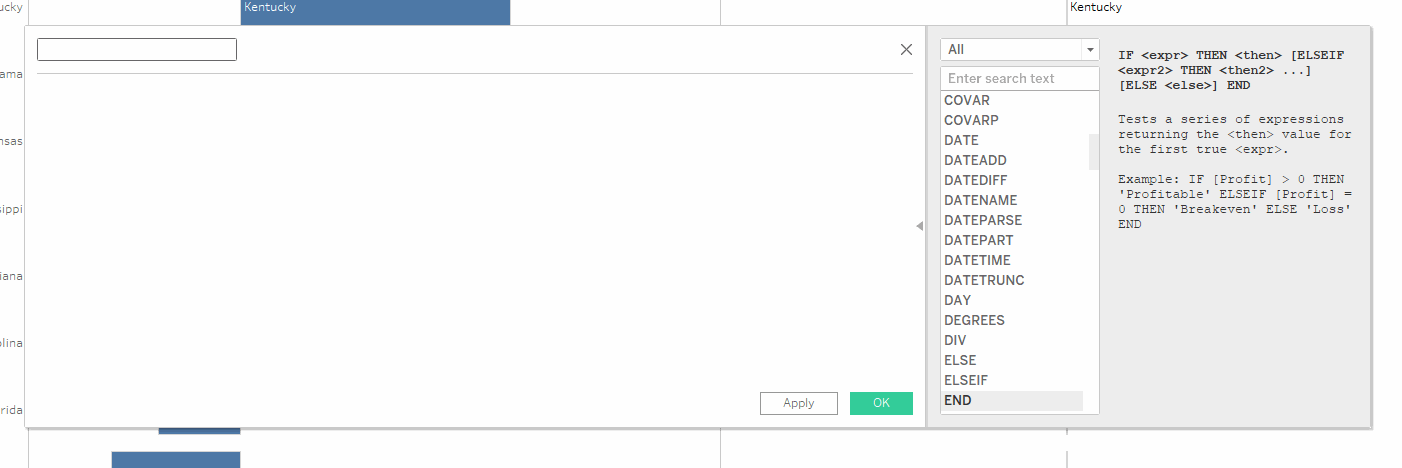
Profitable label (>0 label): IF SUM(Profit)>0 THEN ATTR(State) END
Unprofitable label (<0 label): IF SUM(Profit)<0 THEN ATTR(State) END
I’ll take you through my reasoning for the profitable label as an example. Essentially, where the sum of profit (for each state as that’s what we have in the view) is greater than zero, it will return the name of the state. As you are summing (aggregating) profit, you must also aggregate state, which is why we need the ‘ATTR’ or attribute function. More on this function can be read about here.
So what happens if the sum of profit is less than zero? We did not include an ‘ELSE’ in our IF statement, so Tableau defaults to returning null for everything that isn’t profitable. We could also have written ‘ELSE NULL’ but why overcomplicate it?
c) Add the ‘Profitable’ and ‘Unprofitable’ Labels to the View
- Remove State from label on the ‘All’ marks card
- Drag the ‘ >0 label’ to label on the ‘AVG(0)’ marks card
- Drag the ‘ <0 label’ to label on the ‘SUM(Profit)’ marks card
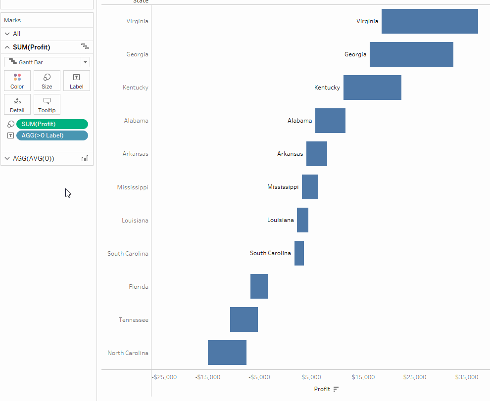
d) Convert to Gantt bars
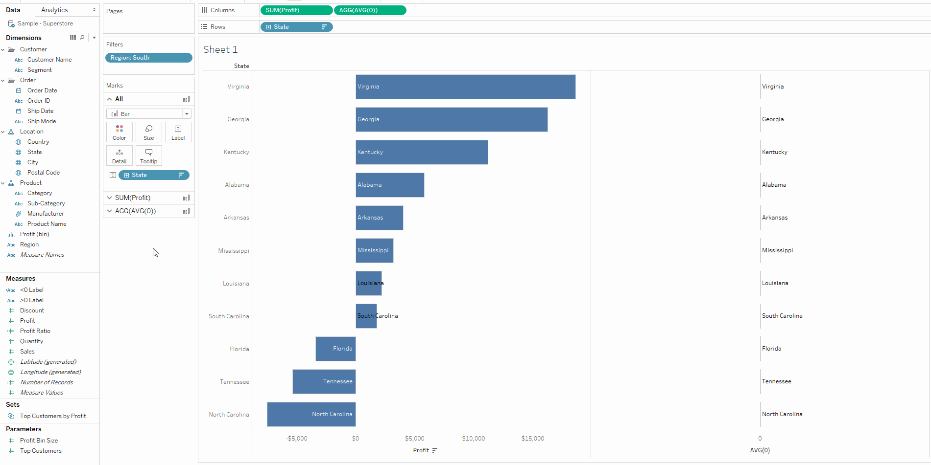
Now our ‘unprofitable’ labels are correctly positioned to the right of the bars. However our ‘profitable’ labels remain inside the bars, despite being left-aligned as shown by the image below.
This problem didn’t seem solvable to me at first, but Andy showed me that a Gantt chart can be used to essentially replicate the bar chart, allowing us to place our labels to the left of the bars rather than inside them. When we change ‘Bar’ (on the SUM(Profit) marks card) to ‘Gantt Bar’, this is the view we should get.
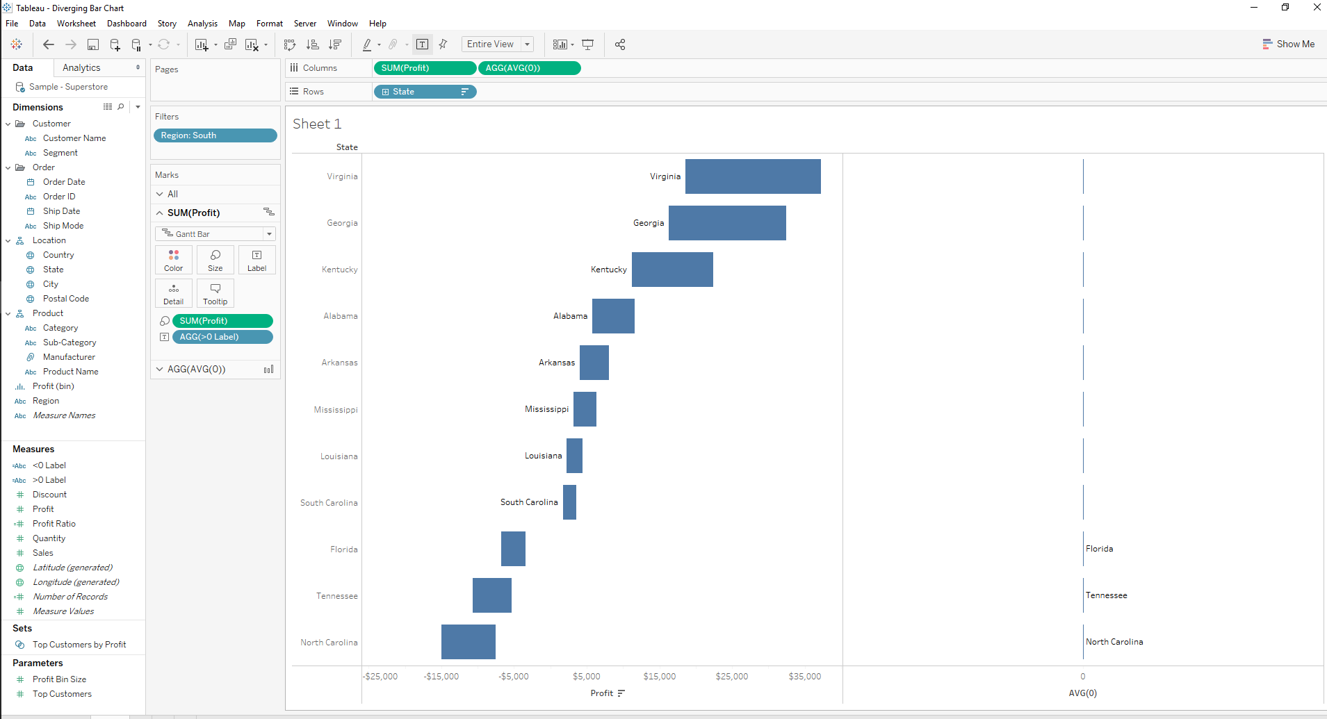
To understand what the Gantt bar is doing, let’s take a look at North Carolina as an example, where the sum of profit is about -7,500. The Gantt bar starts at this value and also is sized by this value by default, so it starts at -7,500 and extends another -7,500 to -15,000. Therefore, if we just make the size -SUM(Profit) instead of SUM(Profit), we’ll still start at -7,500 but go back 7,500 to 0.
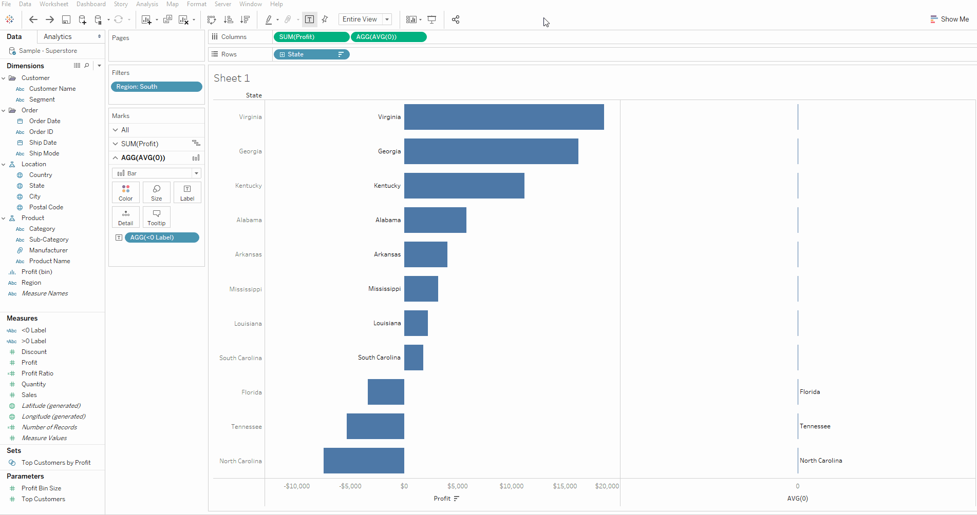
e) Dual axis + Synchronise Axis
Now we can make our dual axis and synchronise them for correct alignment:
- Right click on AVG(0) and select ‘Dual Axis’
- Right-click on the profit axis and select ‘Synchronise Axis’
f) Additional Formatting
We can also clean up the chart a bit at this point:
- Drag ‘Profit’ to colour for additional visual impact
- Hide unnecessary state headers – right-click on one of the state names (on the left) and untick ‘Show Header’
- Hide the AVG(0) axis – right-click on the AVG(0) axis and untick ‘Show Header’
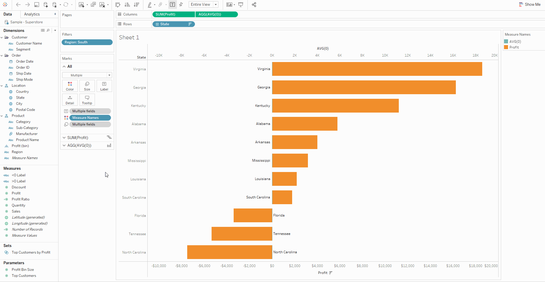
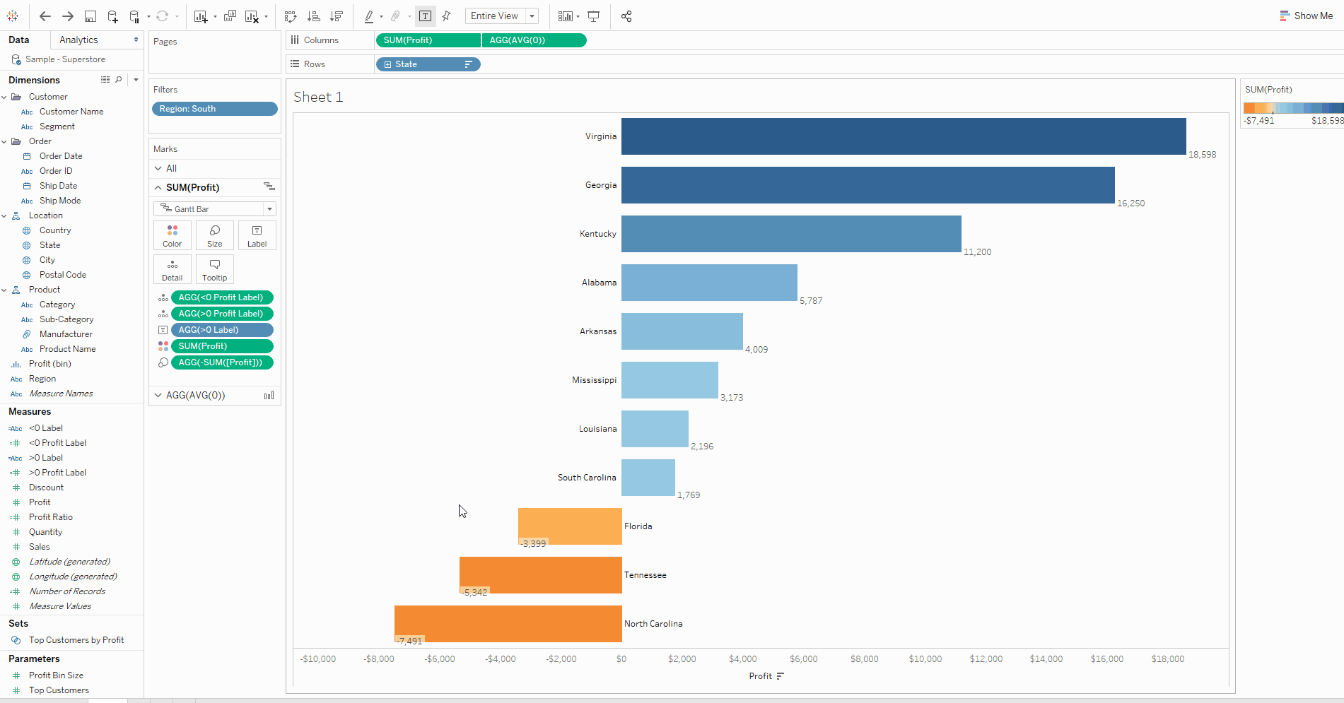
3. Profit Label For Each State
a) Create two more calculated fields for the <0 and >0 labels
After getting my state labels in the desired position, I wanted to have labels for profit next to the bars, coloured by whether they were negative (orange) or positive (blue).
To do this, we must create two more calculated fields, one for >0 and one for <0 as we did for the state labels. The difference here is that we want to return the value for profit rather than the state. I called them ‘>0 Profit Label’ and ‘<0 Profit Label’ (I know the naming of these could be clearer):
>0 Profit Label: IF SUM(Profit)>0 THEN SUM(Profit) END
<0 Profit Label: IF SUM(Profit)<0 THEN SUM(Profit) END
A quick way to make these is to duplicate the ‘>0 Label’ and ‘<0 Label’ calculations we made earlier and replace ATTR(State) with SUM(Profit).
b) Adding the New Labels to the View Using Reference Lines
Now we want to add our labels to the view.
Our ‘profitable’ or ‘>0’ state labels are left-aligned, but we want our profit labels to be right-aligned. As we can only pick one alignment per marks card, we must use reference lines to display these labels on the opposite side:
- On the SUM(Profit) marks card, drag ‘>0 Profit Label’ to detail. It is now ‘in the view’ so we can use it with our reference line
- Go to the analytics pane
- Drag reference line to the cell level for SUM(Profit) (as we want one line per state)
- Change the line value to ‘>0 Profit Label’
- Change the label to ‘Value’
- Format the line to be ‘None’
- Repeat these steps for ‘<0 Profit Label’
c) Format the Reference Lines
The default formatting for reference line labels isn’t very visually pleasing, so let’s change a few things. For the ‘>0 Profit Label’ reference line:
- Right-click the reference line and select ‘format’
- Under ‘Alignment’, make it right-aligned horizontally and centre-aligned vertically
- Change the font colour to blue and make it bold
- Repeat for the ‘<0 Profit Label’ reference line
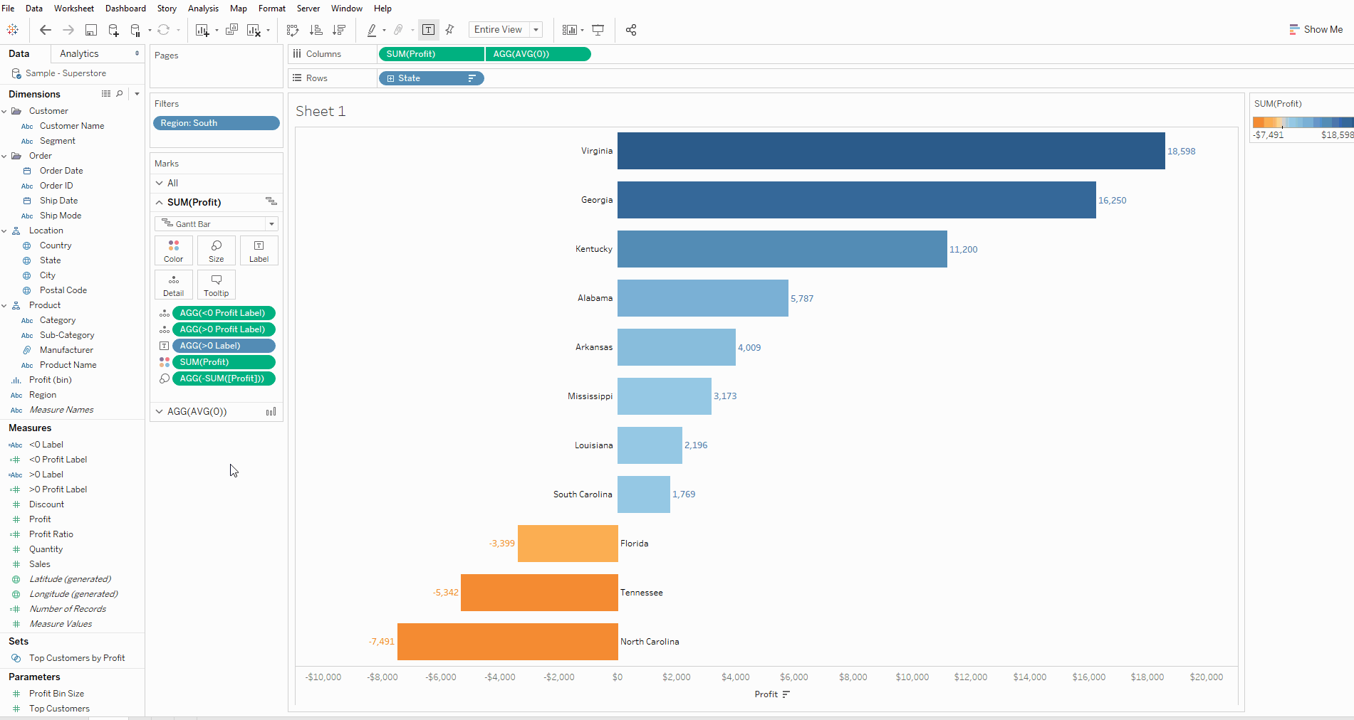
4. Finishing Touches
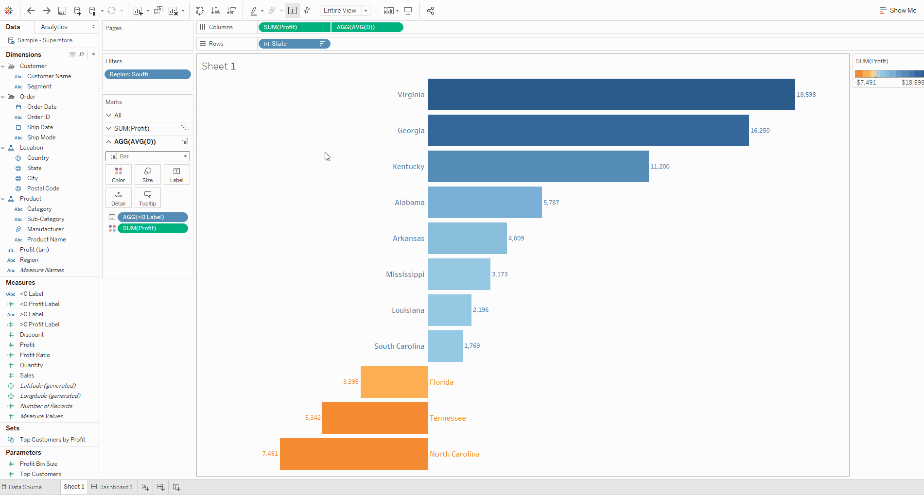
a) Remove Profit Axis
Right-click on the axis and untick ‘Show Header’
b) Increase the Size of the Bars
Click on ‘Size’ on the ‘SUM(Profit)’ marks card and increase the size
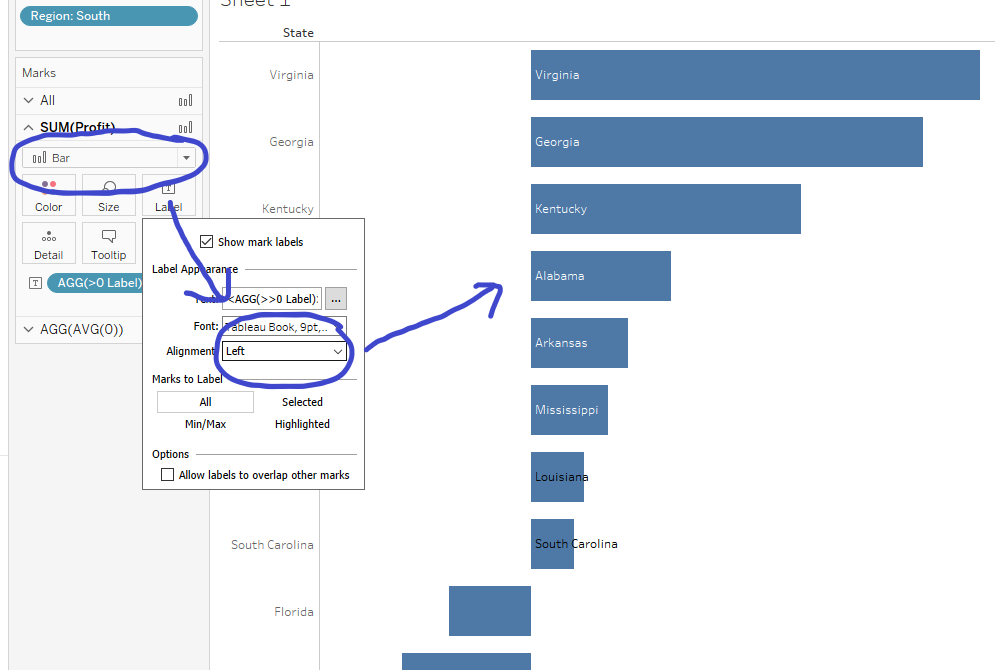
c) Format the State Labels
Click on ‘Label’ on each marks card and make the font bold and blue/orange (this will change only the state labels because the profit labels are associated with the reference lines)
d) Remove Row and Column Dividers
Right-click on the chart, select ‘Format’ and navigate to the borders pane. Change the row and column dividers to ‘None’.
e) Nice Tooltips
If you hover over one of the bars, the tooltip should look quite messy, so let’s edit it from the ‘All’ marks card. My suggestion here would be to create a sentence, such as:
In <State>, the profit was <SUM(Profit)>
f) Dynamic Title
Finally, let’s create a dynamic title which updates when we select a region:
- Double-click the sheet title to edit it
- Remove <Sheet Name>
- Give it a name, I chose ‘Profit by State’
- Then insert the field ‘Region’ (or type <Region>)
- This will then automatically update when another region is selected.
And there we have it! A clean diverging bar chart.
I hope you could follow along easily, please comment if you can think of another way to do it, or if you have any questions. For more from me, check out my Twitter and LinkedIn pages.
