Was a relief to see that today’s task promises to include less data prep and more dashboarding.
After reading the blog, I sketch the plan for the day.
- Download and look through the data just to get an idea of what is in there
- Dataprep if needed
- Read a bout the topic
- Sketch viz
Do all this by 11am, leaving me 4 hours to work on the viz and 1 hour to write the blog.
How it actually happened….
Learning from Monday’s experience, I read the context that was on the viz for social good web page before doing anything.
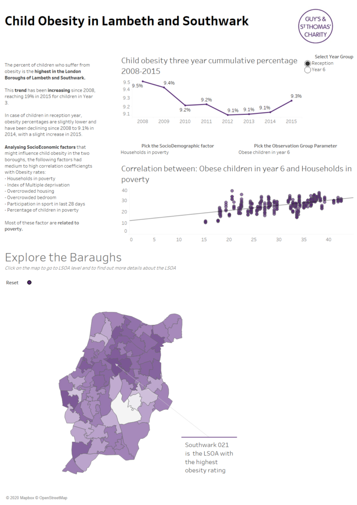
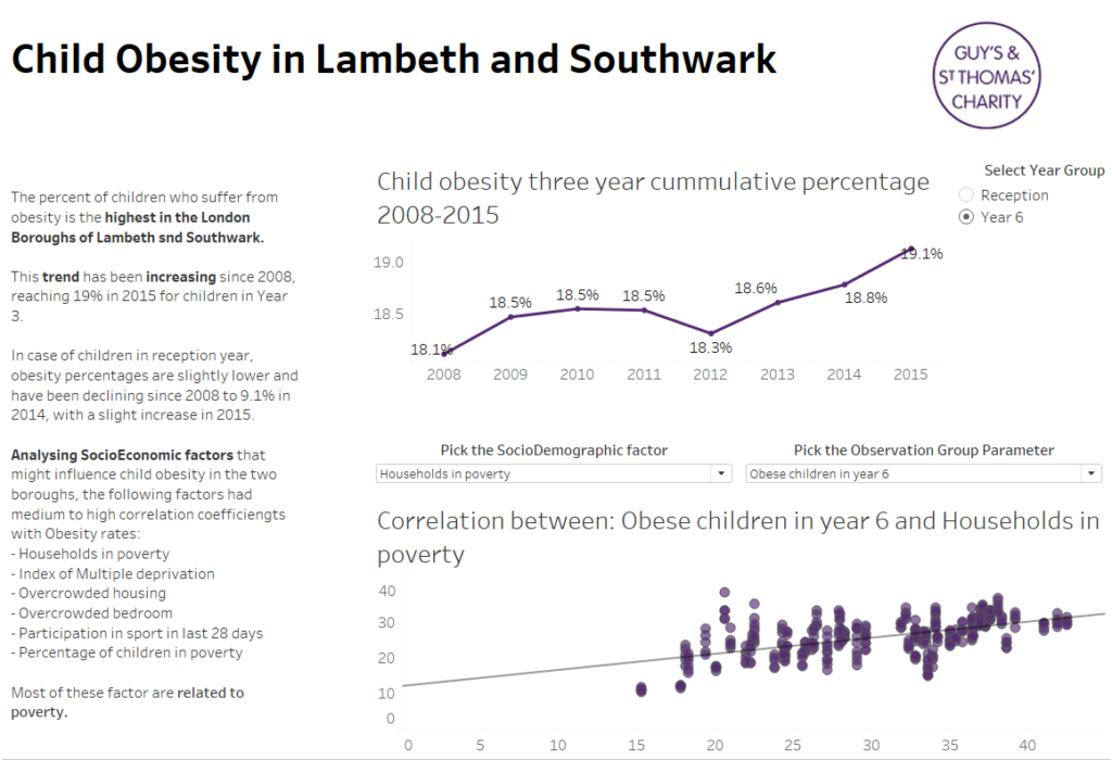
So I noted that the purpose of this dashboard should be to help Guy’s & St Thomas’ Charity to understand where to target its resources and which areas to fund in the London boroughs of Lambeth and Southwark, to help childhood obesity levels. The questions they would like to focus on were:
identifying places most (and least) affected by childhood obesity
- identifying who lives in the areas, using a range of socio demographic data
- identifying what the contributing factors are. e.g. by exploring pollutant concentration levels, emissions data and sources of emissions with a particular focus on traffic and time
- identifying how the childhood obesity has evolved over time
- Identifying neighborhoods across the UK that have similar characteristics to neighborhoods in Lambeth and Southwark with high obesity rates.
I knew I wouldn’t have time to explore the last point so I decided to focus on the first three, and narrow down the area to Lambeth and Southwark.
As a first step I really wanted to identify all the factors that correlate with Child obesity. To do this I tried to use the Association Analysis tool in Alteryx, that would create a table with all the Correlation coefficients for all the variables. I used this one to identify the demographic factors that I want to focus my analysis on.
As I have never used the tool before, it took a while to get it to work and then to select the relevant factors.
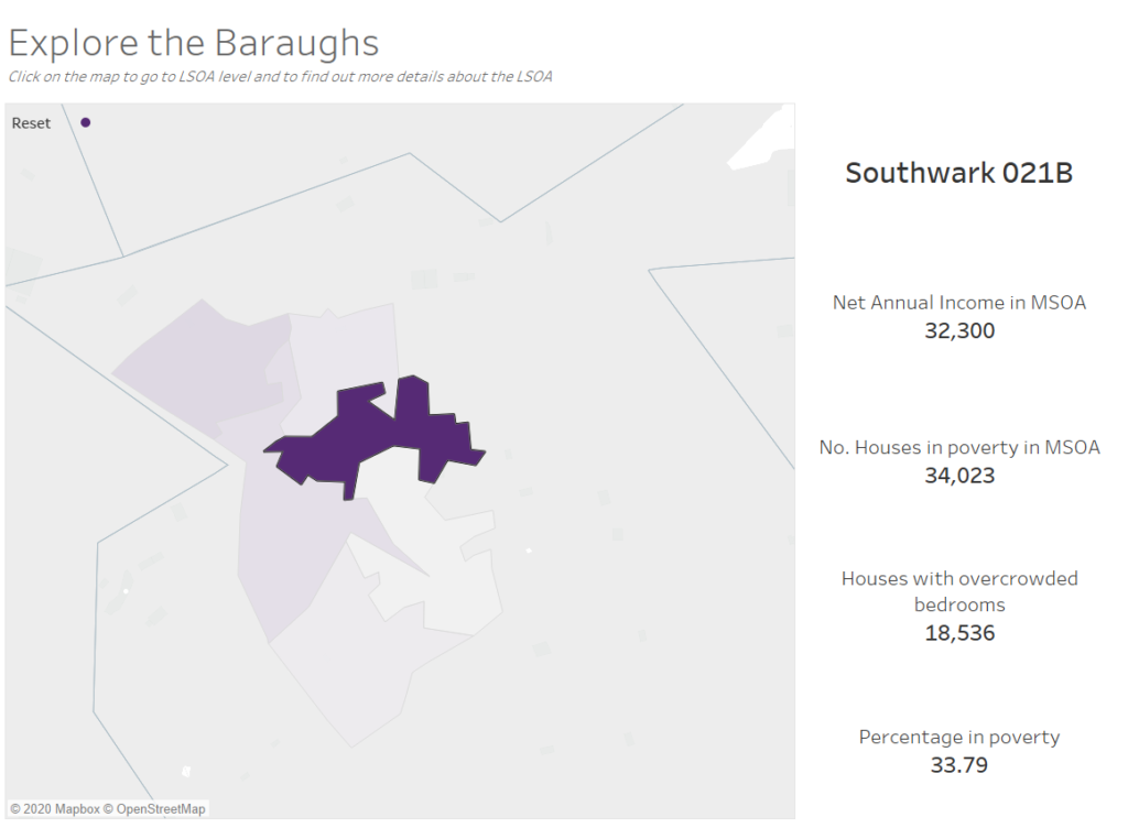
So instead of 11 as planned, I started on the dashboard after 1pm, when I realized that I haven’t joined in the shape files for the LSOA, and MSOA levels.
Luckily, while I was building the flow, and waiting for it to run, I sketched the dashboard,and knew exactly how I wanted it to look like.
When designing it, the main thing I was focusing on, was that this is a tool that would make decision makers, and that it should be something that can be printed out, Therefore I set the size to A3 Portrait, which can fit on two A4 Landscape pages. So that is how I split the layout. I also kept the background white to save ink.
The purpose of this is to allow decision makers to explore it and print out the relevant views.
The first part is focused more on an overview, but allows selection between the two age-groups: Reception and Year 6, and the factors for correlations.
While the second one allows drill-down and list the basic information about the specific LSOA.
Overall, I enjoyed this data-set and it was so good to discover the Association Analysis tool. About the dashboard…I feel that I could have done with another hour of formatting 🙂
Below is the full view for the user without any drill-down.