What are unit charts?
Unit charts are a type of chart used to communicate quantities of things by making the number of symbols on the chart proportional to the quantity of things being represented. In my example I will be using a unit chart to show the breakdown of seats held by each party in the UK general election in 2019.
The Data Prep
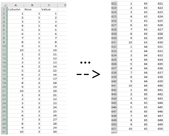
This method does require a bit of data prep to get started. It relies on having a template table which makes the required shapes in the tableau viz. That table looks like the image below.
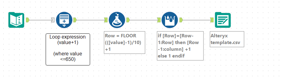
This table can be made in excel by hand or in a slightly quicker way using some logic in an alteryx workflow as shown below.
If you want to follow along, the template file I made can be downloaded here. Once you have this table, you’re all prepped and ready to go.
Moving into Tableau
Bring the template sheet into tableau as a new data connection. Right click and drag the ‘Row’ and ‘Column’ pills onto the ‘row shelf’ and ‘column shelf’ respectively. When you drop the pills onto the shelf with a right click it will prompt you to show what form you want to put the data onto the shelf, we just want the absolute value of the data that we’re dropping in, so choose the top button as shown below.
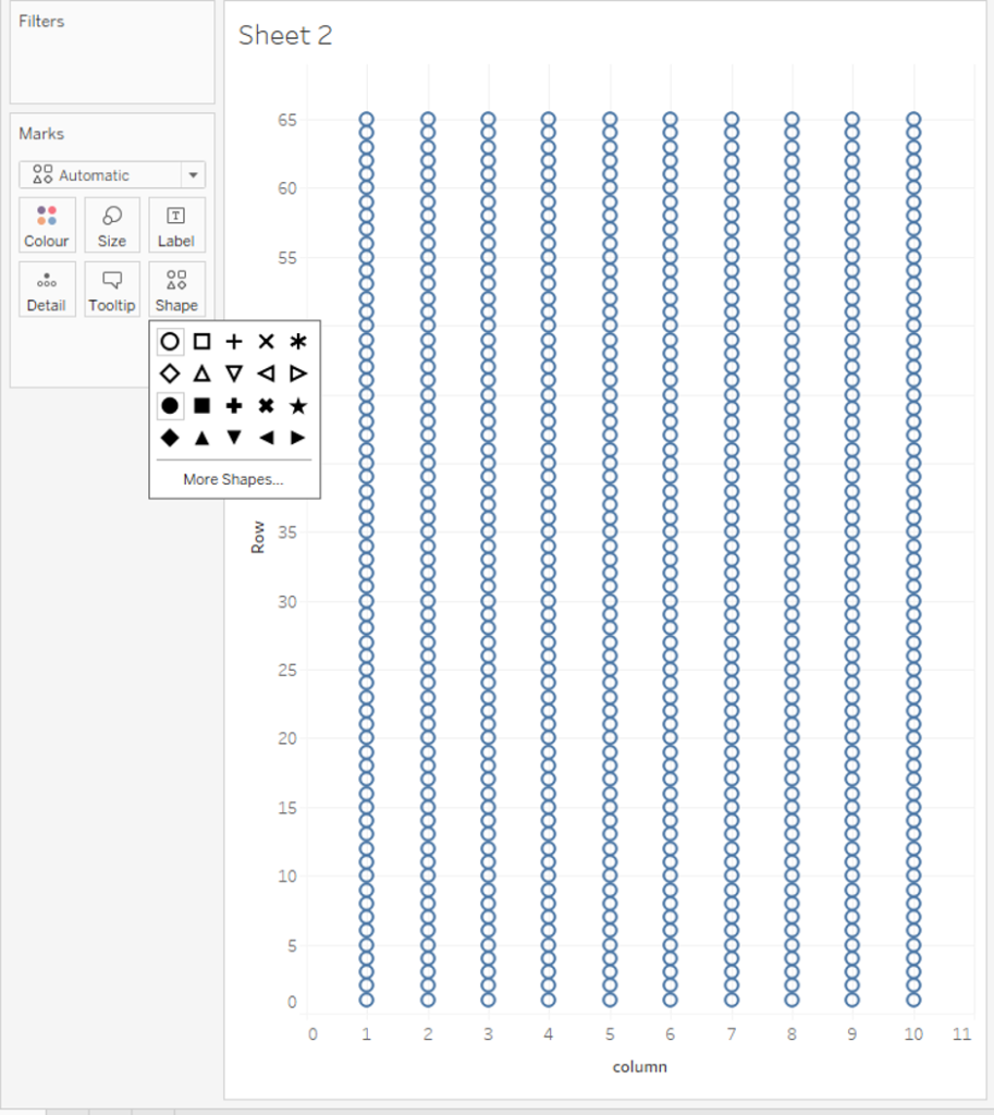
The canvas will now look something like the picture shown below. You will see that all the values that we had in our table are now being plotted as shapes on the view. You can change these shapes to be whatever you want by clicking on the shape tab on the marks card , in my instance I wanted filled circles so I chose the filled circle shape.
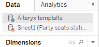
Importing the New Data
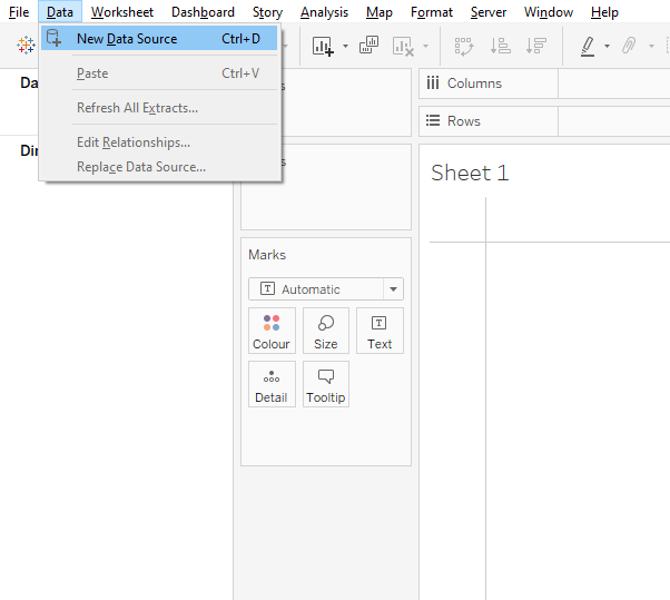
Now the party election stats needs to be imported, again, if you want to follow along my file can be found here. You import the data by going to the data tab at the top left of tableau, and clicking the new data source option. No linking has to be done for this technique to work, tableau will try to tell you that the data needs to be joined in some way, don’t listen to it, for our purposes it is lying.
Colouring in the dots
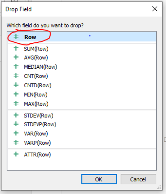
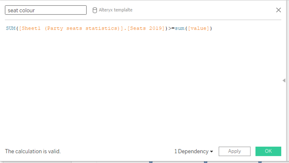
A calculation needs to be created to allow us to highlight the number of seats that each party has. You will want to make this calculation in the alteryx template window. This calculation is displayed below. What this calculation does is display every value smaller than or equal to the number of seats in 2019 as ‘true’ and those greater than the number of seats in 2019 as ‘false’ we can then use this to colour the circles in accordingly.
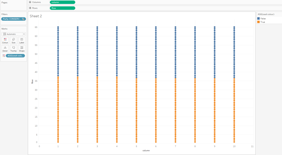
Drop the calculation into the colour tab of the marks card, this may again give you an error pop up, ignore it, the method will work just fine. You will then want a filter which allows you to select which party’s seats appear in the view. Do this by dragging the party from the ‘Party seat statistics’ data source onto the filter shelf, this will give you error messages again, but once again they can be ignored. You should now have something like below.
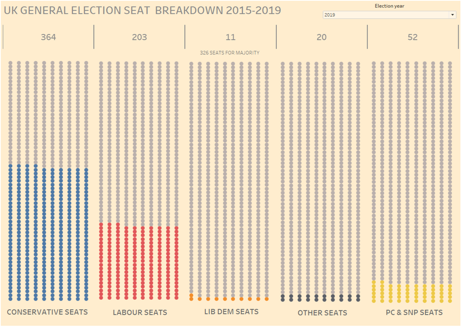
This is now essentially the finished product, minus a bit of formatting to make the chart look pretty and doing one for each party per year. After all the formatting and some extra touches, which may be the subject of future blogs, I was left with the below as my final product.
Thanks for sticking with me this far. If you make use of the technique I’d love to see what it can be used to display. If you have any questions feel free to get in touch with me on twitter @thenumberstim.