This post has been on my laptop as a draft for weeks, and I had been meaning to finish and publish it forever. After Andy and Eva gave a talk at the Data School about being more productive and mentioned how they never keep a blog post in draft, I decided to finally push this out rather than let it rot in the draft section.
For our last task in Week one we were told to revisit our initial applications and enrich them with new data.
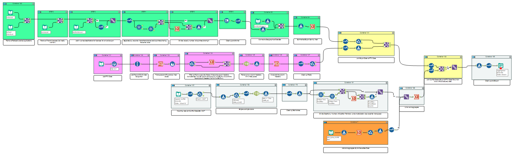
We would use Alteryx to prep our datasets and get them ready for Tableau where the fresh information would (hopefully) enhance and expand our prior vizzes.
The Original Visualisation
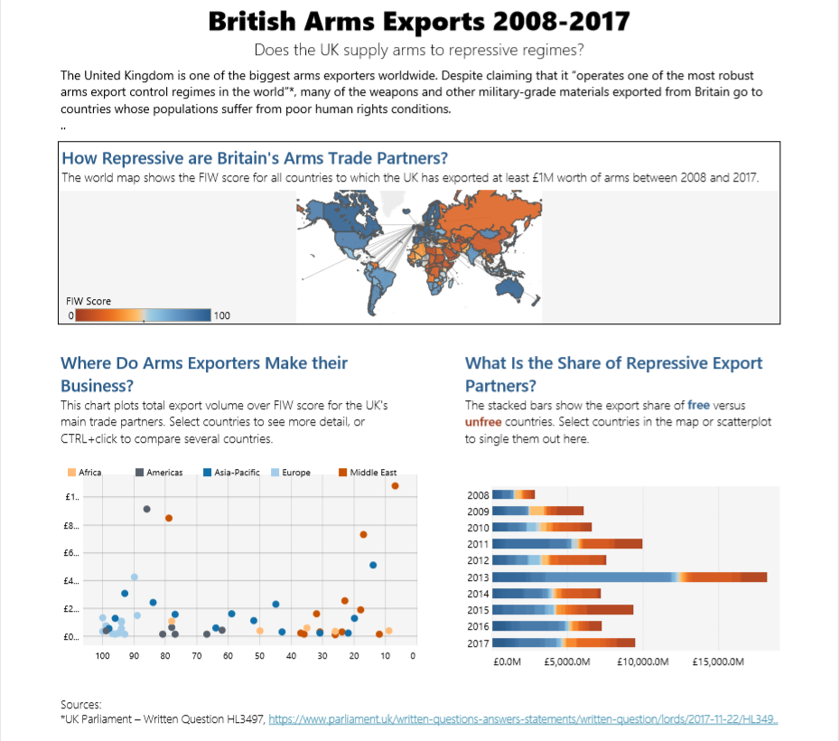
My first application was my very first attempt at a Tableau viz and was based on data about British arms exports from the Campaign against Arms Trade. In the original I charted arms exports against the Freedom in the World index which ranks countries according to civil liberties and freedom of the press, asking if UK arms trade supports repressive regimes.
I used a map to show the countries in the world, and the dashboard also had a tree map that showed the different kinds of weapons materials that were exported. The finished dashboard looks decent but doesn’t offer a great amount of insight, nor does it follow a particular story. There are too many different dimensions that have little to do with each other and it’s not very clear what I’m trying to say.
The Reviz
For my revisit I wanted to make the viz louder and clearer. If I was being critical of UK arms trade, I might as well go all the way, so I added data about conflict deaths worldwide where at least one party was a state government. This way I could show how many deaths the importers of British arms and, by extension, British arms traders themselves were responsible for.
I used data from the Uppsala Conflict Data Program and from the Violations Documentation Center in Syra since the former did not include any data about the Syrian Civil War. I merged my data sets in Alteryx, which proved tricky since I needed to join them on the Country Name fields and people can’t seem to agree on what some countries should be called (looking at you, Democratic Republic of Congo aka DR Congo aka Zaire aka Congo-Kinshasa). Once joined, I had one single data set containing all the information I needed to start building my visualisation.
Pay particular attention to the pretty colours.
We have been discussing bias in visualisations this week, and my interpretation of the data is deliberately provocative: It asks how much a human life is worth to UK arms exporters by dividing the value of exports by the number of deaths caused by the importing nation. The bar graphs show how both exports and conflict deaths are split between free and repressive nations, and how they developed over time.
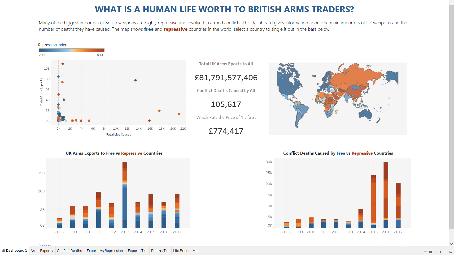
The resulting viz does a better job at getting the point across, aided by the additional data sets I could add thanks to Alteryx. Perhaps the most stunning experience was the fact that I managed to do the same amount of data prep in half a day that had taken me nearly a week the first time around.
You can find the viz on Tableau Public here.