Try Something New!
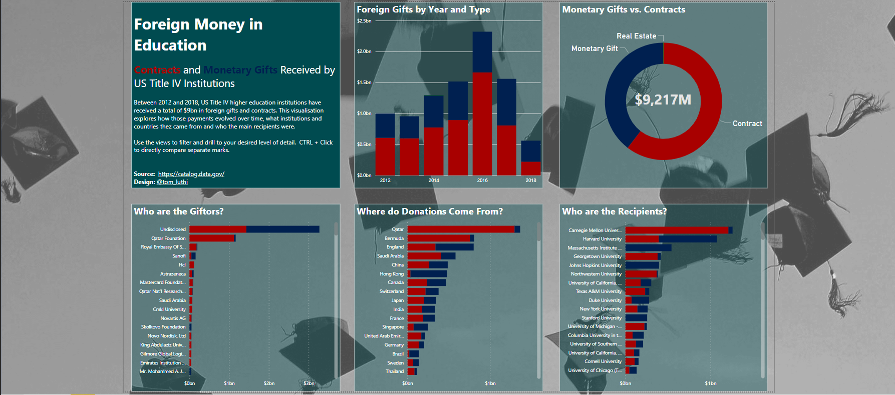
It was hump day for DS11’s dashboard week today, reason enough for Andy to mix things up a little and drag us (some of us willingly, some less so) out of our comfort zone. The task for today was to visualise a data set on money paid to US higher education institutions, either as monetary gifts or through bilateral contracts. Essentially, US universities are obligated by law to disclose any form of paiment they receive from foreign sources. Andy even went ahead and downloaded the data for us. Lovely.
As a funny little twist to the whole affair, Andy wanted us to stay off Tableau and create our dashboard in Microsoft Power BI. A tool none of us had ever used before. It’s easy to get tunnel vision when you’re working in one and the same environment 24/7, so this was a great challenge for us to wrap our heads around a different way of analysing and visualising data in a couple of hours and produce something presentable.
Old Friends
First of all, Andy claimed that the data was in such good shape that we didn’t need to do any data prep. I’m starting to see a bit of a pattern, because so far, every time he said that I ended up spending a good chunk of the day doing exactly that. In this particular case, it was soon clear that the data had been entered manually, and lots of different names, spelling variants and typographic errors meant that one and the same entity could have up to dozens of different entries in the data set. Since I wanted to have a look at who the main foreign sponsors, donors and contracors are that US universities make business with, I needed this data cleaned before I was able to find any kind of meaningful insight.
Hence I did end up using a product from the Tableau Suite, even if it wasn’t Tableau Desktop. Tableau Prep has an extremely useful feature that lets you group entries in a field, and Prep even goes so far as to give you suggestions on what rows should be grouped together based on spelling and pronounciation.
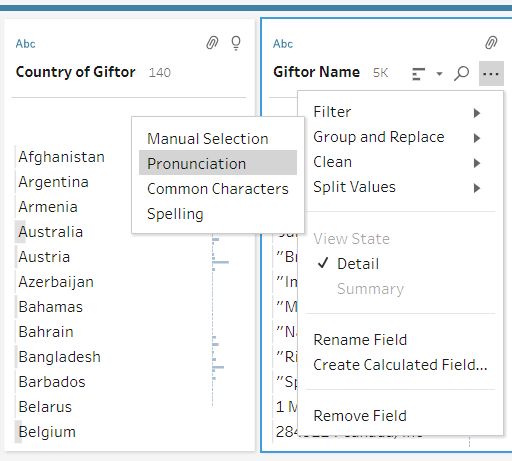
The function is called Group and Replace, and you can pick from several options to let Tableau group rows automatically. We have used the pronunciation feature with great success before, but today I ended up getting lots of completely off groupings based on Tableau’s automatic suggestion. Instead I used the spelling function, which still returned lots of false groupings but nevertheless allowed me to identify those instances where there were lots of similar but slightly different names used for the same institution, as in this example below.

Thanks to this feature I could rely on my findings with a lot more confidence, so it was worth the 45 or so minutes it took to sift through the thousands of rows. That being done I bade farewell to Tableau and headed off to uncharted waters.
(Get it? Uncharted. Teehee.)
Vizzing in Power BI
The first big difference between Power BI and Tableau is that Power BI doesn’t differentiate between views and dashboards. Instead, you build your view directly, dragging and dropping chart and fields into it. Power BI doesn’t make you build views from scratch, instead you select how you want to view your data, add the dimensions and measures and watch as your chart is built for you. That’s a great feature because it lets you hammer out views within seconds, on the other hand it’s much more difficult to explore the data in-depth because it’s almost impossible to create custom views, adjust the level of detail and expand on an existing chart with dual axes etc.
An amazing feature is that Power BI has an online gallery with pre-built charts ready to use, which you can simply download and populate with your data. Tableau is unbelievably flexible and can accommodate pretty much every use case, but very often even simple things can be overly complex to build or require a workaround – things as simple as building a tree map are much less intuitive in Tablea than they are in Power BI. Of course, this might lead you to play around with chart types without really knowing what you’re trying to do or say. For example, I spent a good 20 minutes with a network graph feature that lets you draw bubbles around the view (BUBBLES!) as you please, something I wouldn’t dream of trying to do in Tableau even though it’s probably possible.
Formatting the view in Power BI is both super easy and horribly complicated. Dragging and sizing objects on the canvas is one of my pet peeves in Tableau Desktop, and don’t get me started on containers. In Power BI, you get some help in aligning your objects, something I hope will become a feature in Tableau soon. On the other hand, I missed the dashboard actions and highlighters that help you get that bit of extra depth in a Tableau dashboard.
The Result
All in all, I believe that Power BI is a great addition to every analyst’s arsenal, and I already have some ideas for future projects to help me get a grip on the software. I mainly missed the exploratory function in Tableau and how simple it is to create calculated fields, custom filters and parameters. But all these are things I only really picked up several weeks into the training – and I’m sure there is much more training with Power BI to be had.
Feel free to check out my dashboard here.