Alongside with Laine, we worked together on creating calculated fields to create dynamic reference lines that marked every product release date as shown in the graph below.
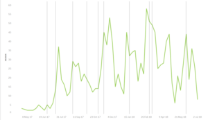
The main aim was to overlay the dates of the release of a product on top of the number of sales, we wanted to understand how the release of a product affected the number of sales and therefore we wanted to overlay the dates of a product release on top of the number of sales across time.
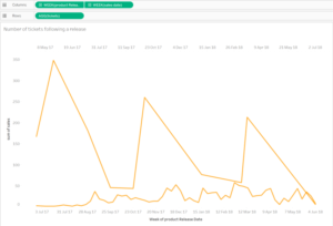
The problem we faced was that the dates of products were in a separate date field compared to the dates of sales hence when we did a dual axis with the 2 dates fields it wouldn’t show the correct release dates and it looked like the picture below:
To solve this we created a calculated field to figure out the reference lines that matched dates to the product release dates.
First, we did a calculated field which gave us the minimum sales date for each product release date if it was greater than or equal to sales date then we wanted the sales date.
{ FIXED [product Release Date]: min(IF [sales date] >= [product Release Date] THEN [sales date] ELSE NULL END)}
Following this, we created a calculated field that matched our first sales date with the original sales date which gave us a value of 1. This allowed us to pinpoint our reference line.
IF [first sales date] = [sales date] THEN 1 END
Make sure to edit your axis for your calculated field to end at 1 and re-size your bars, then finally hide your header.