For day 4 of Dashboard Week, our task was to download data from an API and build a visualisation in a tool other than Tableau. We were to pull every event within 50 miles of our hometown or our current city and return all fields available from the API.
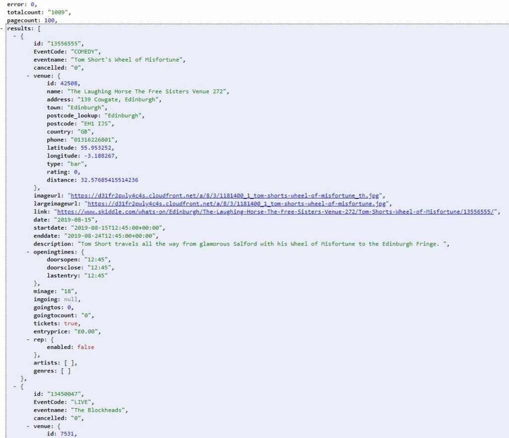
I decided to go ahead and do my data prep and visualisation with just the first 100 events (the max limit per page), and build a macro in Alteryx to pull more if I had time afterwards. Spoiler alert: I didn’t.
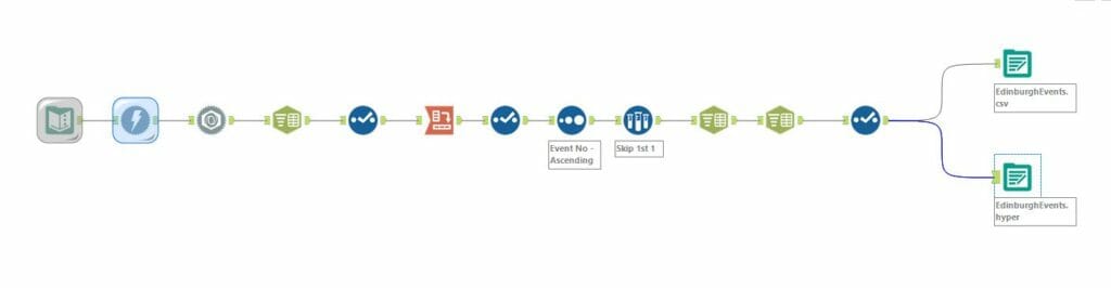
After getting the data from the API into the form I wanted in Alteryx, I spent a fair bit of time trying to build a viz with Flourish. I thought this example was particularly cool but wasn’t able to figure out how to re-create it in the time allotted. I got this far:

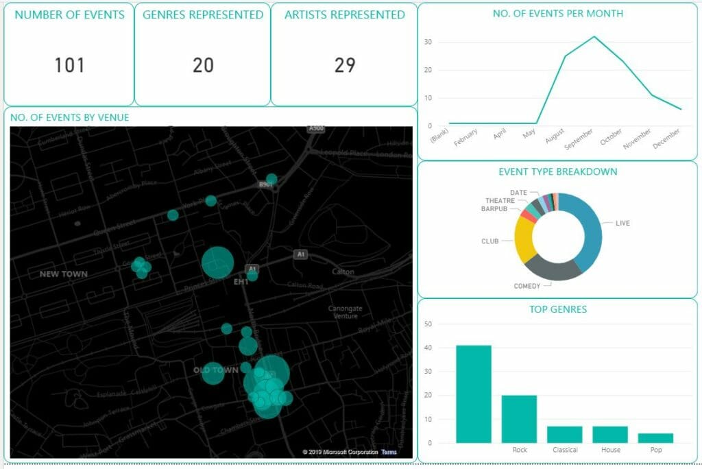
I tried a few other types of maps in Flourish, trying different mark types and whatnot, but I couldn’t get the formatting to look quite right. At this point, I decided to give Power BI a shot. Here’s what I ended up with:
It was fun experimenting with other tools, but the main takeaway was that this task made me really miss Tableau!