A dumbbell chart illustrates the change between two (or more) data points. To create a dumbbell chart on Tableau you will need to create a dual axis; one of the axes has a mark type of a line and the second axes has a mark type of a circle. Below is a step by step guide on how to create a dumbbell chart. In this example, I will use Sample – Superstore data to compare how regional category sales changes between 2015 to 2018.
1. Drag the Region and Category dimensions to rows and drag the Sales measure to columns
2. Change the default chart type on the marks shelf to a line
3. Then drag the Year(Order Date) dimension to Path on the mark shelf
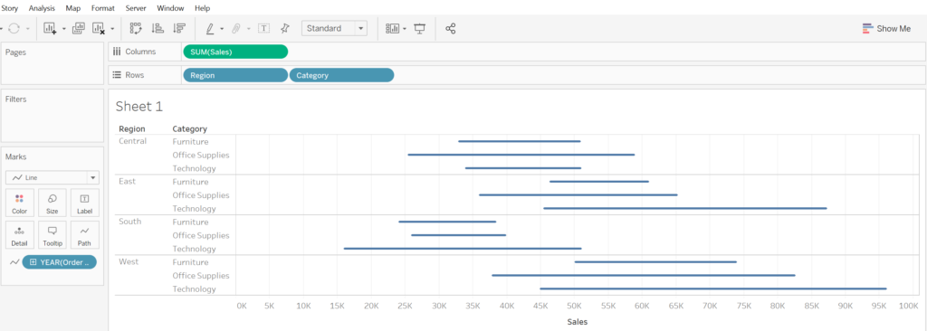
4. Drag the Year(Order Date) dimension to the filters shelf, select Years and click 2015 and 2018
5. Drag the Sales measure to columns again, but this time change the second chart type to a circle
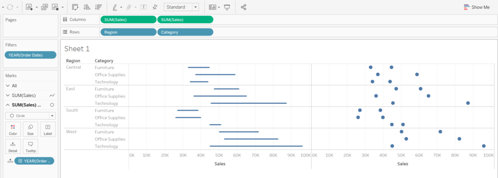
6. Left click on SUM(Sales) and select dual axis
7. Right click the top axis and deselect ‘show header’, then right click on the bottom axis to synchronise axis
8. On the marks shelf where the chart type is a circle, drag Year(Order Date) to colours
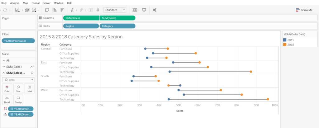
Now you have a beautiful dumbbell chart; it’s easy when you know how 😊